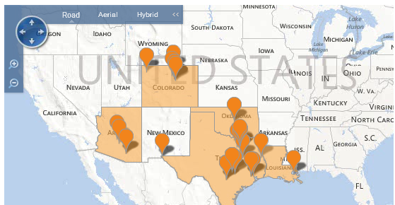
Classic Designer supports the display of geo markers and bubbles on a geo map or Bing map to represent businesses, households, landmarks of interest, etc. You do this by adding a scatter plot or bubble chart layer to the geo map or Bing map layer. The location of a geo marker or bubble on a geo map or Bing map needs to be provided as latitude and longitude values in decimal format. For example, San Francisco California is latitude 37.754508972168, longitude -122.42126083374. See the Geo Map Reference for latitude and longitude values.
There are several websites that offer free utilities to convert addresses to GPS coordinates (for example, http://www.gpsvisualizer.com/geocoder).
When adding a scatter plot or bubble chart layer to a Bing map, the Bing map uses default Bing geo markers instead of the scatter plot markers or bubbles when viewing the map in the standard version of Dashboards. The properties of the scatter plot or bubble chart (such as colors and marker shapes/sizes defined in the Other tab) will not be applied.
Custom colors can be defined for Bing map markers for use in the HTML5 version of Dashboards using hex color values in the result set to drive the color of the markers. To do this, set the Color dropdown on the Chart Series and Categories tab of the Layer Properties dialog box for the Bing map to a column containing hex values. See Using an Attribute to Define Chart Colors for more information. If you are using the Color field to provide marker colors for your Bing map, make sure the Uniform Color property in the Other tab for the scatter plot or bubble chart is not checked.
To add geo markers or bubbles to a geo map or Bing map
| 1. | Open the report containing the geo map or Bing map in Classic Designer. |
| 2. | Select Options - Chart Properties to open the Chart Properties dialog box. You will see the GeoMap or Bing Map chart layer. |
| 3. | Click New to add a new chart layer. For geo markers, select Scatter Plot as the chart type. For geo bubbles, select Bubble Chart as the chart type. |
| 4. | Select the column with the name of the location as
the Category, the column with the longitude values in decimal format as
Series, and the column with the latitude values in decimal format as Series2.
For a Bubble Chart type, select the measure column to use for bubble size
as Series (size). If you are using the Color dropdown on the Chart Series and Categories tab for the Bing map to specify a column to use for color coding Bing map markers, make sure the Uniform Color property in the Other tab for the scatter plot or bubble chart is unchecked. |
| 5. | Click Apply, then Close in the Layer Properties dialog box then Close in the Chart Properties dialog box. |
| 6. | Click Report - Save. |
See Also
Configuring Drilling in
a Geo Map
Adding an Advanced Chart Type
to a Report
Geo Map Reference
Creating a Bing Map
with Custom Regions