Changing Grid Intervals and Labeling Frequency
On the X Axis (or Y Axis) tab:
-
In the
Interval fields next to
the Major Gridlines, Minor Gridlines, or both fields, type a number to modify
the default interval which is 1.
Major gridlines relate directly to the data specified for the chart. Minor gridlines have no direct relationship to the data represented on the relevant axis, but you can use them to show additional graduations between the items on the axis, or to provide additional labeling where the default labeling format applied to gridlines is appropriate for the data you are charting.
- To show gridlines that are closer together, specify a number smaller than one, for example 0.25.
- To show gridlines that are further apart, specify a larger number, for example 0.5.
- To add labeling for the gridlines, on the relevant axis, check the Show Labels check box. When checked, this displays numeric labels for the gridlines for which you have specified intervals.
-
To control the number of intervals on the relevant axis:
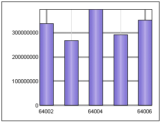
Option To Add Gridlines (and labels, where Show Labels is selected) 2 For every other data value on the relevant axis. 1 For every data value on the relevant axis. 0.5 For every data value and three additional instances between data values on the relevant axis. 0.25 For every data value and three additional instances between data values on the relevant axis. In this example, the major gridlines interval is 2 for the X axis:

Major gridlines take precedence over minor ones. When Show Labels is checked, the major gridlines display labels for the charted data and only the minor gridlines display default labeling for the axis.
When you specify 2 as the major gridline interval, the X axis data labels are only shown for every other instance on the X axis.
- Click OK to save the changes.