You can visually filter data in most reports by dragging a capture rectangle around the attribute values in a chart or table to select only those values. Some reports, such as pie and donut charts, use keyboard commands to filter.
Note: Funnel and pyramid charts do not support visual filtering. Visual filtering only works for attributes and measures. Expression columns do not support visual filtering.
Alternatively, you can filter the data by dragging an attribute or measure to the Filters bucket in the Chart Builder. See Filtering Data in Visualizer.
To drag-select the data to filter
Drag-select works both while editing in Visualizer and when browsing reports in Dashboards 2.0.
| 1. | Click and
drag across the desired region. 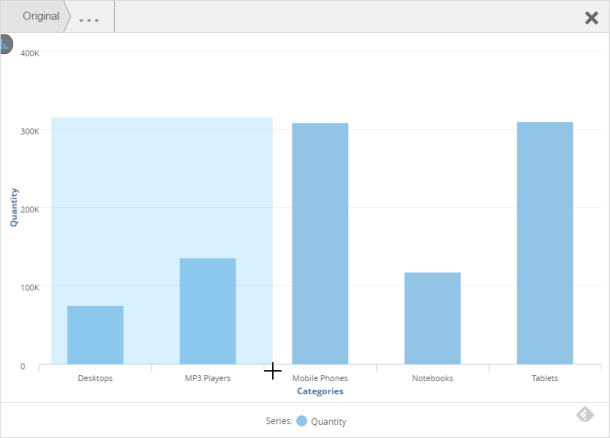 |
| 2. | Let go the selection. The chart
updates based on your selection and the name of the filtered column
displays in the Filters bucket. 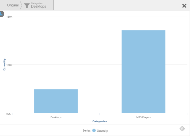 |
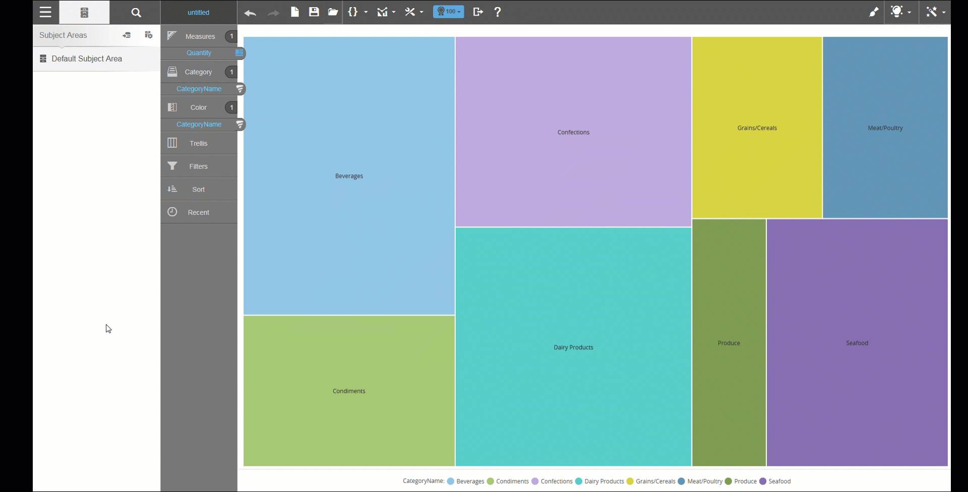
Tree Map Visual Filtering
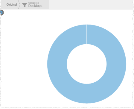
To use keyboard commands to filter pie and donut charts
Pie, donut, and semi-donut charts use keyboard commands instead of drag-select.
- Press a command key:
- On a PC: Press Cntrl
- On a Mac: Press Shift
- Click on a segment of the chart. The segment enlarges.
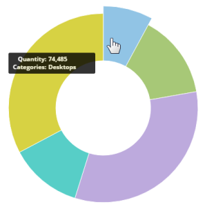
- Let go the keyboard. The chart (and dashboard, if in Dashboards 2.0) updates to use the selected filter. You can see the current filter at the top of the work area.
Tips:
Click
the Filters bucket to see or change the filter conditions.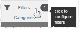
You can
toggle the filter on and off using the toggle switch .
.
You can
remove the filter by clicking the Remove  icon.
icon.
A visualization can have multiple filters.
You can use a Visualizer report expression as a filter by dragging and dropping it to the Filters bucket. However, you cannot filter the data using a saved expression (a shareable expression) created in Designer.