Dashboards 2.0 has an intuitive interface that is easy to learn and use.
Here are a few tips for getting the most out of your dashboards.
- Navigating
- Viewing
- Filtering
- Sorting
- Exporting
- Print Settings
- Sharing in Email
- Using Bookmarks
- Exploring in Visualizer
- Delay Charting
Navigating
Click
the dashboards breadcrumb pulldowns to quickly navigate
between dashboards and dashboard collections.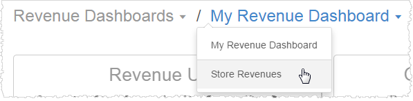
Alternatively, click the Dashboards menu button to browse a list. 
Click on charts, KPIs, links, or buttons to drill down to detail levels or drill across to other dashboards, if available and depending on how the chart was designed.
- Hover
over a chart to see the drill icon. Click on
the chart to drill down to another level of detail, or to another
dashboard. Notice how other charts with related data will also update
to the new drill level.

- For some dashboards, when you drill to other levels, the drill path shows in a navigation bar. Click on the parts of the bar to change the drill again, or click Original to go back to the beginning.
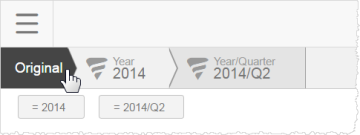
If you don't want to see the drill path, you can toggle it off.
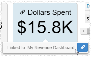
- The
link icon shows that a KPI or button links to another dashboard. Hover over
the KPI to see the name of the linked dashboard and click the link icon to open it.
Use the Main menu to go back to
the main Infor menus
or to log out. 
Viewing
Hover over charts to see more detailed
information in a popup.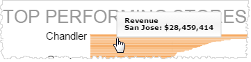
Maximize a report by hovering over
it and clicking Maximize. The report expands to fill the screen.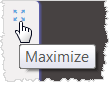
Click Minimize to restore its original size.
Tip: Maximize is particularly helpful for viewing
map reports.
If enabled
for a report, you can change report types
by hovering over a report and clicking Dashlet Actions - View Selector.
The options reflect the type of charts that most closely match the data.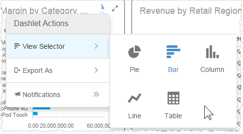
Tip: The Table view is a convenient way to see
the data in a column/row format.
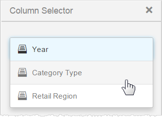
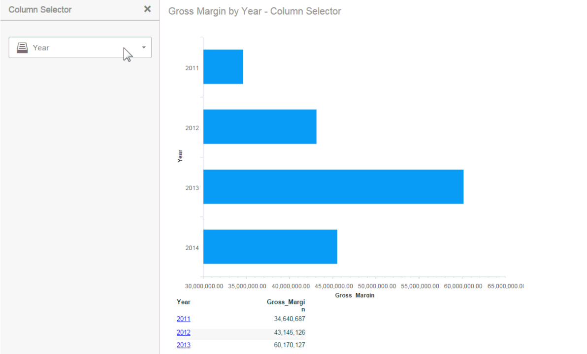
Some reports
let you choose what attributes or measures to show.
Use Dashlet Actions - Column Selector.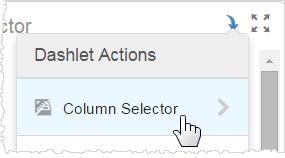
Alternative attributes or measures display in the Column Selector list. When you choose another one the report updates with the new data.
 Watch: Column Selectors in Action.
For some
tabular reports, you can toggle row and column parent
headers. Click the table menu icon and then click the toggle button.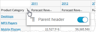
For some
tabular reports, you can immediately create a percentage
calculation column from a numeric column. Click the column menu
and select Percentage Of..., then select either subtotals or grand total.
Subtotals and grand totals are available based on the data in the report.

Notice that the table automatically resizes to fit in its panel when you
add the new column.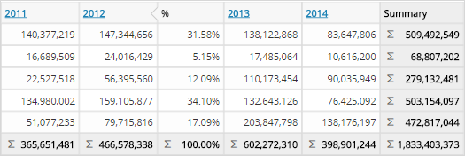
To delete the percentage column, click the column menu and select Remove.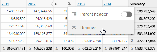
Filtering
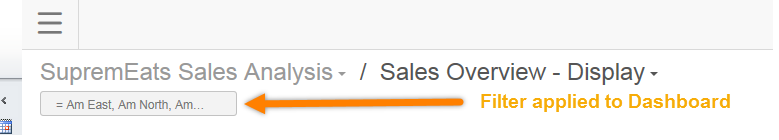
Dashboards can have standard or embedded filters that let you explore subsets of the data.
Click Filters at the top right of
the dashboard page to use the standard filters. 
What filters, if any, are available depend on how the dashboard was set
up.
Check the filters and operators you want and click Apply.
Tips: Check the box to the left of the search box to toggle select or deselect all options. Click the icon on the right of the search box to toggle showing all or only selected options.
You can toggle filters off. In a dashboard, when a filter is toggled off it maintains its state, but it is not applied to the dashboard.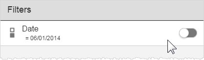
To hide the filter drawer without applying new filters, click on the Filters menu button again.
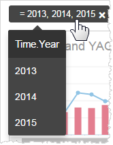
Filter cards for the filters you select appear along the top of the dashboard. Hover over them to see the name of the filter and its current filter values.
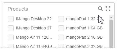
If there are a lot of filter values, you can search on them to narrow down
your selection.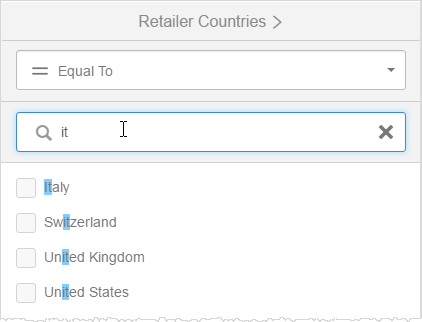
Or, check the All box to select them all.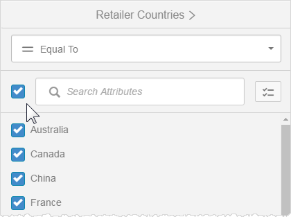
Undo filters by clicking the X on the filter card.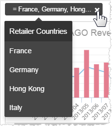
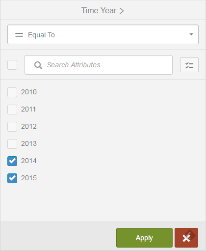
Some filters
are based on dates and use a calendar. For those types of filters, click
the filter card to see the date picker, and select the dates. Use
the operator buttons to refine the your selection criteria. 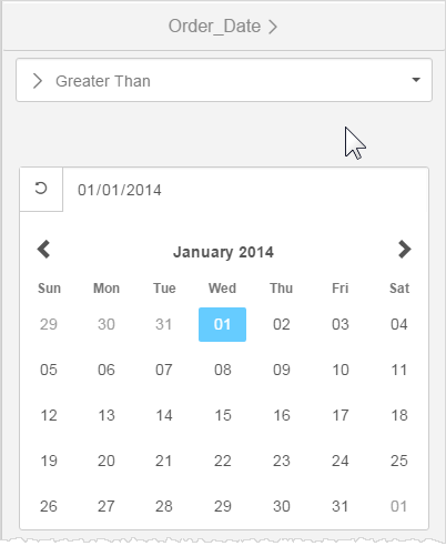
Some standard filters
are set up as hierarchical groups. You can also toggle them on or off.
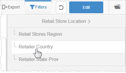
Traverse filter groups to see different levels of the hierarchy.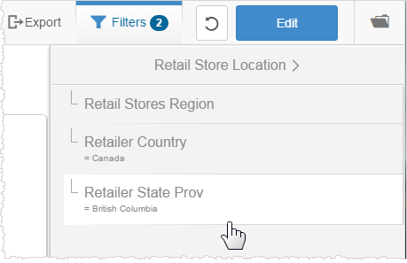
Some filters are embedded on a page, so you can easily see them and click to change them. The filter cards for embedded filters work the same as for standard filters.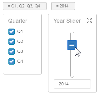
Embedded filters have a Search bar so that you can more easily find a value when there are many values.
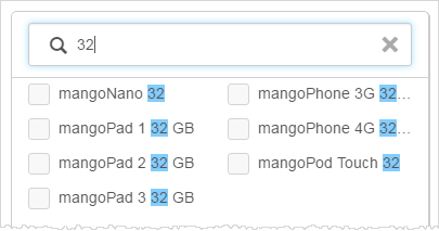
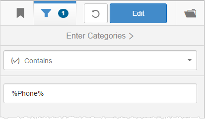
Some filters let you type in partial text using the Contains operator. Always use the percent sign (%) as a wildcard in these fields.
You can drag-select a part of a chart to
visually filter to that level.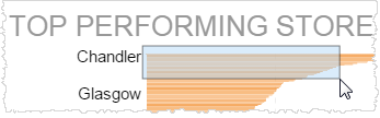
The chart, and any chart using the same filter, updates to show the details.
A filter card appears at the top. You can delete the filter card to return
to the previous view.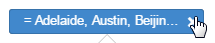
Sorting
In some
tables and crosstab reports you have a Sort option. Hover over the titles
on either axis to see and click the Sort icon.
X axis sort: 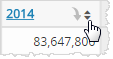
Y axis sort: 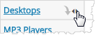
Click to change the sort order, and click again to set it back to the original
order.
Exporting
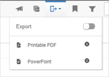
Export an Entire Dashboard
To export an entire dashboard to PDF or PowerPoint, click Export from the top menu.The Export toggle (with Details) option provides the collection name, dashboard name, report names (Visualizer reports only), a timestamp, and lists any filters that were applied at the time of export and page numbers. The export downloads immediately.
This option does not export the background image or color.
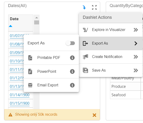
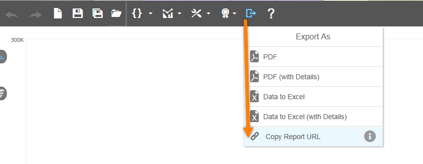
Export a Single Report
To export a single report, click Dashlet Actions and then Export As.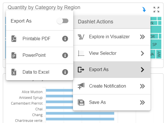
Enabling the Export As toggle will add a tab or page that includes the name of the report, its dashboard and collection, and the timestamp.
The export options that are available from the menu will depend on the type of report, size of the report, the space's Email Export Threshold, and your security permissions. For information on modifying a space's Email Export Threshold, see Modify Space Properties.
- The user will see Data to Excel if:
- The user only has the Enable Download permission.
- The user has the Email Export and Enable Download permissions, and the report's number of cells is equal to or less than the Email Export Threshold.
- The user will see Email Export if:
- The user only has the Email Export permission.
- The user has the Email Export and Enable Download permissions and the report has more than cells than the space's Email Export Threshold.
Tips:
- If a Visualizer table report has many rows, it will export to multiple pages in a PDF. Crosstab reports, however, will reduce in size down to the size of a page.
- Visualizer charts exported to Excel or PDF do not always look exactly like the report in Visualizer.
Export a Collection
Export a collection by selecting the Dashboard menu icon that will pivot the view of collections and pages. At the top of the menu click the ellipsis button and select the export type.
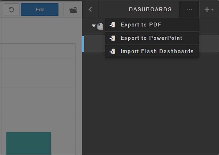
Select the desired dashboard collection to export.
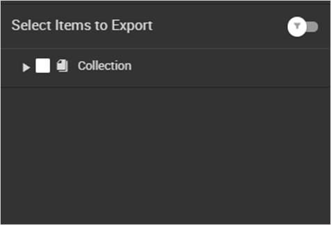
The toggle will include the details of the collection name, dashboard name, report names (Visualizer reports only), a timestamp, and lists any filters applied.
Note: The file will be attached via email to the user’s email address.
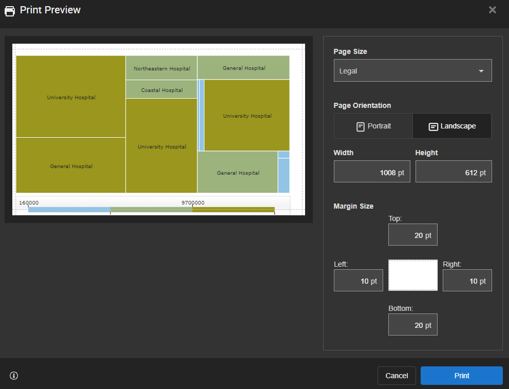
Print Settings
You can use the Print Report option to configure the print settings of your embedded Visualizer report. If the Visualizer report has a Save Configuration, the print settings on the Visualizer report will be used as the default print settings for the embedded dashlet on the dashboard. These settings can be modified when using Print Report. Note: The Print Report option is only available to users with the Enable Download ACL.
Note: The following chart types do not support Print Report: Spline, Areaspline, Points, Semi-donut, Benchmark/Treadline, and Geomap.
- Select the Dashlet Actions icon from the dashlet and select Print Report.
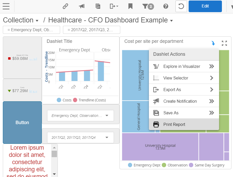
- From the Print Preview screen, you can set the print parameters for the report include page size, page orientation, page width, page height, and margin size. As you make changes to the settings, you will see the changes reflected on the preview image. Visualizer reports will have an option to set the Export As type as either PDF or CSV.
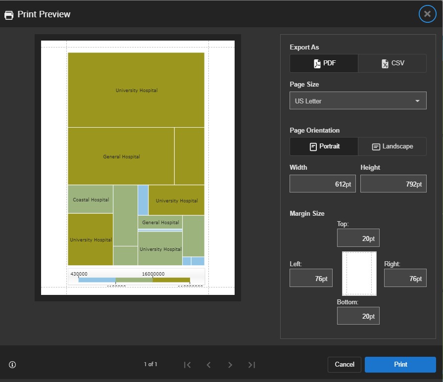
- Select Print. A copy of the report will download to your computer.
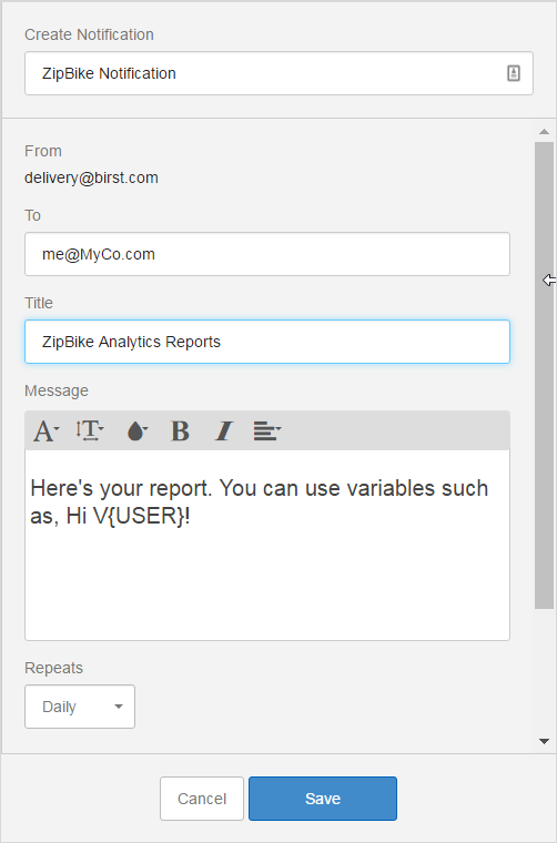
Sharing in Email
If enabled for your user account, you can create a notification that emails a report or a dashboard to one or more email recipients. For more information on notifications, see Creating Notifications.
Share a report by clicking Dashlet Actions - Create Notifications. 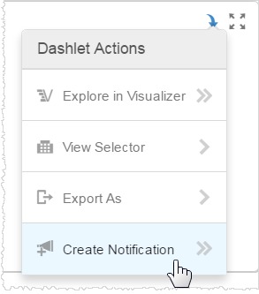
Click Add (+) and enter the name of the notification, email addresses, frequency, time, and time zone. 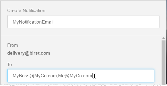
Tip: Separate email addresses for multiple recipients with a semicolon and no spaces. For example:
MyBoss@myCo.com;Me@myCo.com
Optionally, change the default PDF attachment format for a report/dashlet. Note: Dashboards can only export as PDFs. Toggle it on and select another format such as CSV, PPT, Excel, HTML, or RTF/Word. The type of available format depends on the type of chart.
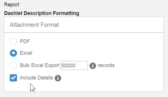
If enabled for your account, and if the report is a large Visualizer table, the Bulk Export option lets you export up to the maximum number that the Administrator configured for your account rows.
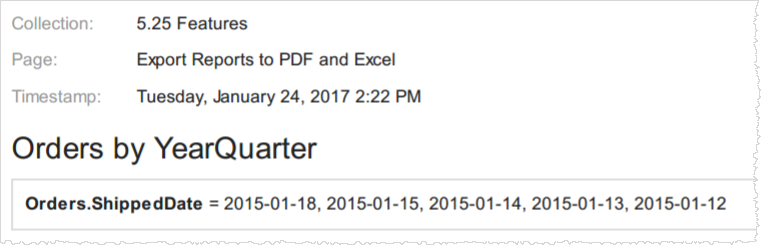
The Include Details option adds a tab or page called "Metadata" that includes the collection, dashboard, and report names, the timestamp, and the applied filters if any. For example, here is a PDF details page:
Save the notification, then click Done. A summary of the report notification information shows in the Notifications panel.
Click Back to leave the summary. Click the Notifications button in the top menu bar to close the panel. 
Tip: To see and edit any of your notifications, click the Notifications button.
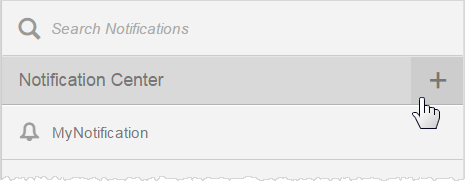
Share a dashboard by clicking the Notifications button, then click the Add button in the Notifications Center.
Fill in the name, email addresses, and set the frequency, time, and time zone. You can enter a title for the email subject line, and format text to go within the email. If your Birst Administrator has set up any variables for you to use, add them with the V{variable_name} syntax.
Then select the attachment format options and whether you want the report to add details such as the collection name. These are similar options to a simple report export, as previously described.
Click Save, then Back, then the Notifications button. Birst will send a dashboard notification to the email addresses at the specified time.
The Notification Center lists all the email notifications that you have set up.

The single bell icon indicates a report notification, and the bell with a paper behind it indicates a dashboard notification.
To share multiple dashboards in one email it's easiest to start with an existing notification, as described above. Then navigate to the second dashboard and go back into the Notifications panel, and select Action - Add Dashboard. The new dashboard gets added to the list at the bottom.
Deep Linking (For Reports or Dashboards)
You can copy a dashboard URL and include the link in a crafted email. The recipient of the email will be directed directly the dashboard if they are already logged into the environment. If they are not yet logged in, they will be directed to the login screen and then they will be taken directly to the dashboard.
Note: Users that you share your report or dashboard URLs with will need to have access to the spaces where they are located and have access to Dashboards and/or Visualizer.
Please note that this feature is only available if users are authenticated via Birst Login Page or via SP-Initiated SAML mode (SSO). This is not available for Custom SSO (Single Sign On) authentication modes.
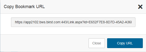
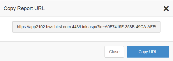
Select the Link icon from the Dashboard menu:
![]()
This opens a dialogue box that lets you copy the Dashboard Bookmark URL. Note: Copying the Bookmark means that any filters you apply to the dashboard at thetime you copy the URL will be in place when the user clicks on the link you email them.
Similarly, you can share a direct link to a Visualizer report by sending the user the report URL via a crafted email message. You will need to be in the Visualizer module to copy the URL. Note: The user you are sharing the report link with must have access to ad-hoc (Visualizer) reports to open the report in Visualizer.
Copy the report URL
Using Bookmarks
Use bookmarks to save a view of your dashboard so you can easily find it again later. This is particularly helpful if you have a few favorite filters that you like to apply.
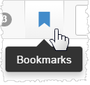
- When you are on a dashboard that you want to save, in the top menu bar click the Bookmarks icon.
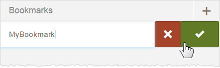
- Click Add (+) to create a new bookmark, name it, and click the check box to save it for later retrieval. Birst saves the state of the dashboard at the time you create the bookmark.
- To retrieve a bookmark, click the bookmarks button and select it from the list. The dashboard will refresh to the view that was saved as a bookmark.
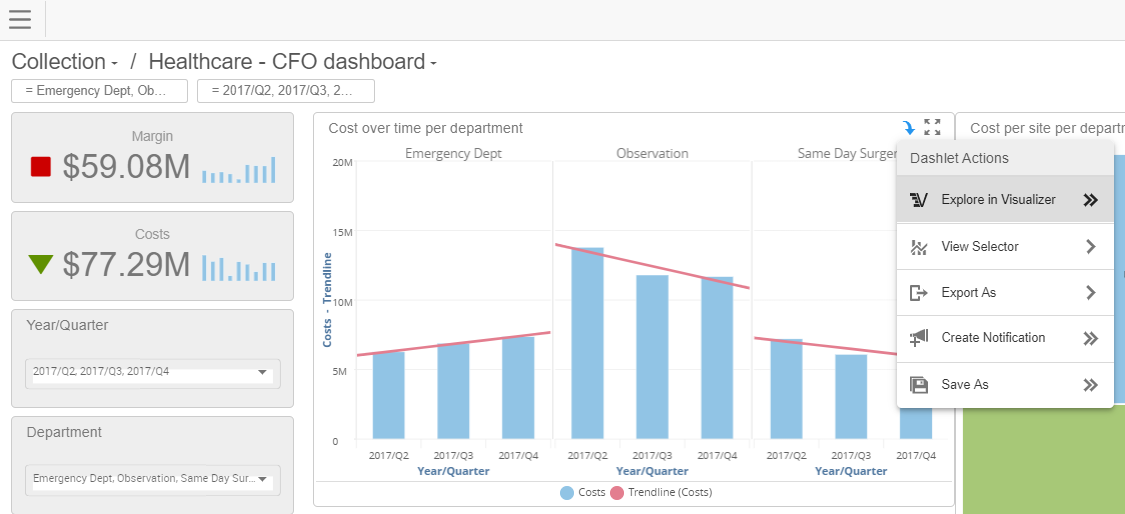
Exploring in Visualizer
Users with the Dashboard Visualizer Exploration permission can open a report in Visualizer and further explore the data. You can then save your changes in a new report.
- From the dashboard, click the Dashlet Actions icon.
- Select Explore in Visualizer.
For more information on using Visualizer,
- Make your modifications to your report.
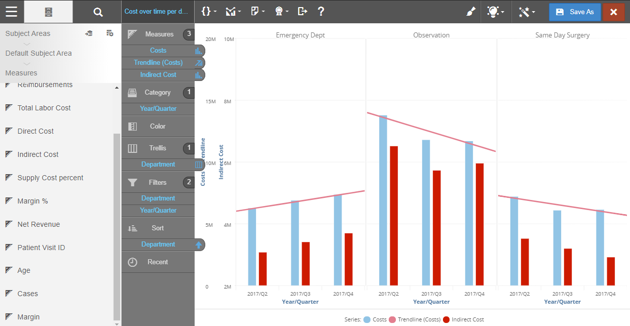
- If you want to save the modified report, click Save As.
- Select a folder and click Save As again. Save As will create a new report. It will never overwrite an existing report.
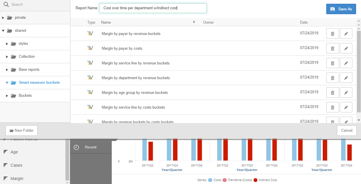
Tip: If Save As icon is disabled, a report with the same name already exists in that folder. Either select a new folder to save the report or rename the report. - When you are done in Visualizer click the red Exit icon to return to the dashboard.

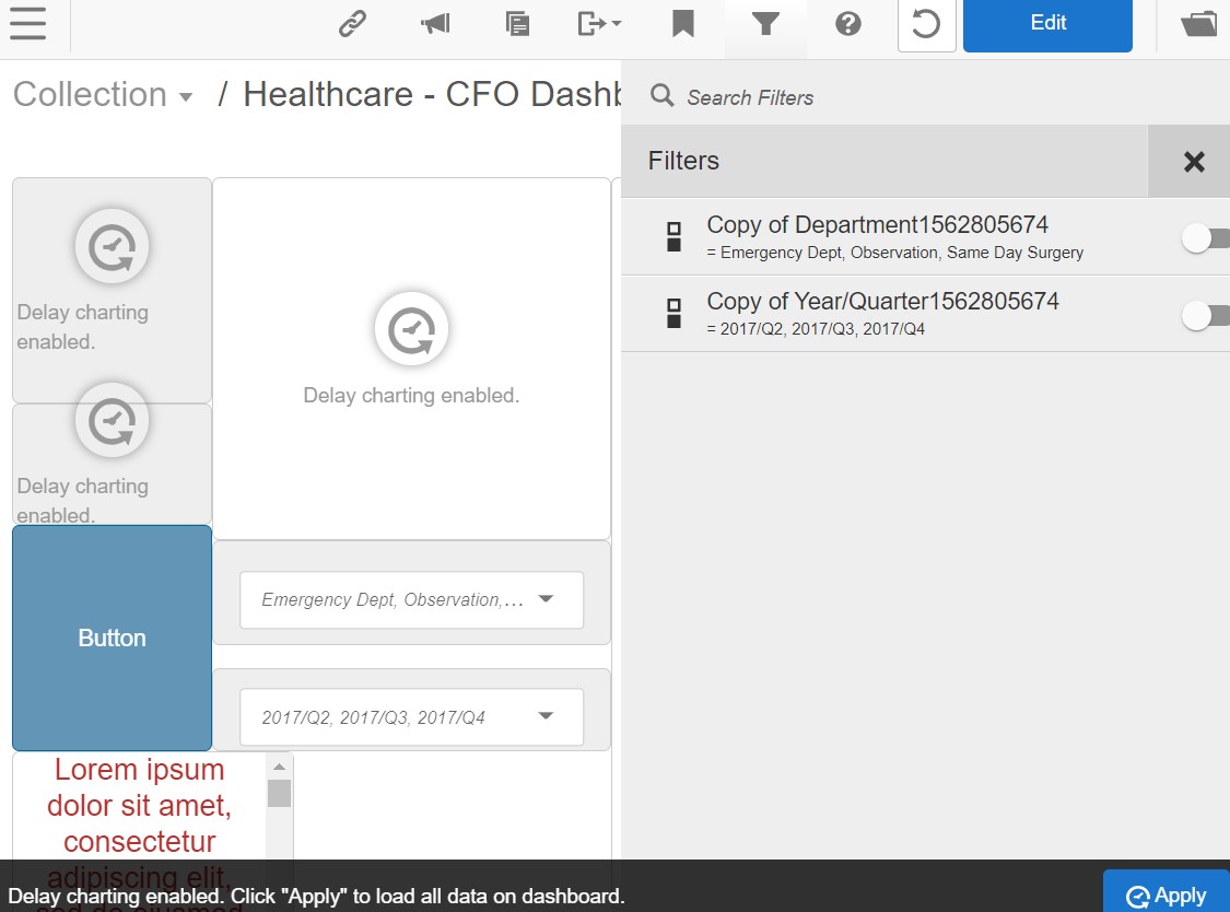
Delay Charting
You can enable Delay Charting by selecting Edit on a dashboard and then selecting Delay Charting. This feature is useful for dashboards with long initial load times, especially if the dashboard is designed to be used with filters.
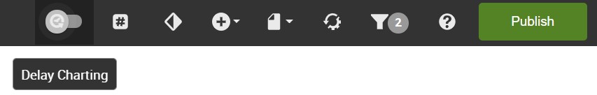
When the Delay Charting setting is enabled for a dashboard, Visualizer reports, Designer reports, and KPIs won’t render on the dashboard. All other dashboard elements will be visible. After selecting the dashboard's filter settings, click the Apply button to render the dashboard.