Overtime Trend Report
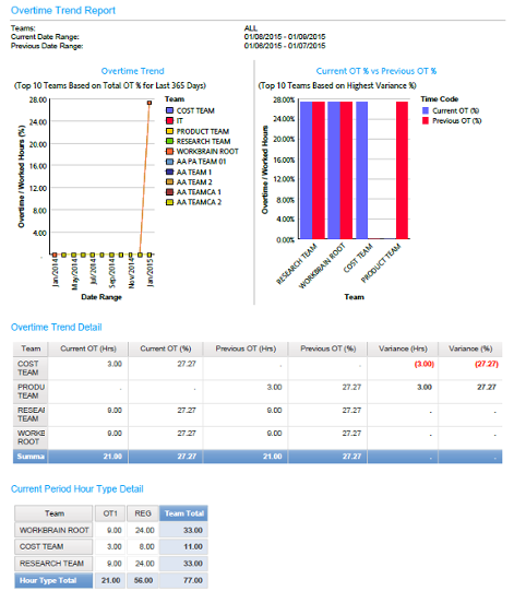
The Overtime Trend Report allows a manager to see the amount of overtime worked by their teams in a configurable date interval versus the same interval previous. For example, a manager will use this report to compare overtime worked this week-to-date compared to the same days in the previous week. The date intervals compared always have the same number of days, ensuring a meaningful comparison. A manual date option is also available. If the total overtime exceeds the overtime accrued for a team in the previous period, the font is changed to highlight this condition. To further illustrate trends, the data is graphically rendered in a bar chart and a line graph. There is a maximum of ten teams displayed in the bar chart filtered based on highest variance percentage (%). There is also a maximum of ten teams displayed in the line graph filtered based on the Total OT% for the one year period. Data is summarized such that an executive viewing the report will see the total of all sub teams. If further detail is required, then a drill through to the sub teams is provided.
Example output:
