Adding or editing data for the Y axis
Use the Values field on the Data tab to specify values plotted on the Y axis.
- Next to the Values field, click Add or Edit to open the Chart Value dialog which has two tabs:
- Value for specifying the data to be charted and its label which is the legend for the data.
- Action for specifying a hyperlink from the data shown on your chart to a bookmarked area in another section of the report.
- In the Label field, specify this information:
- Label
- Either type a label for the chart's data or click the browse button to open the Enter Field/Expression dialog where you can select a label. This label is the legend that describes the data represented on the chart.
- Value
-
Type a name for the data you are charting or click the browse button to select a data field. For example, to show a total amount where you have a Base Amount data field on your report, you could enter the expression:
=Sum(Fields!LedgerLine_3_baseAmount_baseAmount_amount.Value)Note: If the amounts are large, you might want them to be represented as smaller numbers on the chart. For example, to express the amounts in thousands, you can modify the expression to divide the amount by a thousand like this:=Sum(Fields!LedgerLine_3_baseAmount_baseAmount_amount.Value)/1000Then add as the title of the relevant axis, something like:
Total Amount ($ 000s)An alternative technique is to use the Format code field on the X Axis and Y Axis tabs to specify a format which scales the values on the relevant axis.
- Use the Series Styles button to open the Style Properties dialog where you can select the format and color of the bar, line or other representation of data on the chart.
For example, to show the bars on a bar chart as cylinders:
- On the Border and Line tab, from the drop-down lists, select Solid as the line style and Black as the color.
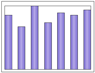
- On the Background tab, in the Colour field select SlateBlue, in the Gradient field select Vertical Centre and in the End Colour field, select Lavender. This produces a bar chart formatted like this:

- Optionally, use the Show point labels check box to label the columns, points or other representations of the data on the chart:
- Check the Show point labels check box. This enables the Data label and Format code fields for specifying the data to use as labels and the format of the labels.
- In the Data label field, browse to open the Enter Field/Expression dialog where you can select a data field or aggregate, such as the total amount, represented by each column on a bar chart or point on a line graph.
Where the value you added on the Data tab was an expression for the total amount per account on your report, you could use this expression to show the total amount as a label for each bar on the bar chart or point on the graph for each account on the X (or Y) axis.
For example:
=Sum(Fields!LedgerLine_3_baseAmount_baseAmount_amount.Value)You can modify the expression to obtain smaller numbers to fit neatly over the points on the chart, if required.
- Use the Style button to specify the labeling format.
On the Action tab:- By default, no hyperlinks are set for the chart.
- You can select the Jump to bookmark option to bookmark an area in another section of your report and link the chart to data on the report.
- Click OK to save the changes.