Example Chart
This is an example of a line graph produced with Report Designer:
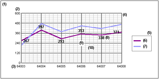
Key to Example Chart
- 1. Chart area
- The portion of the display containing the chart title - for example Account Listing and plot area.
- 2. Y axis
- Values on this axis are dependent on elements plotted on the X axis, for example base amounts per account (or period) on the X axis. By default, the range of values plotted on the Y axis determines the scale used. To improve the look of the plot area, a larger maximum has been specified for the scale in this example.
- 3. X axis
- Values on this axis group the data plotted on the Y axis, for example account codes (or accounting period).
- 4. Plot area
- The area bounded by the X and Y axes. In the case of a pie chart, the plot area is defined by a circle representing the totality of all data items.
- 5. Legend
- A box containing a description for each of the groups of Data values on the chart - for example base amounts and reporting amounts.
- 6 and 7. Keys to the data plotted on a graph
- Each key relates to an individual set of values plotted on the Y axis, or segment of a pie chart.
- 8. Point labels
- Values that are plotted on the Y axis, displayed as labels on the graph. On a pie chart, these would be shown in each segment of the pie. Use the Show point labels check box in the Chart Value dialog to display labels.
- 9. Major gridlines
- Lines that form a grid in the plot area which are aligned to values displayed on the X and Y axes.
- 10. Minor gridlines
- Lines that form a secondary grid within the plot area. They mark the intervals between the values displayed on the X and Y axes. Where major and minor gridlines, are displayed, with different line weights, the minor gridlines form grids within the grid formed by the major gridlines.
Format and Layout of Example Chart
- The chart's background is formatted using the button on the General tab.
- The background of the plot area is formatted using the button on the General tab.
- The major and minor gridlines are set using the Major Gridlines and Minor Gridlines check boxes on the X Axis and Y Axis tabs.
- The data labels in the plot area are added using the Show point labels check box, and formatted using the button, on the Value tab in the Chart Value dialog. You can open this dialog from the Data tab by selecting an item from the Value list box and clicking the button.
- The lines depicting the data in the plot area are formatted using the button in the Chart Value dialog which is accessible from the Data tab.