ConditionalImageButton
A conditional image button is a button that shows different images depending on the value the button is bound to. A node can have these attributes, in addition to the common control attributes:
| Attribute | Description |
|---|---|
| DefaultImage | Default image to show on the button. |
| Gravity | Position of the button within its container. You can specify Left or Right. |
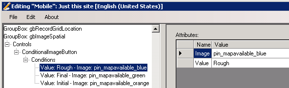
Each node has one node as a child. The node has one or more nodes as children, each of which specifies a value/image pair. If the value that the control is bound matches one of the specified values, then the specified image for that value will be used. Otherwise the button will show the default image.
| Attribute | Description |
|---|---|
| Image | Image to show for the specified value. |
| Value | Value that will show this image. |
Each node specifies a priority code and the button to show for that code. If none of the conditions is met, the app will show the default image.
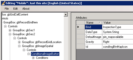
For example, a conditional image button can be used to show inspection icons on the map in different colors, depending on the inspection type. The Bind attribute of the node specifies the property that determines which image will be used. Specify a property of the model that the parent view uses.
In this case a conditional image button is being added to the CDR_Building_Inspection_GridCell view, which uses the CDR_Building_Inspection model. The Bind attribute is set to InspectionType. Note also that the DefaultImage attribute specifies an image to show if none of the conditions is met.
Each condition under the node specifies a value of the InspectionType property, and an image to show for inspections of that type. In this example, an orange icon is used for Initial inspections, a blue icon is used for Rough inspections, and a green icon is used for Final inspections.