Dashboards
This table describes the format of each panel and the kind of information it shows.
| Panel | Example |
|---|---|
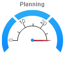
| Angular Gauge Shows values from zero to a specified maximum, such as a count of building permits or open work orders. In some cases you can click the gauge to view the records in Infor Public Sector GIS. You can use the panel's preferences to set the maximum value, and to set color-coded warning and danger values. You can also indicate whether you want to show an odometer in the middle of the gauge. |
|
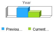
| Bar Chart
Uses colored bars to compare different values. |
|
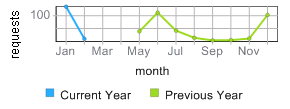
| Line Chart Draws a line through a series of values plotted on an x-axis and y-axis. |
|
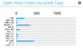
| Linear Gauge Uses horizontal bars to measure values against a specified maximum and to compare values to each other. For example, you can compare work orders for different asset types. You can use the panel's preferences to set the maximum value. In some cases you can also click a bar in the chart to view the records in Infor Public Sector GIS. |
|
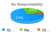
| Pie Chart
Compares different values as percentages of a total. You can hover over a slice of the pie to see a tooltip indicating the value that slice represents. |
|