Customizing the display
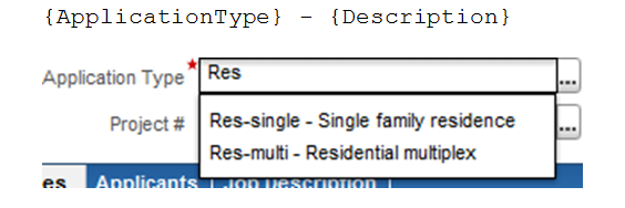
In the simplest case, the AutoComplete results display values of the selected property that match the characters the user has typed so far. In many cases you’ll want to display additional properties as well, so that users can more easily select the correct value. To customize the display, use the component’s Custom Display attribute.
For application types, for example, the description is often more informative than the application type code, so the AutoComplete for Building.ApplicationType is configured to display both. To display additional properties of the object identified by the Component Moniker attribute, specify the properties’ common IDs in curly brackets, as in this example:
