About FlexLayout components
A FlexLayout component is a container component which is used to flexibly house other components. Each FlexLayout component can be divided into different horizontal or vertical regions, and each region can contain multiple child components. The overall positioning of those child components is specified by the FlexLayout region attributes, and their order is specified by the Sequence property.
You can nest FlexLayout components inside regions of other FlexLayout components. You can nest these components as many levels deep as you need to accomplish your form design.
A FlexLayout component can be customized, using the properties that are described in this topic.
FlexLayout container types
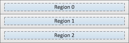
When using multiple regions, the FlexLayout component can group the regions horizontally or vertically.
- Horizontal box

- Vertical box

Region length
The Length and Units attributes control the individual length of each region of a FlexLayout component. Length is expressed as a number of characters, equal portions of the total available width (Flex units), or as a combination of both.
Char units only:

Flex units only:

Combination of Char and Flex units:

About the Orientation, Pack, and Align attributes
The Orientation attribute specifies whether child components are arranged vertically or horizontally within each region.
The Pack and Align attributes work together to position the child components within the region.
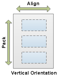
- Verical orientation
- When the FlexLayout region is vertically oriented, to position the child
components at the left, center, right, or to stretch them to fill the entire width
of the region, use Align. To position the child components at the start (top), center
(middle), or end (bottom) of the region, use Pack.

- Horizontal orientation
- When the FlexLayout region is horizontally oriented, use Align to position the child
components at the top, middle, bottom, or to stretch them to fill the entire
height of the region. Use Pack to position the child components at the start (left), center
(middle), or end (right) of the region.

Theme Border
To enable or disable the region's border of a FlexLayout component on WinStudio and web client, use the Theme Border attribute.
Use the Theme Editor to specify these border attributes:
- Border color
- Top, left, right, and bottom border visibility
- FlexLayout and FlexRegion border visibility
- If you select , then no border is displayed for both the FlexLayout component and FlexRegion.
- If you select , then the border is displayed around the FlexLayout component only. Any borders for the regions are not displayed even if the Theme Border from the Flex Region properties is enabled.
- If you select , then the border is displayed around the FlexRegions only. Any borders around the FlexLayout component are not displayed. To enable or disable the border visibility of a specific region, use the Theme Border attribute from the Flex Region properties.
- If you select , then the border is displayed for both the FlexLayout component and the FlexRegion. The border of the region is only displayed if the Theme Border attribute of that region is enabled.
- FlexLayoutAndRegionBorder
- FlexLayoutBorder
- FlexRegionBottomBorder
- FlexRegionTopBorder
- FlexRegionLeftBorder
- FlexRegionRightBorder
- FlexRegionBorder
VisibleWhen
The VisibleWhen attribute specifies the conditions under which the component is visible or hidden.
Animation
To add a sliding and/or bouncing effect to a region when it is opened or closed, use the Animation attribute. To disable animation, leave the field blank. To enable animation, select from these options:
Background image
To add an image to the background of a region, use the Background Image attribute.
Support for watermarks on Report type forms is available only for PDF and Printer output formats.
Minimum/Maximum length
When a region size is defined as a number of flex units, to specify the maximum and minimum possible size of that flex region, use the Min/Max attribute.
Region margins
The Default Margin property specifies the margin, measured in framework characters, that defaults for any child components added to the current FlexLayout region.
To override, if necessary, the Default Margin property for components contained in the FlexLayout region, use the Margin property.
About the Orientation, Pack, and Align Attributes
To select horizontal or vertical box when creating a Flex region, use Orientation Adorner property.
To add a region on the selected flex layout, use Add flex regions. The Flex region orientation is based on the Orientation Adorner property being selected.
To remove a region on the selected FlexLayout component, use Remove flex regions.
To add a FlexLayout component on a selected region that has no contained component, use Add Flex.