User Input objects
These objects can be added to a form or modified if they already exist on a form.
Button
Use this object to activate a function. This could be opening a form, running an inquire or a report, and many other things. (In release 3.0.x, this button was known as a pushbutton.)
Listbox
A list of valid data that the user can select from for a particular field.
Checkbox
Add a checkbox for toggle on/off options.
Radio Button
A list of options that a user can select. This option is typically used in place of a value list when the list of options is short and only one can be selected.
Textbox
A rectangular box to accommodate user text entries. This box accommodates one line of user input.
Text Area
A sizable area for text input to accommodate any amount of text input. Scroll bars and other viewing aids can be added to a text area object.
User Input Object Properties
These properties apply to user input objects.
| Property | Applies to | Description |
|---|---|---|
| Across | Radio Button |
By default, options for radio buttons show in a vertical list format. Select this option to show the options horizontally and to determine how many options are displayed in a row. For example, if you have six radio button options and you type "3" for the Number Across option, the result are two rows of three across. |
| Action | Button |
Determines what the button activates. The choices vary depending on the form you are modifying (or the form the new form is based on), but include such things as:
|
| Border | Text Area | Use this option to add a border around the text in a text area. |
| Color | Text Area | Click the hyperlink to open a dialog for picking a font color. |
| Custom | Button, Checkbox, Listbox, Radio Button | Update specialized options. These sections are described more fully in specific sections. |
| Data Source | All | Select the database field that the input object updates. |
| Default | Textbox, Listbox, Radio Button, Checkbox | Add a default value for a field. This can be an alphanumeric value or an action. |
| Field Nbr | All | All form properties have an internal number that links the property to the field it is related to. This number appears for your information only. You cannot change it. |
| Font | Text Area | Click the hyperlink to open a dialog for picking a font. |
| Height | Label, Button, Radio Button, Image, Browser, Rectangle, Tab Area, Detail Area | Height of an object. You can resize by dragging and dropping or by typing the number of pixels. |
| Justify | Button, Textbox, Listbox, Checkbox, Radio Button | Align text for an object that contains text, such as a label. Options are left, right, and center. |
| Left | Textbox, Button, Listbox, Checkbox, Radio Button | The left position that the object occupies. |
| Name | Textbox, Button, Listbox, Checkbox, Radio Button | Changes the internal name of the object, the name that identifies the object in the XML code. All objects have an internal name. The name can be changed but, unless you are planning to modify the code through JavaScript, there is no reason to do so. |
| Output Only | Textbox, Listbox | Select this option to make output viewable only. Users cannot change the field data. |
| Read only | Text Area | Use this option to make the field data viewable only, not editable. |
| Text | Button, Checkbox | Text that appears on a button or check box. By default, the text is "New Button" or "New Checkbox." |
| Tooltip | Button, Textbox | Add or update a usage tip that appears when users hold the pointer over a button. Type the text for your tooltip in the text box. |
| Top | Text, Button, Listbox, Checkbox, Radio Button | Vertical physical position of an object in relation to the size of the form. |
| Width | Textbox, Button, Listbox, Checkbox, Radio Button | Width of the object. You can resize by dragging and dropping or by typing a number of pixels. |
| Word wrap | Text Area | If you want text to be allowed to wrap in the text box, select this option. |
Linking an Object to a Data Source
When you add a user input object (field) to a form, you must associate the field to the data source so that data can be stored in the database.
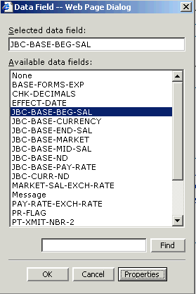
Click the hyperlink to the right of Data Source in the Properties pane to open the Data Field dialog box. On the Select Data Source dialog box, you can scroll the list, type the name of the field, or use the Find button to perform a search. When the name of the field you want to be the data source appears in the text box to the left of the Find box, click OK. You can use the Properties button to open a box of technical data about the currently highlighted field.
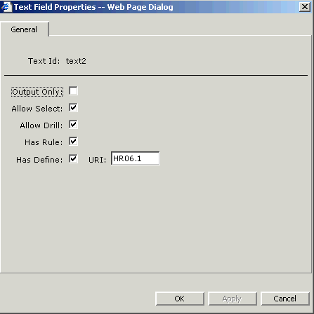
Textbox Custom Options
When you create or modify a textbox, you can click the Custom button to open a dialog box of options for customizing.
You can make selections for these listbox custom options:
| Option | Meaning |
| Output only | A read-only description. The user cannot edit this field from the current form. This parameter is applied to fields, for example, that can display on one form but are updated on another form. |
| Allow Select | When this property is applied to field, the user can select data. |
| Allow Drill | The field is drill-enabled. Users with appropriate security access can open a Drill Explorer session for this field. |
| Has Rules | This field has associated data (rules) that are read and populated on the form. |
| Has Define | When this property is enabled, it means the field has defined data that can be updated. |
| URI | The source for the define, where is, the field is updated. Often, the URI is the form you are currently working with, but it does not have to be. |
Listbox Custom Options
When you create or modify a listbox, you can click the Custom button to open a dialog box of options for customizing
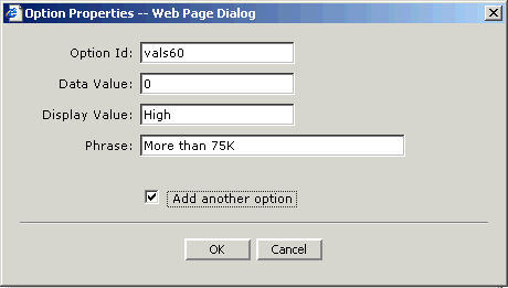
When you add a new listbox, you must make selections for these fields.
| Option | Meaning |
| Option Id | Design Studio assigns a default Id here; you can change it if you want to but this ID is for internal use only. |
| Data Value | The data that are stored in the database for this field. This can be the actual data of the user selection or a code that represents the data. |
| Display Value | What displays on the form in the field when this list item has been selected. This can be the same as the data value or, if you choose to use codes for data values, the display value can provide a short description of what the choice means. |
| Phrase | The text that appears for this text item when the user is deciding which list item to select. You can use a phrase as a way to add hints for the user. |
Press OK to add the listbox item. When the Add Another button is checked, Design Studio opens another listbox dialog box so that you can continue adding more items for the listbox. You can de-select Add Another when you add your last listbox item or you can press Cancel when you are finished adding items.
Radio Button Custom Options
When you create or modify a radio button, you can click the Custom button to open a dialog box of options for customizing. A radio button has similar properties to a listbox.
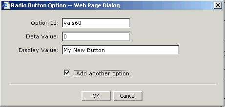
When you add a new radio button, you must make selections for these fields:
| Option | Meaning |
| Option Id | Design Studio assigns a default ID here; you can change it if you want to but this Id is for internal use only. |
| Data Value | The data that are stored in the database for this field. This can be the actual data of the user selection or a code that represents the data. |
| Display Value | What displays on the form in the field when this list item has been selected. This can be the same as the data value or, if you choose to use codes for data values, the display value can provide a short description of what the choice means. |
Press OK to add the radio button item. When the Add Another button is checked, Design Studio opens another radio button dialog box so that you can continue adding more items. You can de-select Add Another when you add your last item or you can press Cancel when you are finished adding items.
Button Custom Options
When you create or modify a button, you are adding an item to a form that performs a single action. You can perform a typical field update action or open or transfer to a form or a URL.
When you create a new button, you must assign an action to the button. Following are the available actions:
| Option | Meaning |
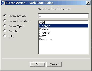
| Form Action | Select a field action. Options are Add, Change, Delete, Inquire, Next, and Previous. |
| Form Transfer | If transfer to another Lawson form is available from this form, a list of forms that can be transferred to appears. |
| Form Open | Type the name of a form to open. This can be anything you want it to be, including a formlet that you created or a different Lawson form. |
| Function | Used with custom scripting to identify a special function that has been developed at your site. |
| URL | Type a URL for the user to go to when this button is clicked. If you are adding a button to access a URL to a form, the location can be any location you want it to be. |