REST API Modeler user interface
You can navigate through the application using the side and split menu for easy access to all sections.
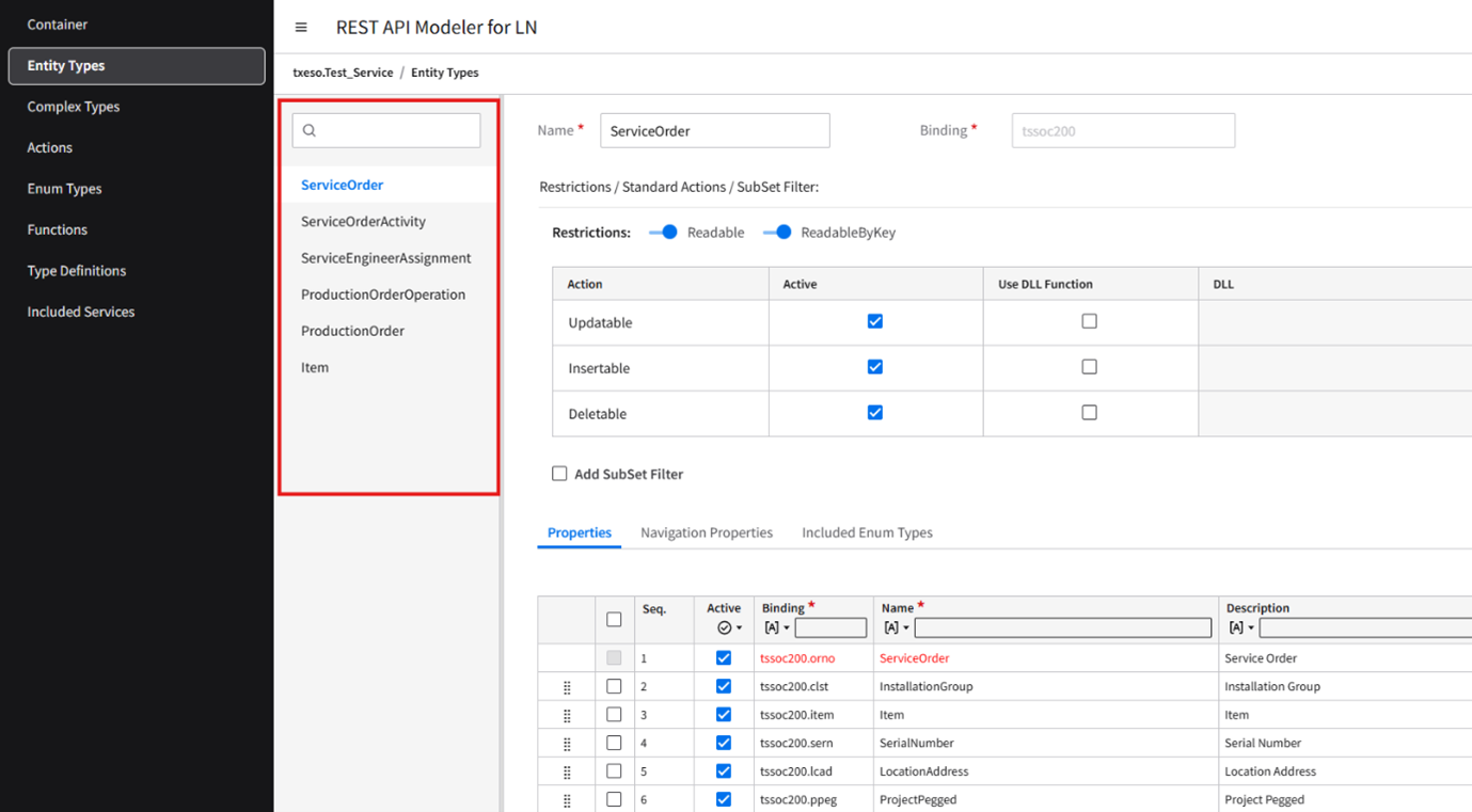
Side menu
The application features a side menu that facilitates navigation to different sections. The side menu includes these sections:
- Container
- Entity Types
- Complex Types
- Actions
- Enum Types
- Functions
- Type Definitions
- Included Services
Split menu
Each section, except for Container, includes a split menu listing the elements for that section. When you navigate to a section from the side menu, such as Entity Types or Complex Types, the first element is automatically selected, and its content is displayed on the right side of the split menu.
To search for an element, specify some characters in the search box.
Main header
This section displays the title and other important information.
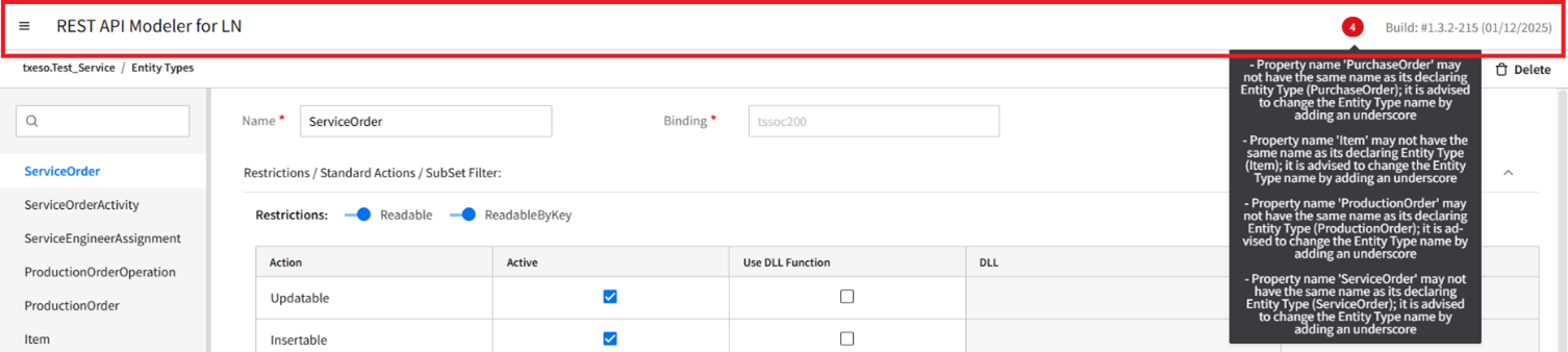
- Error indicator
- Displays the number of errors when the service is saved. Hover over the indicator to view detailed error information in a tooltip.
- Build
- Displays the build number along with the release date.
Documentation Mode
If an element is available within a Container, Entity Types, Complex Types, Functions, or Actions section, a option is displayed in the top-right corner next to the , , and buttons.
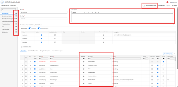
- Documentation Mode
-
Controls whether the element is displayed in a documentation-focused view or the standard view.
- ON: Displays only documentation-focused fields.
- OFF: Displays all fields.
- Description
- Provides a textual explanation of the element, property, or parameters, offering additional context about purpose and usage.
- Documentation Status
- Indicates the completeness of the documentation for the element and fields. The status icon uses two colors: Green (Complete) and Grey (Incomplete).
Create New, Save, and Delete
If an element is available within a section, these buttons are displayed at the top right corner:
- Create New
- Used to create an element in the section.
- Save
- Used to save the service. This button is enabled only when all mandatory fields contain valid data.
- Delete
- Used to delete the data.
