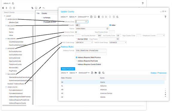
Overview of the form layout editor
You can change the layout (number and position of panes on the form) and you can modify individual items on the form, such as fields, text, and buttons.
The sample form layout below shows how the layout sections listed in the Configuration Console correspond to the sections on a form. The layout sections shown are not the only possibilities. See the table for more detail.

| Layout Element | Description |
|---|---|
| form title |
To change the heading of the form, specify the new name in Title. Select Is Primary to indicate that this form should displayed in cases where a business class has multiple forms that could apply. Select Propagate as Drill to make this form eligible to be used to construct the DrillAround list of related forms and lists. It will only be included if that business class UI definition does not have a defined drill list. |
| Actions |
Select Called Out to view the actions available to pin to the toolbar of the form. Items that have been pinned to the toolbar display along the top pane of the form with default options such as Actions or Options. Select Restricted to remove from view actions that users do not perform in order to make the list of available actions simpler and faster to navigate or to restricted an action based on a condition. |
| Layout directive | |
| Column |
At the layout level, you can define sections based on a number of columns: single column, two column, and so on up to seven column. Elements in the section will be distributed evenly throughout the columns. For example, in a two-column layout with a total of six elements, the first three would be placed in the first column and the second three would be in the second column. Note that there is also a column component that you can use to control the content of a section's columns more specifically rather than relying on the default distribution. |
| Paragraph | A paragraph within a layout is a section where the elements are placed in horizontal rows. If all of the elements do not fit in a row, the elements that do not fit are placed in another row. |
| Header | A header for a layout enables you to provide a title above a section or between sections. The text can be sized differently based on whether you choose header1, header2 and so on up to header6, with header6 being the smallest text size. |
| Condition | A condition layout directive enables you to use a boolean field to control when a component is visible or valid. Valid fields are visible but users cannot enter or modify their values. |
| Blank Line | A blank line adds extra space between sections or between a header and a section. |
| Page Break | A page break causes a break between sections. |
| Visibility | ‘Visible when' conditions will show when the value meets conditions you specify. For example, In the LRCPositionDetail form, the Position Description text can have the condition "visible when the value is synched to the Job". Validity 'Valid when' conditions will always show the field, but will control whether you have the ability to enter information in the field. |
| Validity | 'Valid when' conditions will always show the field, but will control whether you have the ability to enter information in the field. |
| Panel | Organize multiple forms in composite forms. See Configuring composite forms. |
| Components | |
| Field | Within a section, you can modify fields, for example, by rearranging, hiding, adding, or modifying their appearance. See Adding fields to business class configurations. |
| Text | The Text component allows you to add and modify text at any point within a section. |
| Column | When you specify a column component within a section, you can override the default distribution of components within sections that are set up with columns. For example, if you have a two-column layout, you can specify "column1" and "column2" and then place whatever individual elements you want in each of these columns. |
| Button | The Button component allows you to add buttons to a form. You can create buttons for a variety of purposes, including external links, navigation links, sign in and sign out links, and related action links. The appearance of this component can be as a standard rectangular button or as a web page style link. |
| Check Control | The Check Control component enables you to check the status of a value and specify an action to take based on the value. |