Editor properties
This section provides anoverview of how to work with the Designer editing canvas.
The editor provides several methods for creating and editing a mashup application:
- Preview/edit mode, sometimes called WYSIWYG: This method lets you drag controls visually
onto the canvas as well as make edits to grid and control properties so that you can see
their effects during design time. This is the method that many mashup designers will use
most.
XAML editor: The Designer includes a text editor that is optimized for XAML code creation. This is the method that XAML developers will typically find the fastest.
- Menu-driven editor: In this editing method, the grid and all controls are editable through a menu system.
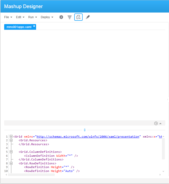
Preview/edit mode
When you start a new XAML application, the Designer opens a blank window in Preview mode with the XAML editor appearing in the bottom portion of the window. Click (pencil icon) to launch Edit mode. Now you can drag controls from the Controls pane (bottom right) and edit rows and columns.
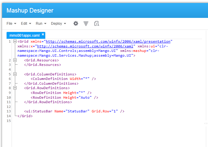
XAML editor
This is the default The editor provides color coding of properties and automatic indenting to help make your code readable.
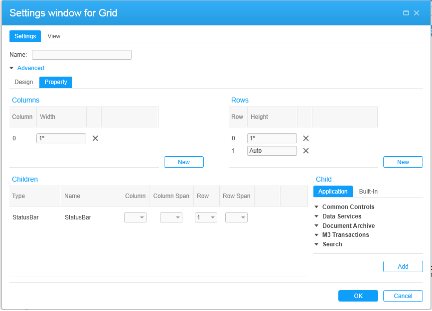
Menu-driven editing of the grid
The grid is the space where you create your mashup application. You can use a menu-based method for placement of controls, text blocks, panels, links, input boxes, and so on.
Many of the examples in this document show the menu method for adding and placing controls. If you decide to use the menu method and are not familiar with its concepts, be sure to read additional information in this guide to provide background.
Properties dialog boxes
When you add a new control or select an existing control to be configured, a dialog box for the new control opens in a new window.
Properties tab (bottom-right pane)
When you move through the XAML code, the properties for each control appear along the botton-right pane.
Controls tab (bottom-right pane)
Use this tab to add new controls to the mashup or to edit an existing control. This works the same as the gear icon on the toolbar.
Document Outline tab (top-right pane)
The Document Outline tab shows a list of all controls used in the mashup. It provides a quick way to locate controls.
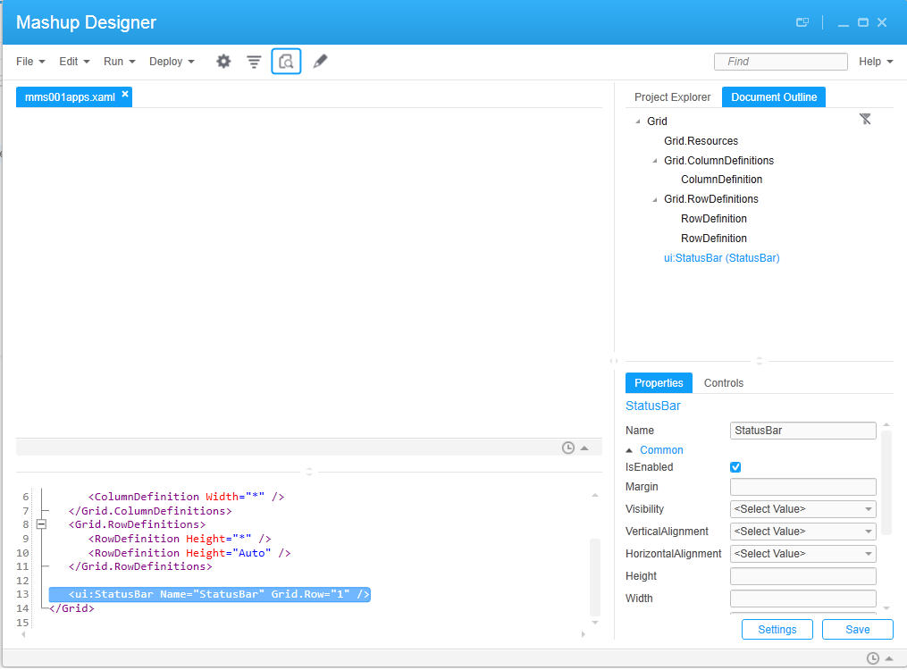
When you select a control in Document Outline, the XAML editor automatically moves to the section in your code where the control is used.
Project Explorer tab (top-right pane)
If the mashup you are currently designing is part of a project, the Project Explorer pane shows all files that are included in the Project.
If more than one .xaml file is included in the project, you can select one of the.xaml files to show its properties in the Properties tab (lower-right pane).
You can also add a .xaml file to the project. When the project name is selected, an button is available in the Profile section of the pane. You might need to scroll to see the button. Click to browse for the file to add.
The button is a quick way to save the .xaml file you are currently working on. It will automatically become part of the current project.
If a button is available, you can remove the .xaml file currently showing in Path.