Designing the mashup
The sub-sections that follow describe how to add and configure controls for the mashup. But, first, we need to understand the concept of the grid.
The grid is a table or a chart, you could even think of it as an electronic sheet of graph paper if that helps you visualize, in which you tell your application where to place each control that you want to use in your mashup.
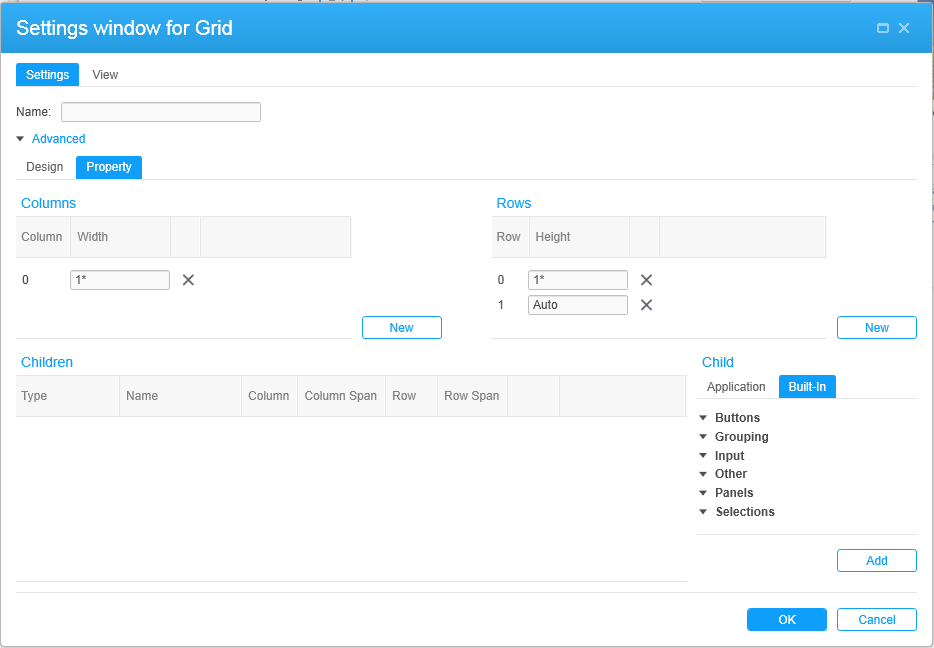
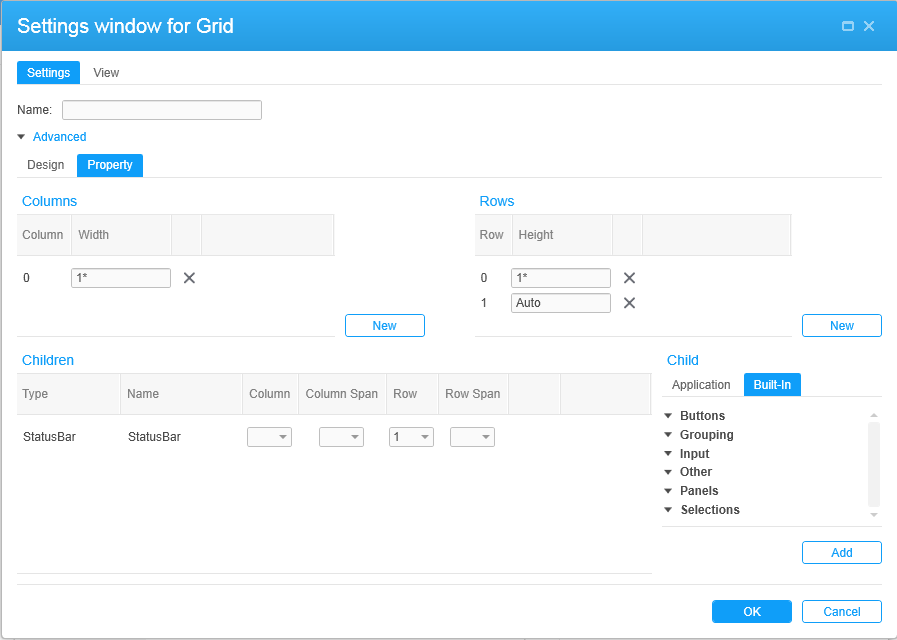
When you click , the gear icon, a grid is displayed in a new window above the XAML code. When you access the grid for the first time in a new application, a few commonly used controls will be on the Designer canvas initially. In our case, they are a TextBlock and StatusBar.
In addition to the default controls, the Designer also automatically adds a column and two rows to the canvas.
Even when it is not required, it is always a good idea to name the components of a mashup that have a Name field. Because we are creating a new application, we start on a new grid. We will assign the name MyGrid. Name fields are alphanumeric but cannot include spaces or special characters.
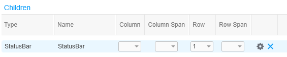
We will start by deleting any controls placed on the grid by default that we do not want to use. In our case, we will delete StatusBar. To delete the StatusBar, click in the StatusBar control row. When the control is highlighted and the context menu appears to the right of the control, click the to delete the control.
The sections that follow describe adding and configuring other controls needed for our mashup application.