Infor Mashup Designer grid
The grid is the space where you create your mashup application. You can think of it as a piece of graph paper if you find that image helpful. It is, in fact, a table that keeps track of the placement of all controls, text blocks, panels, links, input boxes, and so on, that are used in your mashup.
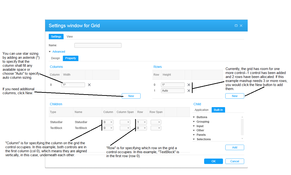
The Grid settings dialog box is for making settings for the grid. To open it from the XAML design interface, position your cursor on the first line of the XAML code and then click (gear icon) from the toolbar.
The concept of a grid will be familiar to experienced software developers. If you are not familiar, the brief information in this section should help. In addition, read the examples in this document. The step-by-step approach used in those sections will make the grid concept easy to understand.
Controls are considered children of the grid. In Infor Mashup Designer, you can configure settings for the grid as a whole and also for each child control.
When you click , the Settings for Grid dialog box is displayed. The properties on the top of the Settings tab are also available to all controls and are described in another section.
The top portion of the Settings for Grid dialog box is for configuring the grid as a whole.
The Children portion is for selecting a control that has already been added to grid so that it can be configured. This includes the position of the control on the grid using the column and row combo boxes. You can also select a control, and, when it is highlighted, click to open the dialog box of settings.
The Child portion is for adding selecting a control that has already been added to grid so that it can be configured.
Click on either the Application or Built-in tab to gain access to the type of control you want to add. In general, the Application tab contains controls associated with a particular Infor application. The Built-in tab, in general, contains generic controls, selection buttons and combo boxes, input boxes, separators for visually enhancing a mashup, and so on, that are available to all mashups.
Placing children on the grid
This section describes how to use the grid to help you to determine where controls will be placed in relation to other controls.
The grid column numbers, starting with 0, are for horizontal placement; the row numbers, also starting with 0, are for vertical placement. The simple example below shows how to specify rows and columns for controls.
This table shows the grid column description and row properties for controls.
| Setting | Description |
|---|---|
| Columns and Rows | |
| Column Height | For each column, you can specify the height of the column using one of three
sizing options.
|
| Row Height | For each row, you can specify the height of the column using one of three
sizing options.
|
| Children | |
| Type | This the type of control. |
| Name | Optionally, specify a custom name for the control. |
| Col | Select the column you want to configure from the drop-down list. |
| Col Span | If you want the control to span multiple columns, specify the number of columns. |
| Row | Select the row you want to configure from the drop-down list. |
| Row Span | If you want the control to span multiple rows, specify the number of rows. |
Using star sizing on the grid
Star sizing indicates the distribution of available spaces in proportion to columns and rows of a grid. The term is derived from the fact that you can specify a size of a column or a row by adding an asterisk (*) to a value. For example, if you have a grid with three rows, you could set the height of the row to 2, 3, and 1. This means that the rows would occupy a ratio of 2:3:1 as shown in the table:
| Row A - 2* |
2 star row |
|
| Row B - 3* |
3 star row |
|
| Row C - * | 1 star row |