Adding a GridSplitter to the mashup

In order to make the visual transition between the PO and the form more graceful on our mashup, we will add a horizontal GridSplitter control to our mashup. A GridSplitter also lets a user control sizing of the list view or form within the new application.

  1. To add a GridSplitter, click the Built-in tab on the designer screen and then select GridSplitter (Horizontal). Notice that the GridSplitter control is added to the screen. Notice also that we now have four controls on our screen even though only three have been allowed for by the grid defaults. We need to add a row for this object which we will do this in the next step.
  2. Click New nearest the Row portion of the designer screen.
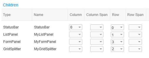
  3. We want the controls to display in this order shown below, where 0 is assigned to the first control in the list, 1 is assigned to the second control, and so on.
    • MyTextBlock = 0
    • MyListPanel = 1
    • MyGridSplitter = 2
    • MyFormPanel = 3

    When we are finished configuring, the Children portion of the designer should look like this:

    Screen capture: Controls lined up in the correct rows for the example application
  4. We want to ensure that both the list view and the form have enough display room on the application, so we will set the height for each at 400 pixels. Specify 400 in the Row Height field for the controls.
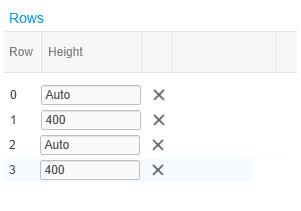
  5. For many controls, it often works well to use the Auto selection which means that the designer places the control in the next position in the grid.
    Screen capture: Configuring row height for a control