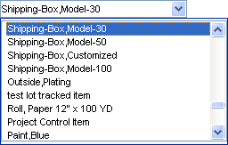
About List, DropList, and ComboBox components
List (list boxes) components, DropList (drop-down lists) components, and ComboBox (combination box) components all allow data to be selected from a list of values.
The List component always displays a scrollable list:

The DropList component (also called a drop-down list) always displays its current value:

It displays its list only when the user clicks the down arrow:

A ComboBox (combination box) component is like a DropList component, except that the user can enter data directly into its edit portion and also select data from the drop-down list.
The current value of a List, DropList, or ComboBox component is a single value. Typically, this is the value that is associated with the component's data binding. The current value is determined by selecting an item from the component's list. In the case of the ComboBox, the current value can also be determined by typing data directly into the component's edit box.
Each List, DropList, or ComboBox component has a list of items from which the user can select the component's value. The component's list can contain multiple columns, but only one column is used to provide the value of the component. The other columns are available to display additional information that is useful in helping the user choose an item from the list. An example of this is a list that shows both codes and descriptions. The value of the component is the code. The description is provided as additional information to help the user determine which code to select.
You must set the List Source property in the Component properties sheet to specify what items show in a component's list.
Once you specify a list source, you can use the Value Is List Index property to set the component's value to the zero-based index of the selected item. If the first item is selected, the component's value is set to 0; if the second item is selected, the component's value is set to 1; and so on.
You can set the Sort property to sort the list. For List components, you can set the Multiple Selection property to allow users to select more than one item from the list.