Overview of portal branding
You can impact branding for the login page and for several components within the product, known as header branding. Branding for the login page is independent of header branding.
The product supports multi-group branding for some components, so that each group can have its own branding. When group branding is used, each brand has a unique name and is associated with a branding CSS. One or more user groups can be assigned to each brand. Only EnwisenAdmin users can access the Branding By Group feature. These branding components can be branded by group:
- Page Header: an image, usually with your logo.
- Header Toolbar
- Breadcrumb Color
- Main Menu Navigation
- Search Navigation
CSS configuration for areas below the header is defined by stylesheet documents that are configured for the organization. If a conflict is present, the CSS that is assigned to employee groups overrides the CSS that is assigned to the header only. It is recommended that you use neutral or generic CSS below the header to avoid clashing with CSS that is associated with groups and applied in the header.
Best Practices
You must limit each user to only one branding group. When you create groups that are used for branding, use criteria that make it impossible for any user to be in more than one branding group. For example, you can create a branding group that includes U.S. employees and another that includes Canadian employees, so there is no overlap. Best practices:
- A group is associated with only one branding CSS configuration.
- An employee is a member of only one group that has been assigned unique branding CSS configuration.
Header Branding
Header branding options are described here.

A: Logo left-side image. Maximum dimensions are 800px width x 60 px height. The best practice is to include at least 10 pixels of space in the image file on the left side of the logo. To set the image on the left side of the banner, use this css, assuming the url shown here includes example path and image name): #PageHeaderBranding {background: url(/orgimages/HCMKB104/InforLogo.png) no-repeat left top;}
B: Logo right-side image: Maximum dimensions are 800px width x 60 px height. The best practice is to include at least 10 pixels of space in the image file on the right side of the logo. To set the image on the right side of the banner, use this css, assuming the url shown here includes example path and image name): #PageHeaderWrapper {background: url(/orgimages/HCMKB104/inforgraphicright85.png) no-repeat right bottom; background-color: #fff;}
A single image can be substituted for A and B. When a single image is used, the maximum dimensions are 1430 px width x 60 px height. To use a single image, use the headerbranding2 data item.
C: To change the color of the Logout link, use #PageHeaderLogout a {color: #000000;}.
To change the color of the logged in user's name, use #PageHeaderLogout {color:#000000;}.
E: To change the background color of the search field, use #PageHeaderToolbar { background: none; background-color: #e6e6e6; }.
F: To change the color of the Home link, use *#PageHeaderMainMenuText SPAN, #PageHeaderMainText SPAN:hover {color: #13a3f7;}.
G: To change the background color of the breadcrumb area, use #PageHeaderBreadcrumb {background-color: #e6e6e6; padding-bottom: 1px; border-bottom-color: #e6e6e6; }.
H: To change the color of the arrow that separates breadcrumb page links, use #PageHeaderBreadcrumb: {color: #51535d; }
I: To change the color of the links, use #PageHeaderBreadcrumb a {color: #51535d;}
Main Navigation Branding
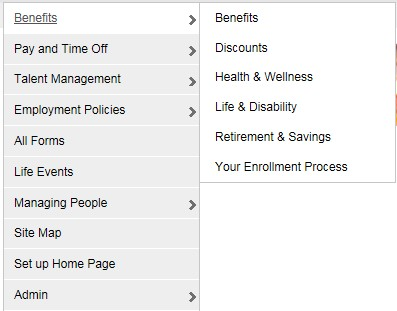
The main navigation menu contains links for all knowledge domains. Users with administrative privileges have access to links to admin tools. Group branding is supported for these elements.

To set the background color on the main panel, use this css: #PageHeaderNavMenu, #PageHeaderMainMenu-benefit, #PageHeaderMainMenu-lifeevent, #PageHeaderMainMenu-bna, #PageHeaderMainMenu-timepay, #PageHeaderMainMenu-admin, #PageHeaderMainMenu-totalrewards, #PageHeaderMainMenu-sitemap, #PageHeaderMainMenu-career, #PageHeaderMainMenu-company, #PageHeaderMainMenu-csr, #PageHeaderMainMenu-mgrpeople, #PageHeaderMainMenu-mgrhr, #PageHeaderMainMenu-perfmgt, #PageHeaderMainMenu-newhire, #PageHeaderMainMenu-it, #PageHeaderMainMenu-recruiting, #PageHeaderMainMenu-forms, #PageHeaderMainMenu-ssmenu, #PageHeaderMainMenu-learn, #PageHeaderMainMenu-Quick-link, #PageHeaderMainMenu-cdd, UL#navmenu-v LI {background-color: #eeeeee;}
To set the Main Nav link and text color on the main navigation panel, use this css: #navmenu-v li a, .nav-doc-topic-text, .sw-link SPAN, .sw-flyout-link-text {color: #000000;}
To set the highlight background color on the fly out and main panel, use this css: #navmenu-v li a, .nav-doc-topic-text, .sw-link SPAN, .sw-flyout-link-text {color: #000000;}
To set the highlight link color and text color on the main panel flyout, use this cuss: ul#navmenu-v li:hover a, ul#navmenu-v li a:hover {color: #000000;}
To set the link hover color on the main panel, use this css: ul#navmenu-v li a:hover {color: #555359;}
To set the highlight hover background color on the flyout, use this css: UL#navmenu-v LI:hover LI A:hover { background-color: #ffffff; }
To set the link hover color on the flyout: UL#navmenu-v LI:hover LI A:hover {color: #555359;}