Properties tab
The Properties tab has two sections: Custom and Style. The options of the Custom section are disabled unless a you select a custom option in the Style section.
Style
| Field | Description |
|---|---|
| Enabled | If then you can edit the object in Design mode and use it in View mode. If , then the object cannot be edited. It remains visible in View mode but cannot be used. To revert to , you must first click in the Objects toolbar. |
| Style in Full Client | Can be Native Windows or Custom. |
| Style in Web | Can be one of several Infor button styles or Custom. |
This table shows the Infor button styles:
| Option | Description |
|---|---|
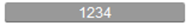
| Infor Standard Button |
Background darkens on hover |
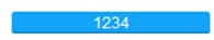
| Infor Highlighted Button (Blue) |
Background darkens on hover |
| Infor Toolbar Button |
Background darkens on hover |
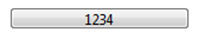
| Native Windows Button |
Background lightens on hover |
Custom
You can specify the background and foreground colors of a button, and several other characteristics.
In the 'color' fields you can select colors from the Report, Web, or System tabs. On the Report tab, you can select from the color palette or specify a custom color.
The Web tab lists supported html colors and their names.
The System tab lists system colors and the purposes for which they are used.
You can display an image on a command button and, if required, a second image to display when the cursor hovers over the button.
To display an image on a command button, click the Image field and browse to a file or select a shared image. The image must be in one of these formats:
- .bmp
- .jpg
- .jpeg
- .wmf
You can specify how the image, and hover image, should fit within the dimensions of the button.
These are the image sizing options:
- Fit
- The image expands or contracts to the shortest dimension of the button. The image does not distort because its height to width ratio does not change.
- Keep Size
- The size of the image does not change. If the image is larger than the button, the button is filled with part of the image.
- Fill
- The image expands or contracts to fill the button. This can distort the image if, for example, the height to width ratio of the button is different from the height to width ratio of the image.
- Fill Horizontally
- The image expands or contracts horizontally to the width of the button. In both cases, the image distorts. If the height and width of the image are greater than the height and width of the button, the button is filled by the image. But the image contracts so that its full width is displayed on the button.
- Fill Vertically
- The image expands or contracts vertically to the height of the button. In both cases, the image distorts. If the height and width of the image are greater than the height and width of the button, the button is filled by the image. But the image contracts so that its full height is displayed on the button.
To display a hover image, click the Picture hotspot field and select an image.
By default, if text is displayed on a button it is aligned at the center of the button. If is selected as the value of the or of the option, you can change the horizontal and vertical alignment of the text. For example, you might display the text at the top right of the button.
If text is displayed on a button, the Left, Right, Top, and Bottom margin options specify its distance from the edges of the button. By default, text is 2 pixels from each edge. To specify different margins, click the arrow to the left of the Margins option to display the margins and their values. Specify new values.