Analyzing and Adjusting Resource Gantt Chart Data (Windows Client)
The display is organized as follows:
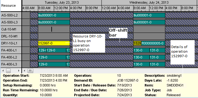
- Green bars represent periods of utilization for the resource shown in the left column.
- Red bars represent down time (for example, off-shift periods or shift-exceptions).
- When you select a bar, the color changes to yellow.
- Blank areas of a row represent idle time for the resource.
Click on a resource utilization bar to view details about the operation the resource is performing and the demand it is working on during the time period. Click on a downtime bar to view details about the reason for and duration of the downtime.
This picture shows three resources, each working on a single operation in a routing.
Manually Adjusting Gantt Chart Data
The Resource Gantt Chart - Scheduler form allows direct manipulation of the bars shown in the Gantt chart. Available adjustments are:
- Changes to the start and/or end of an operation
- Moving an operation to a different resource
- Freezing a job or operation.
Manual adjustments are available whether the schedule is created by a normal Scheduler run or through the Use Planning Output for Scheduling planning parameter. Once manual schedule adjustments are made through the Gantt Chart, the results are reflected in all Scheduling analysis forms and reports available to the user, including:
- Resource/Resource Group Load Profile - Scheduler
- Resource/Resource Group Utilization - Scheduler
- Resource/Resource Group Schedule
- Resource/Resource Group Summary Report