Chart elements
The Elements tab enables you to select chart elements and customize them. For example, you can change the font for labels or change the color of grid lines.
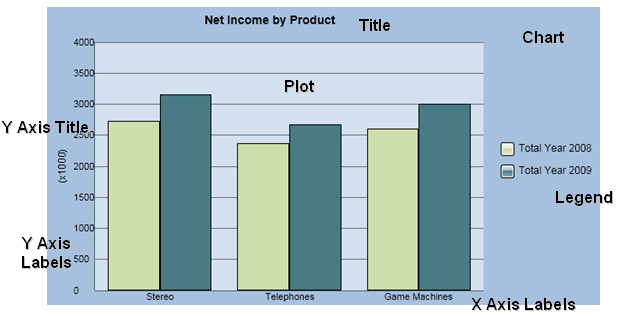
Elements are separable chart items contributing to a whole chart. The main elements are the plot, title and legend. Sub-elements include the axes, axis titles, axis labels, grid lines, data points in the plot, the keys, text entries and background in the legend, and the text and background in the title.
These elements are available:
Chart. The chart object which is all chart elements collectively. You can change the background color of the chart object.
Title. An element consisting of the textual chart title and a containing rectangle. You can change the font and its attributes such as size and color. You can also change the background color of the title element.
Plot. A chart element containing the data portion of the chart in which data is represented as data points against graded axes, grid lines, and walls. The plot is everything between the axes. You can change the background color of the plot element.
Legend. A chart element consisting of the textual series names, their color coded keys and a containing rectangle. You can change the font and its attributes such as size and color. You can also change the background color of the legend element.
Data Point Labels. A text string or number appearing adjacent to a data point, displaying the data point name, value and/or percentage in any combination. You can change the font and its attributes such as size and color.
X Axis Title, Y Axis Title, and 2nd Y Axis Title. Axis titles are single phrases which may appear outside the labels and act as a further description for what the axis contains. Axis titles are optional and must be defined as part of a chart style. You can change the font and its attributes such as size and color.
X Axis Label, Y Axis Label, 2nd Y Axis Label. Axis labels are the multiple division descriptions along the length of the axis. On scaled (usually Y, always 2nd Y) axes, the labels are numbers measuring the data. On a category (usually X) axis, those labels are categories that come from member names. You can change the font and its attributes such as size and color.
X Axis. The category axis. In scatter and bubble charts, it is the X-value axis. You can change the color of the X axis.
Y Axis. The primary scale axis. By default, all series are plotted against this primary scale. In scatter and bubble charts, it is the Y-value axis. You can change the color of the Y axis.
2nd Y Axis. The secondary scale on which specifically selected series can be plotted. A second Y axis can be added to bar, line, area and combo charts. You can change the color of the 2nd Y axis.
X Axis grid lines, Y Axis grid lines, 2nd Y Axis grid lines. Grid lines are reference lines perpendicular to an axis for data measurement or separation. Grid lines are available for the X axis, Y axis, and 2nd Y axis. You can change the color of the grid lines.