Assigning a Color Palette to a chart
You can assign a built-in or custom Color Palette to the whole chart and to each measure. Color Palettes are shared across an account and are available to all spaces within an account.
In Visualizer, the application displays a list of only the first 50 color palettes. Only the applied Color Palettes used in reports are rendered in a dashboard (instead of the application loading all the color palettes in the user's Account when they navigate to the Dashboard).
Note: For Enterprise accounts, use color palettes along with dashboard themes. You can assign Visualizer palettes to themes for consistency across dashboards.
- Click Chart Formatting (paintbrush icon). The Chart Formatting panel opens.
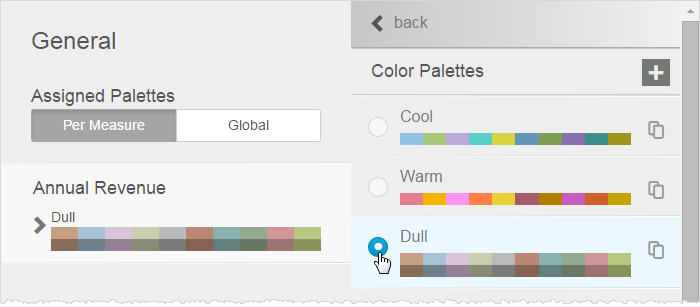
- Click the General tab to see the palette options. Click Global and select a Palette to set a color scheme for the entire chart.
- Click Per Measure to see measures and their current color palettes.
- Click a measure's palette to open a list of available palettes.

- Select a Palette and click Back.

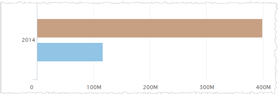
- The chart immediately updates so you can preview the colors.

- Click Done.