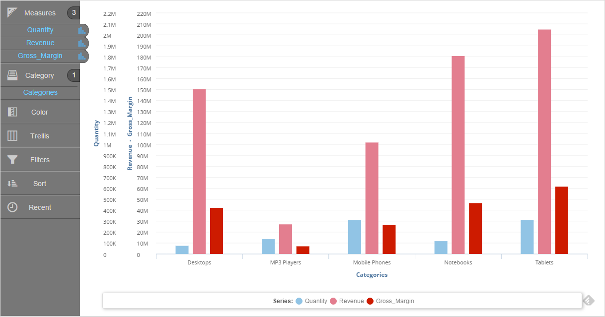
Adding Tooltips and Hiding Columns
All columns display by default when you drag them into measures or categories in the Chart Builder.


The tooltips display:
- The measure name and data for the column
- The attribute name and value (For example, Revenue of $150,413,715 and Category of Desktops)
There are different ways to change the look of tooltips:
- Colors and fonts: Tooltips have a black background with white text. You can change the text.
- Formatting style for prefixes, suffixes, and decimal precision:
- at the chart level
- override chart-level settings for individual columns