Creating a Table in Visualizer
You can view data in a tabular format rather than as a chart. Create a table from either an existing visualization report or make a new one.
Note: Switching to table mode on an existing chart is a great way to preview the underlying data.
To create a table from another visualization:
- Open an existing visualization report in Visualizer. For example, Revenue by Quarter and Region.
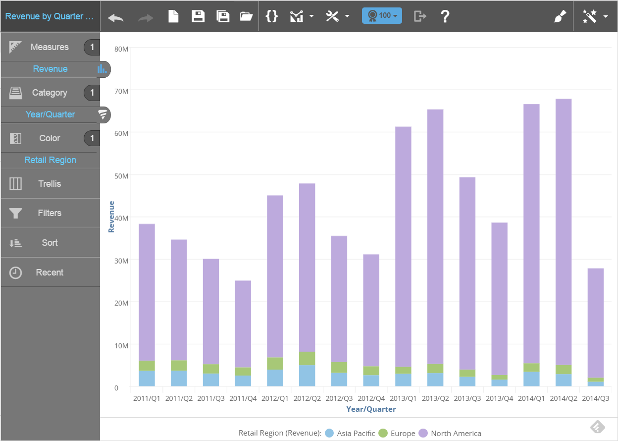
- Select the icon at the far right of the top menu bar to view the Guided Mode options.
- From Guided Mode, select table. Visualizer converts the existing chart to a table.
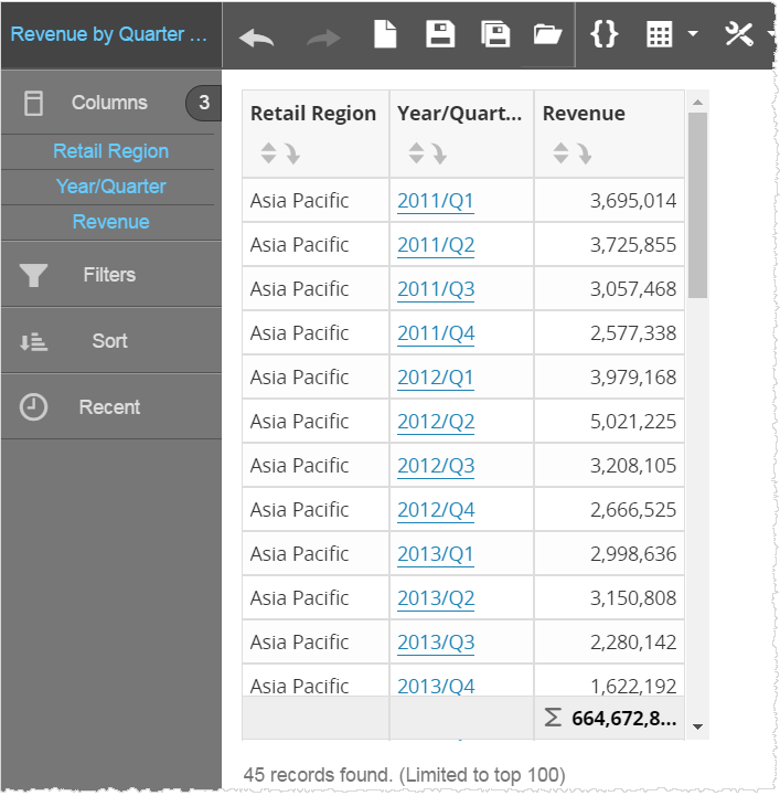
- Click Save As and save the table with a new name.
- Continue formatting the table.
To create a new table:
- If Visualizer is not already empty, click the Create New Chart icon on the top menu bar.
- Select the icon at the far right of the top menu bar to view the Guided Mode options and select table.
- The Chart Builder prompts you to add attributes and measures. For tables, all measures and attributes are put in the Columns section.
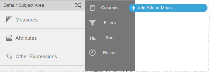
- Drag and drop measures and attributes to the table from the Subject Area.
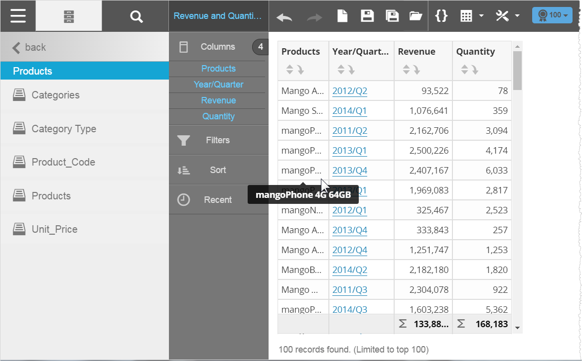
- Click Save to name and save the new table.
- Continue formatting the table.
To create a break by report:
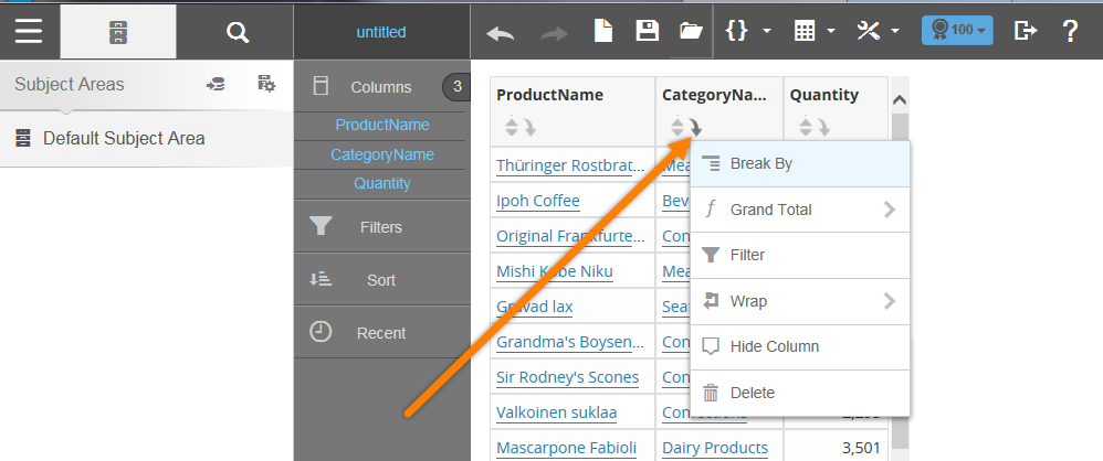
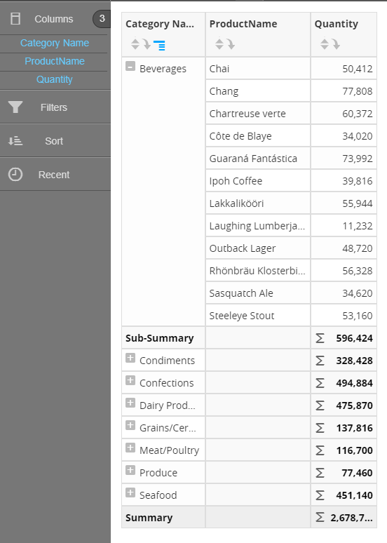
Select the column attribute you want to create sections for, click the drop-down arrow to reveal additional actions and select Break By.
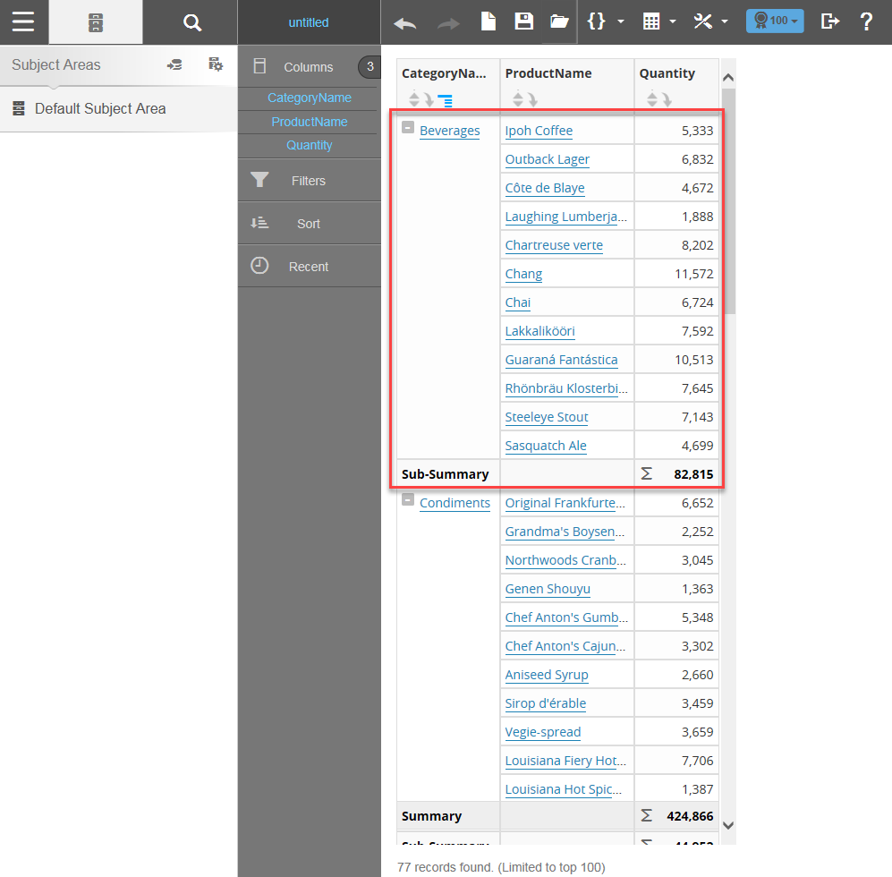
The report creates a subsection based on the Break by attribute selected. In this case, it is the By Category Name.
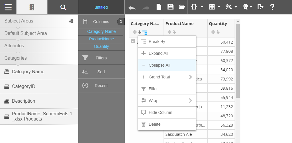
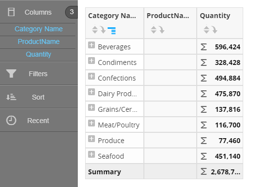
Note: It is possible to expand and collapse all Break by sections.
Note:
- Underneath the table, Visualizer displays the number of rows returned.
- By default, Visualizer limits the number of rows to 100. This is for convenience while designing as well as for performance reasons. You can change this in the Top N Results menu.
- When there are a lot of rows in a table Visualizer automatically adds a scroll bar. The size of the scrolling area is based on the size of your browser window.
- By default Visualizer adds a Grand Summary at the bottom of measure columns. To toggle this option, click Table Settings - Grand Summary - Column Summary.
- If the text or numbers in a column exceed the column width, you can hover over the column and a tooltip displays the full text or all of the number.
- Visualizer has a 50,000 row limit for tabular data.
- When Grand Summary is enabled and Local Summary is disabled for table and cross tab reports, the Grand Summary for some attributes is incorrect. This calculation error can be resolved by selecting the All - Is Not Missing option from the menu.
- The Enabling All - Is Not Missing option adds an Advanced "IsNotMissing" filter for all the attributes on the report. This filter is dynamic and updates when any attribute columns are added or removed from the report.
- The filter is not editable and appears in gray at the top of the Filters bucket in the Chart Builder.
- The filter can be removed either by dragging/dropping it from Chart Builder or disabling the toggle for the All - Is Not Missing option.