Create a Chart Report in Visualizer, dashboard tutorial
Navigate to Visualizer.
In Visualizer, you choose the data you want to show in a chart or table. Birst arranges the columns into two groups, "Measures" and "Attributes". Measures are things that can be counted, and by default Birst considers any column based on numbers (integer or whole) to be a measure. Attributes are things that are descriptive of actual objects or indications of date or time. When you are naming a chart, we recommend a "Measure by an Attribute" format.
If you only want to show attributes, you can use a Visualizer table.
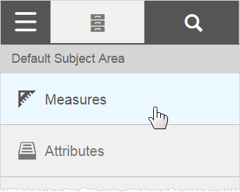
For this chart exercise use two measures and one attribute. Click the section.
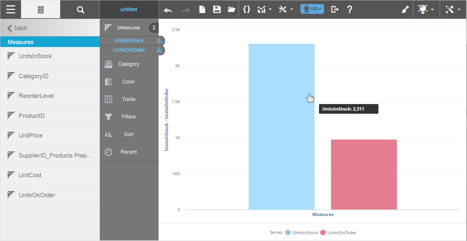
Then double-click the UnitsInStock and UnitsOnOrder. The default bar chart starts building in the work area.
Click to get to .
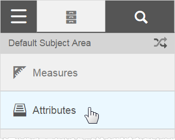
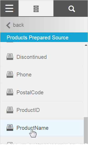
Click , then scroll down to click .
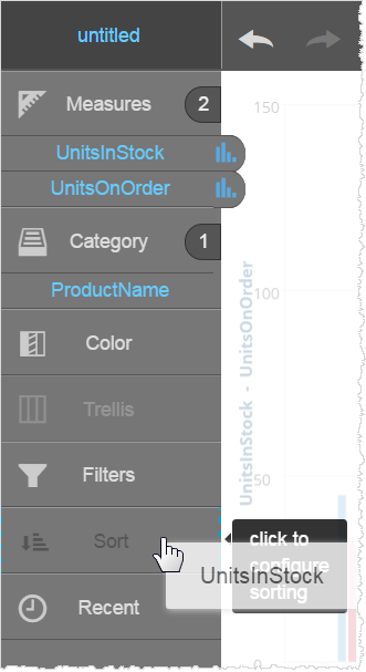
You can drag Units In Stock down to the Sort section.
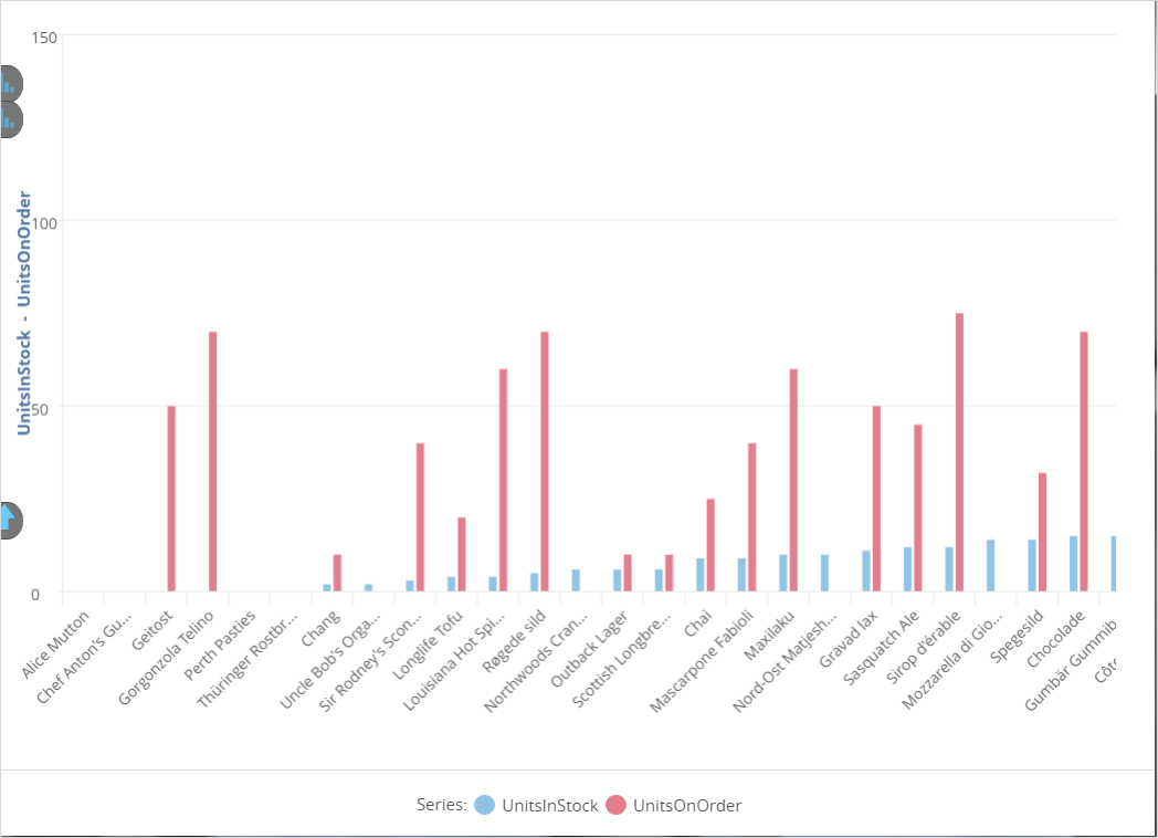
Now you can view what products are out of stock and possibly not yet on order.
Click and specify a Report Name, such as Stock.
The chart is now available in Visualizer for more edits, if needed. For example, You can make other changes to the report, such as changing its chart type.
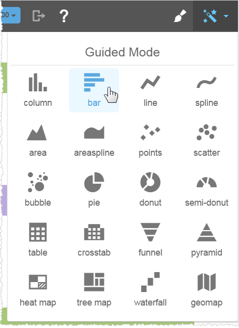
You can also make a few more Visualizer reports with this Modeler data set, for example:
- Add Reorder Level to the chart that has Units In and Units on Order
- A table showing Supplier Company, its Country, Product Names, and Product IDs