Create a chart report in Visualizer, transformation tutorial
Navigate to .
Select OrderID from the Measures panel.
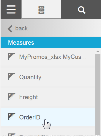
Click when it is listed in the gray Chart Builder column to open its settings.

Set the OrderID aggregation to Count Distinct.
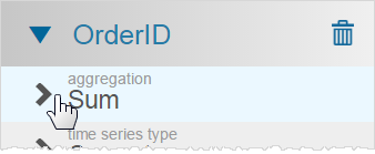
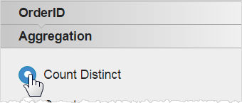
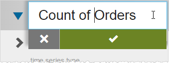
Now the OrderID column represents the count of distinct Orders, so you can also change the label by double-clicking its title.
Click to get to the .
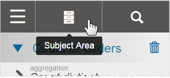
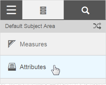
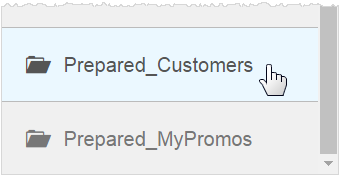
From the Attributes section scroll down and double-click Prepared_Customers.
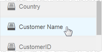
Double-click Customer Name for the Category.
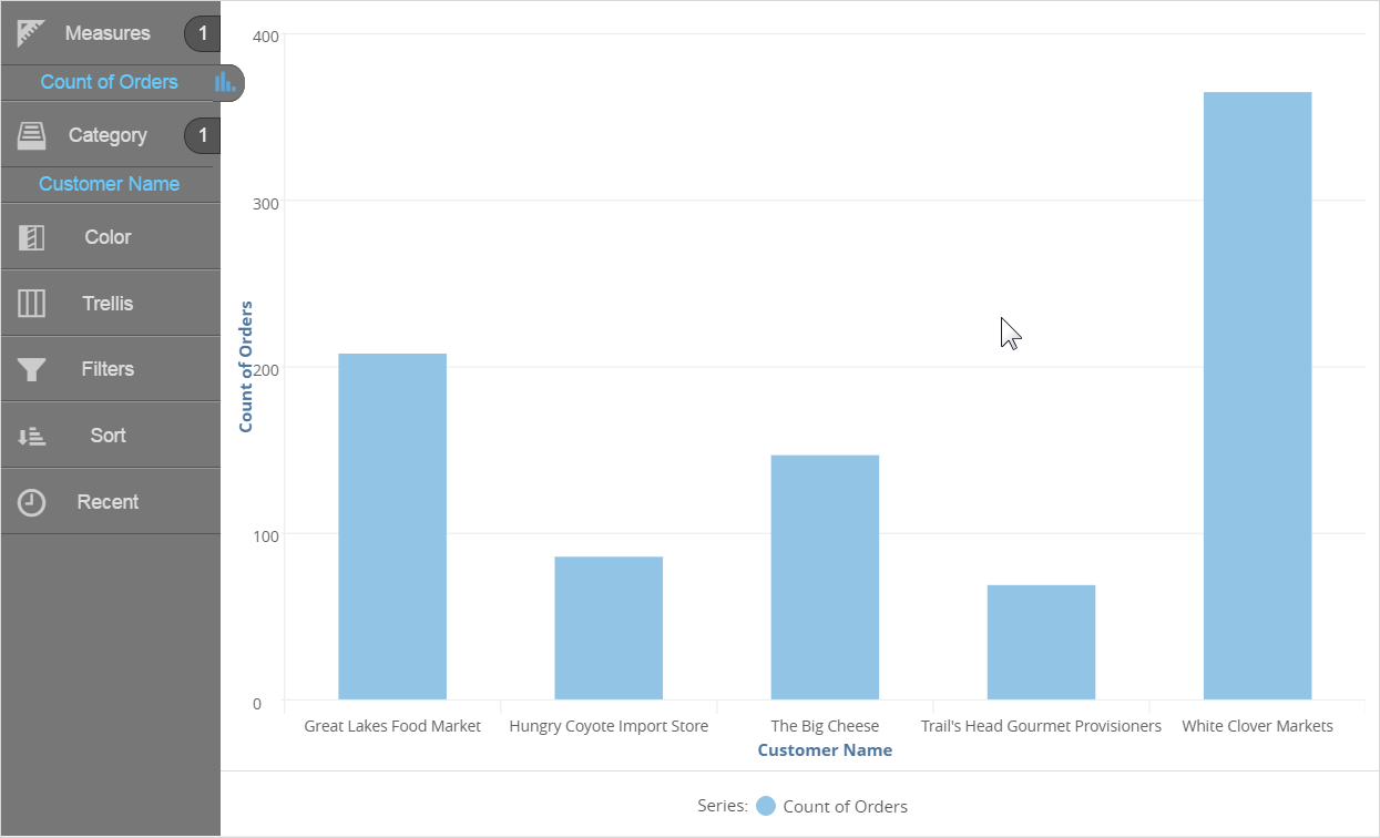
At this point there is a column chart showing the Count of Orders by Customer Name.
Click in the Attributes section.
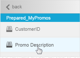
Then double-click Prepared_MyPromos and double-click Promo Description.
Visualizer adds it as a Color section to the chart.
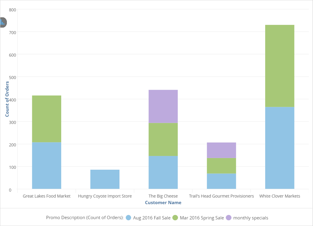
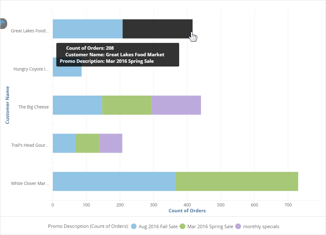
The chart shows which promos were used for which local customers, and the count of orders for each promo per customer.
Save the report and give it a name.

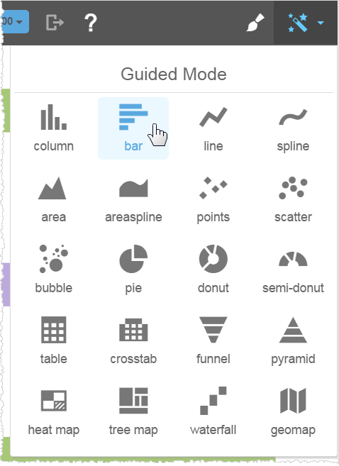
You can make other changes to the report, such as changing its chart type.
Also notice that when the cursor hovers over a section, a popup provides the details.
If you like your changes, click to save it again.