Can I change the look or style of a chart on iOS?
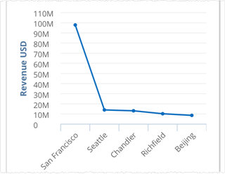
Some charts can display in alternate styles called views. For example, a bar chart can display as a column or line chart. You can change the views with the menu.
The examples show iPhone and they work the same on iPad.
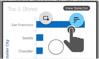
On a report, tap and hold down (long press) to bring up the chart menu bubbles. Drag to the View Selector bubble.
Note: Tap and hold outside of a bar or line; otherwise you see only the tooltips for that item.

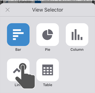
Tap to select another chart style. The styles shown depend upon the type of data in the original chart.

The chart is updated to the new style.

Note: You can use the menu again to change it back.