Column chart
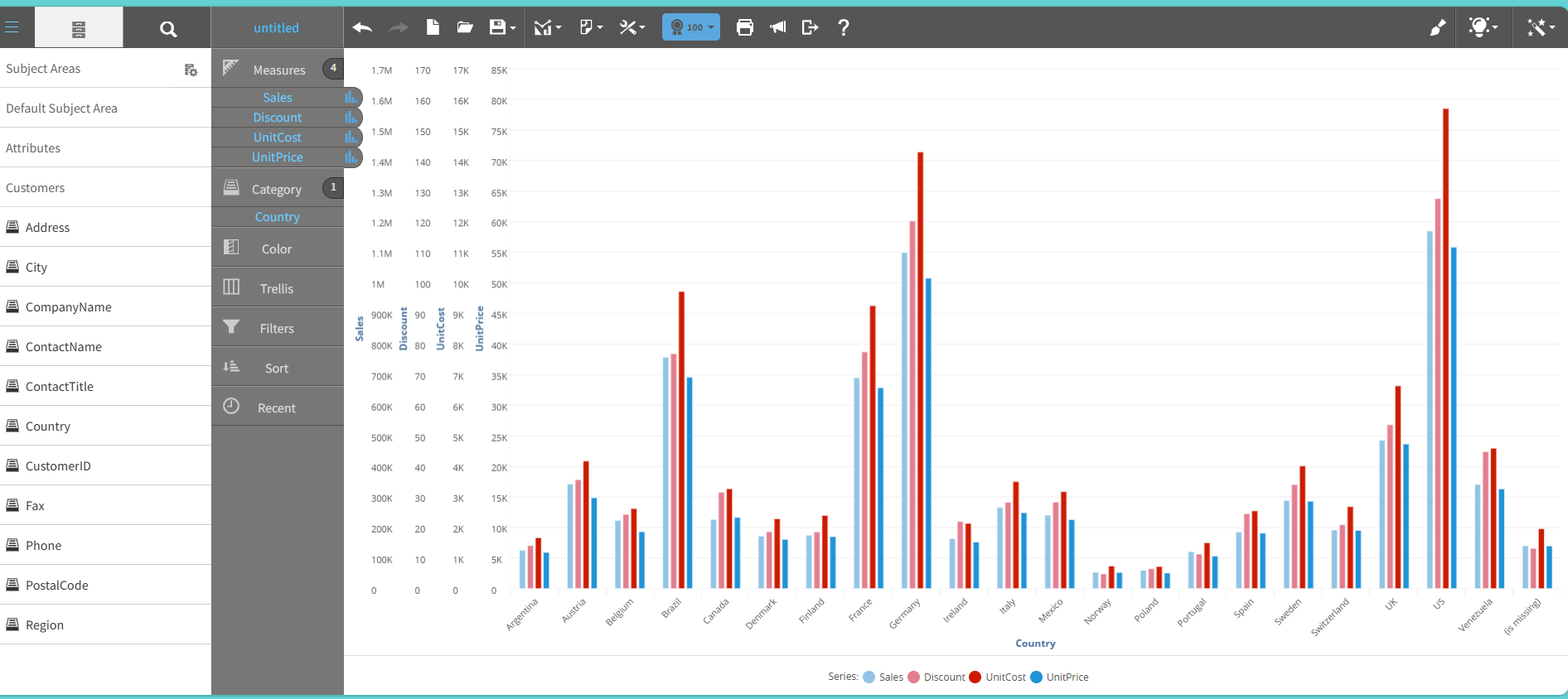
A column chart shows data as vertical bars. Each bar represents a value and the bar height indicates the magnitude of the value.
Use a column chart to compare discrete categories or to show changes over time.
The chart supports grouped and stacked formats to enable comparison of multiple data series side by side.
This graph shows an example of a column chart:
For details on how to create a column chart, see Creating a report by chart type.