Creating Geomap Reports
Visualizer Geomap displays data by geographic regions in a map format, typically as a heat map or with markers, for example Sales by State or Sales by Region.
To create a Geomap, you must provide:
There are important limitations while working with the Visualizer Geomap.
- One attribute, for example location, region, or city
- One measure, for example sales, or quantity
Geomaps work best with aggregated data and fewer than 500 data points. If you need to display more than 500 data points, use a third-party mapping tool and embed its charts in Birst.
Performance depends on the computer resources that you use, so start with a small number of data points and increase gradually.
When too many data points are plotted, Geomaps may slow down or become unresponsive.
Creating a Geomap report:
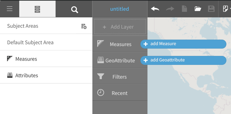
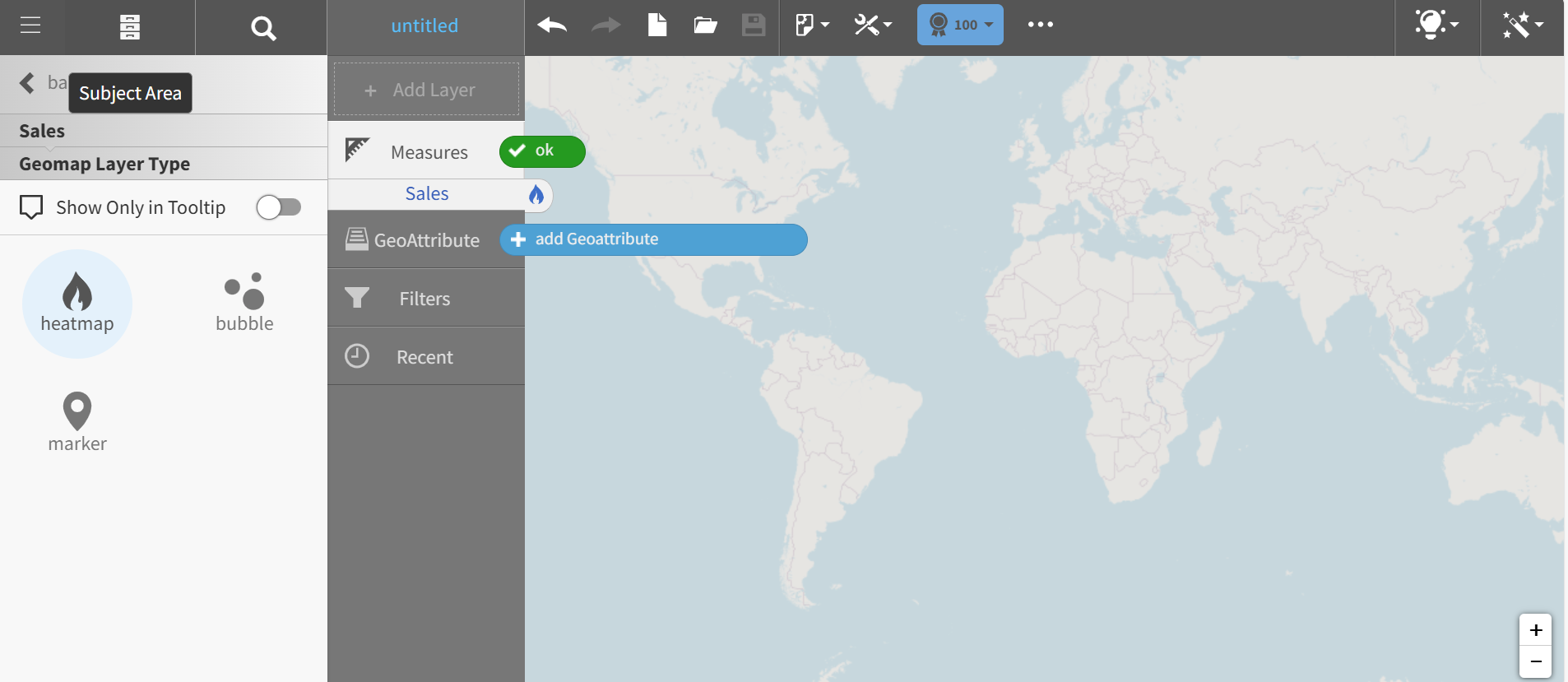
- From the Guided Mode menu select . When the default map displays and the Visualizer prompts you to add a measure and a Geoattribute.
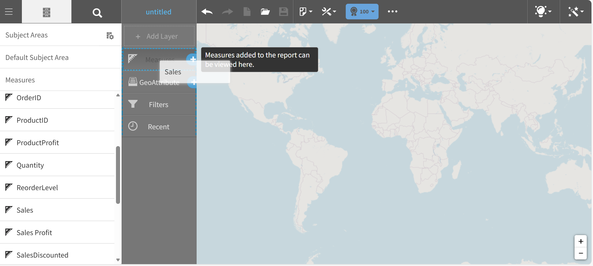
- Add a measure, for example Sales.
- In the left pane, set the Geomap Layer Type for the Sales measure.
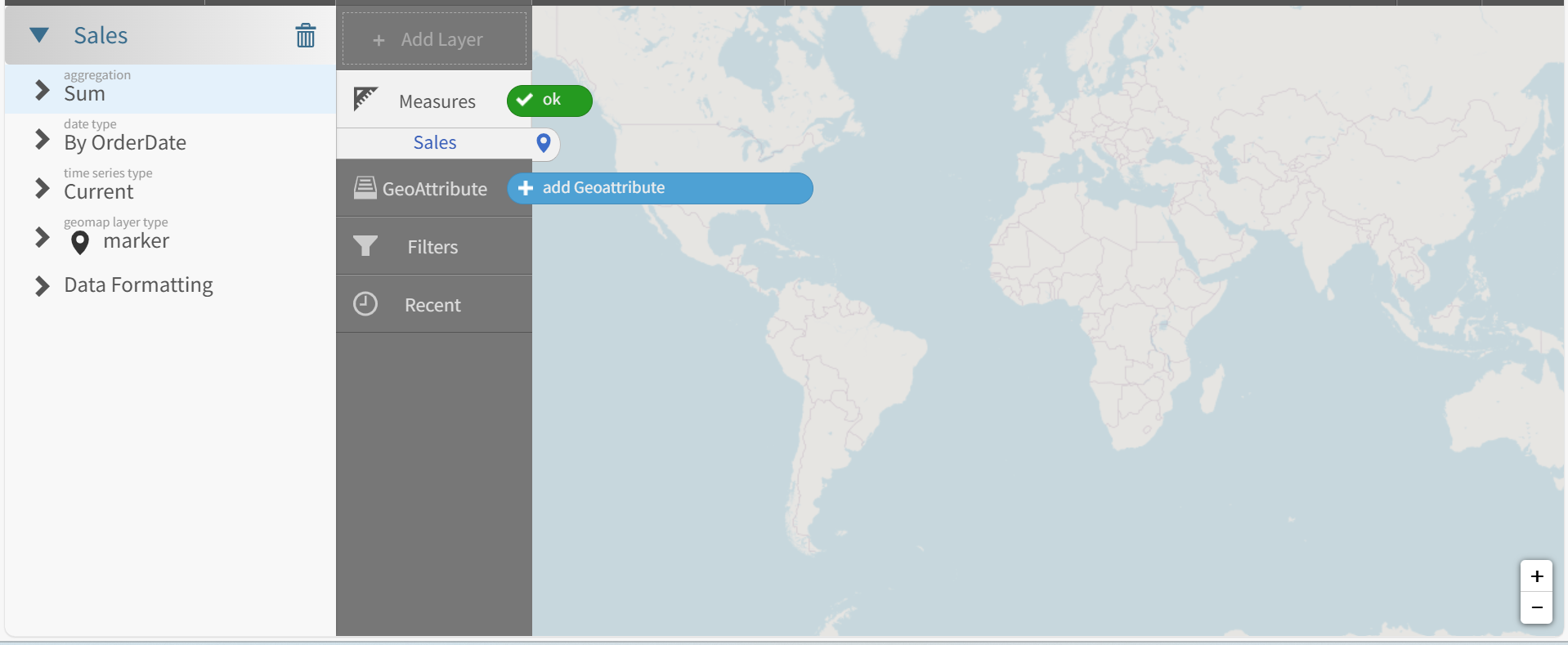
- Pick a Layer Type, for example heatmap.
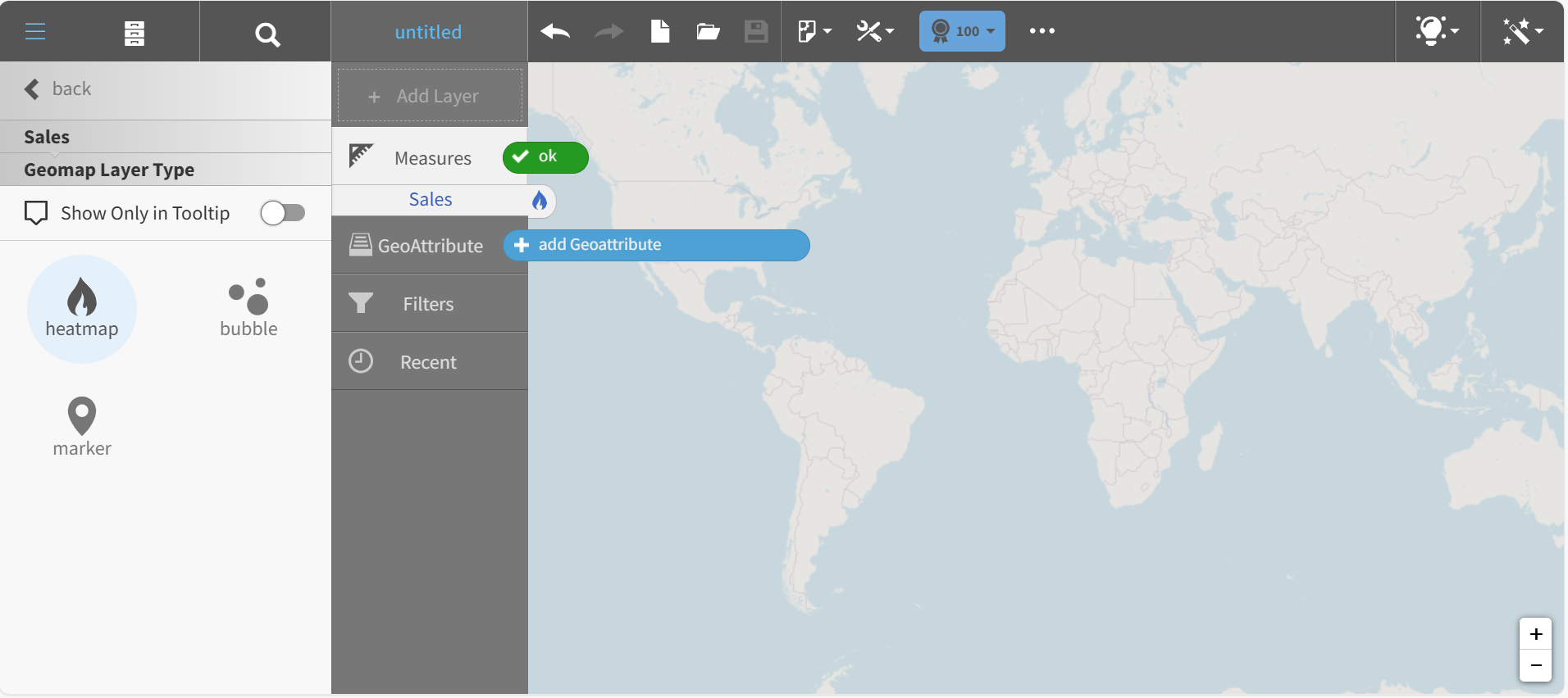
- Return to the Subject Area. The Sales measure in the Chart Builder shows the heatmap icon.
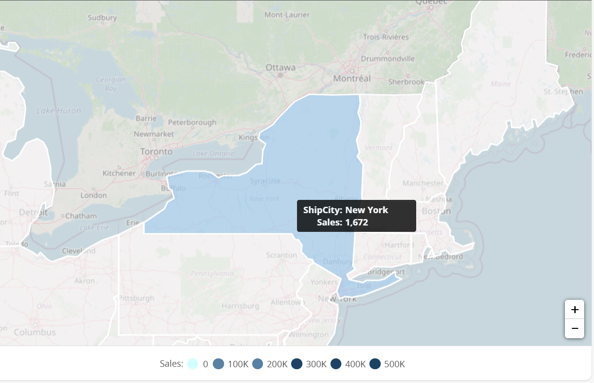
- Add a Geoattribute, for example Orders > ShipCity.
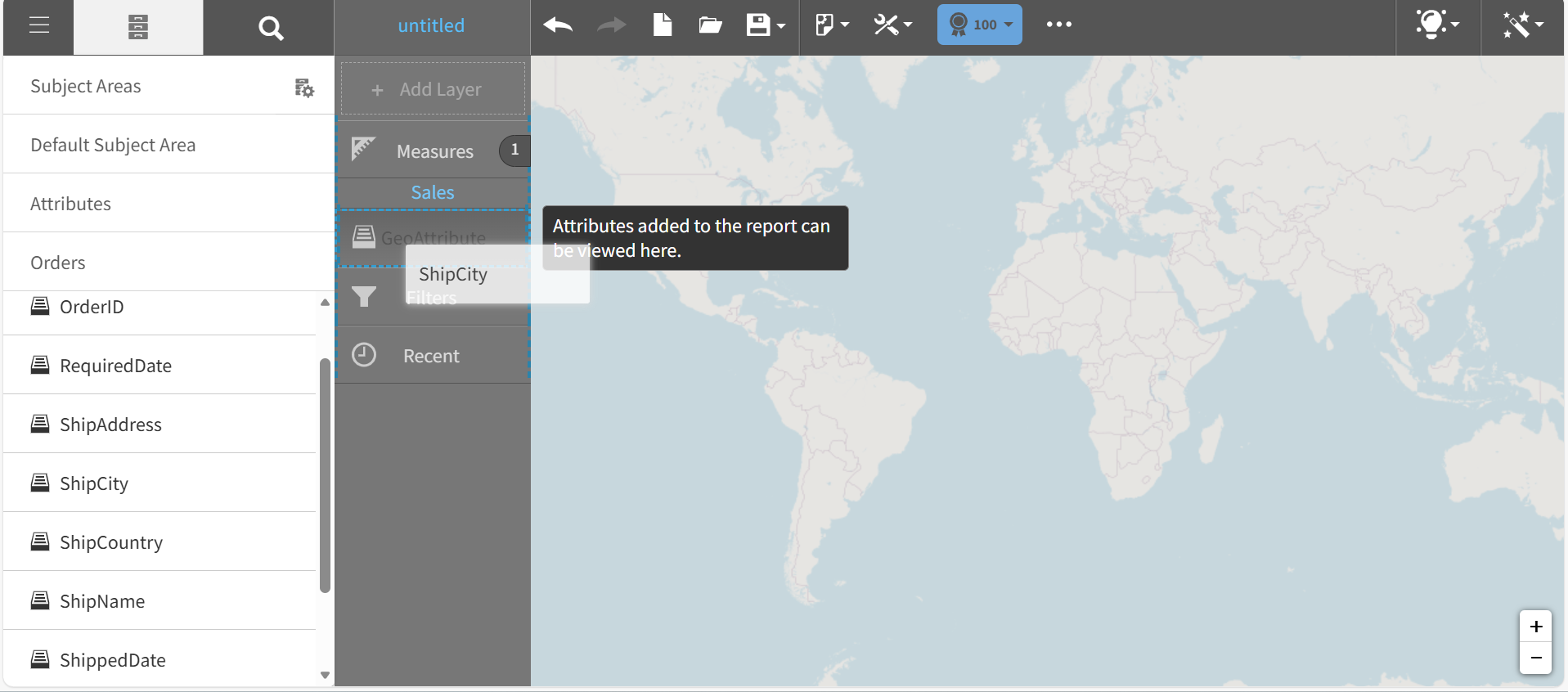
Visualizer prompts you to associate a map with the attribute.
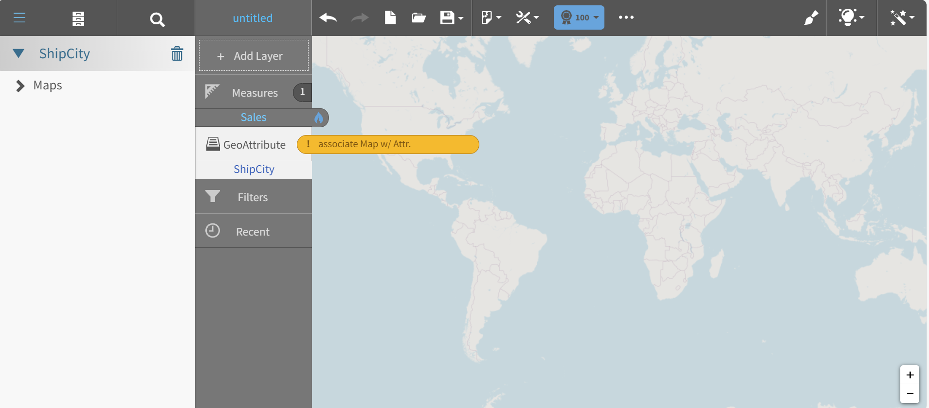
- Click Maps and select one, for example, United States > States.
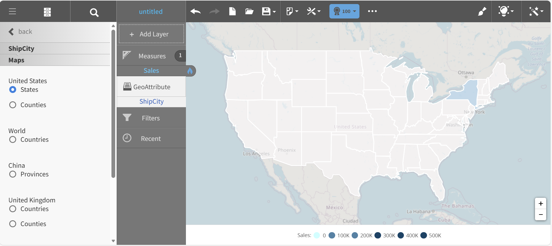
Visualizer applies the Sales measure and the State attribute data to a heatmap.
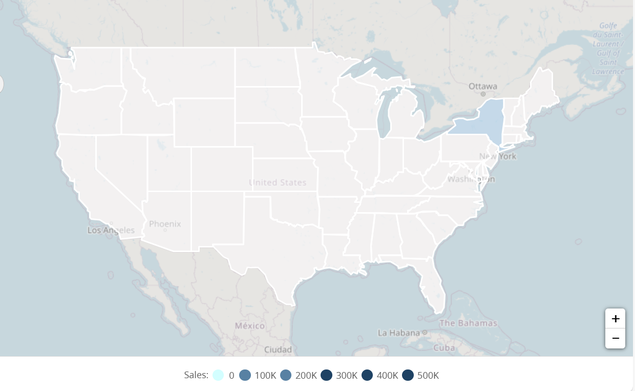
- Hover over the map to see the data. Click a State to zoom. Use the zoom controls, "+" and "-" to resize the heatmap.