Spline chart
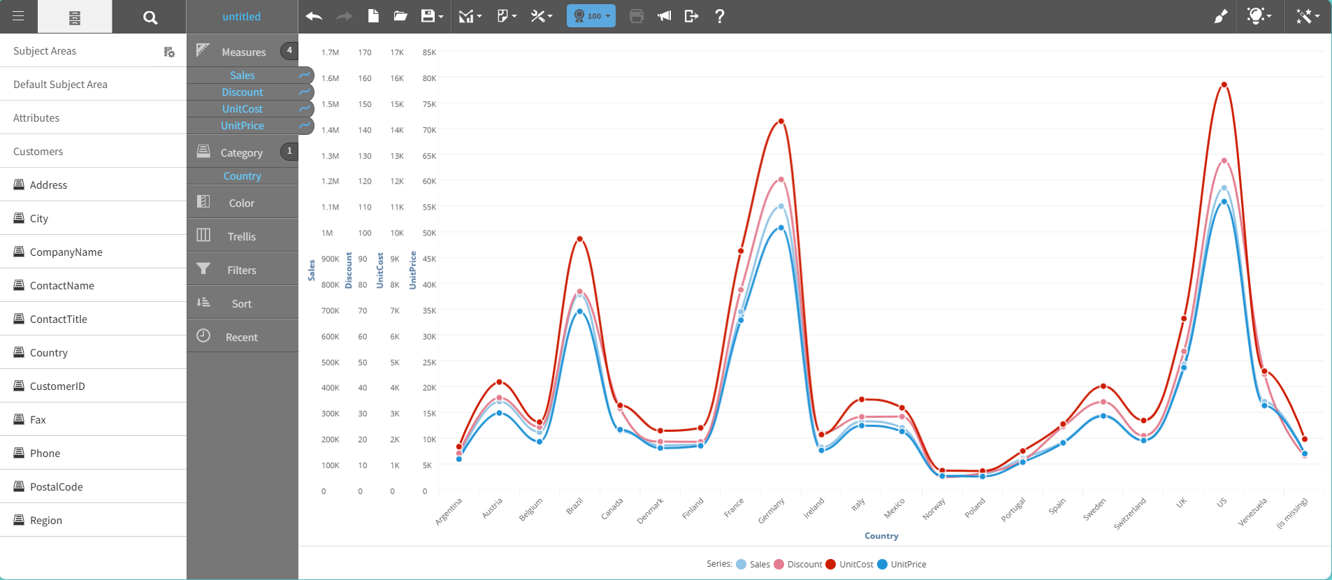
A spline chart is a line chart that shows data with curved lines instead of straight line segments.
Spline charts highlight the trend direction and patterns through smooth curves, reducing focus on individual data points.
Spline charts are useful when:
- Data changes are gradual and continuous.
- Aesthetic presentation and readability are important.
- Trend emphasis takes precedence over exact values.
This graph shows an example of a spline chart:
For details on how to create a spline chart, see Creating a report by chart type.