Heat map
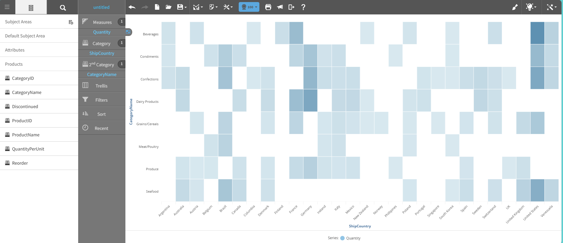
A heat map shows data as color variations in a matrix grid. Each cell represents a value, and color intensity or hue indicates the value's magnitude.
A heat map helps identify patterns, correlations, and outliers across two dimensions.
You can scan large datasets and locate areas of high or low intensity. Typical use cases include geographic data visualization, time-based activity analysis, risk assessment matrices, and large datasets that require quick comparison across categories.
This graph shows an example of a heat map:
For details on how to create a heat map, see Creating a report by chart type.