Pyramid chart
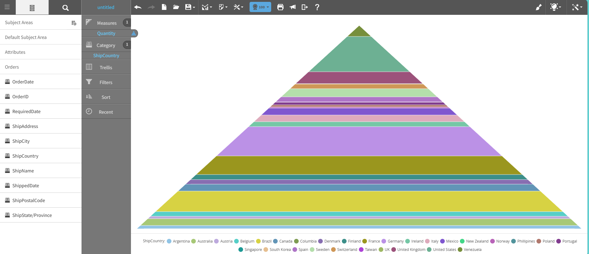
A pyramid chart shows data in a triangle that is divided into horizontal segments, with the widest base and the narrowest apex
Each segment represents a proportion or hierarchical level.
A pyramid chart shows relationships between levels in a hierarchy. The chart's structure highlights how each level contributes to the overall distribution.
You can use pyramid charts to show hierarchical structures, population demographics, organizational layers, and prioritization models, such as Maslow's hierarchy of needs.
This graph shows an example of a pyramid chart:
For details on how to create a pyramid chart, see Creating a report by chart type.