Pie chart
A pie chart shows data as proportional slices of a circle. Each slice corresponds to a category and reflects its relative value.
Use a pie chart to show percentage distributions or proportions, and the comparison of category contributions
Limit the number of slices to avoid clutter. Use clear labels or percentages for readability.
This graph shows an example of a pie chart:
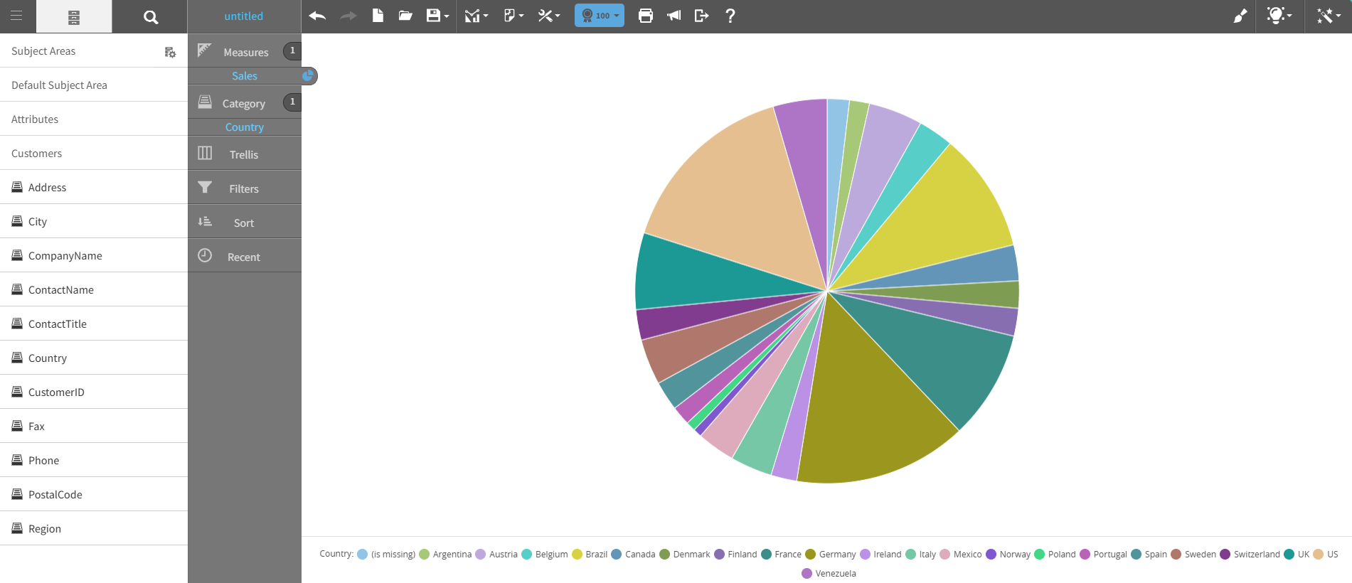
For details on how to create a pie chart, see Creating a report by chart type.