Bubble chart
A bubble chart shows relationships among three numeric variables, for example, the revenue, profit, and market share across products or regions.
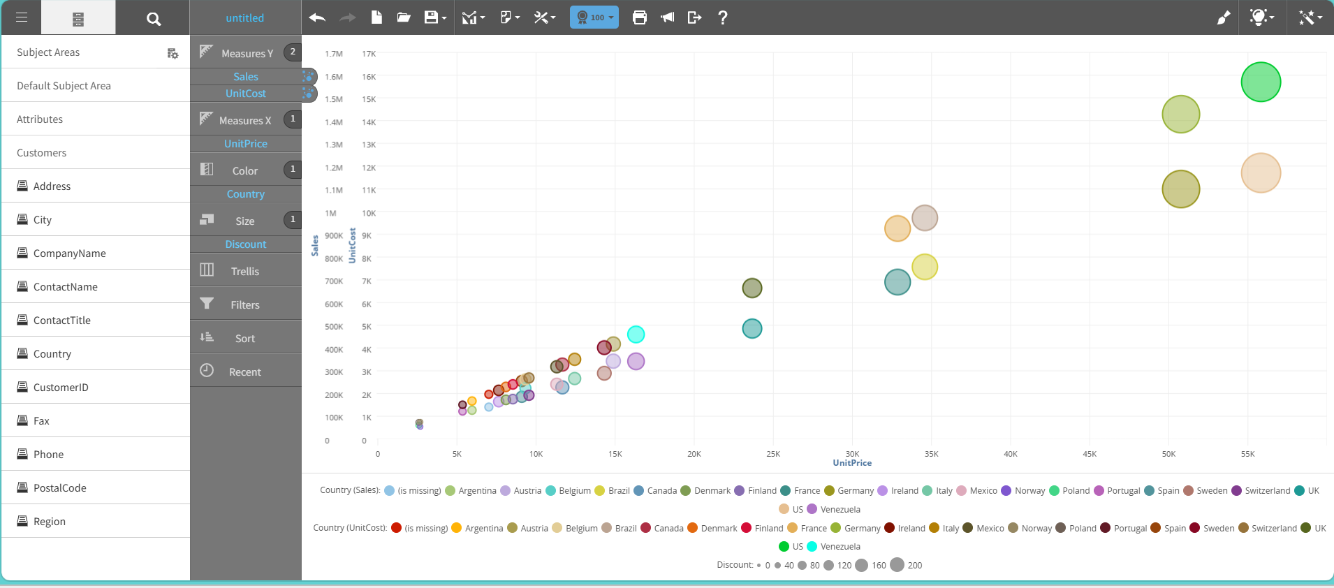
The bubble chart extends a scatter plot with a third data dimension. In each bubble, the X and Y axes are used to define the position. The bubble size represents the third variable.
This graph shows an example of a bubble chart:
For details on how to create a bubble chart, see Creating a report by chart type.