Tree map chart
A tree map shows hierarchical data as nested rectangles. Each rectangle represents a value. A rectangle's size is proportional to the value.
Colors represent additional data dimensions.
You can use a tree map to show multiple items simultaneously. The chart structure enables part-to-whole comparison across hierarchical levels.
Tree map charts are typically used to show system structures, organizational budgets, sales by region and product category, portfolio allocations, and other hierarchical datasets that require part-to-whole comparison.
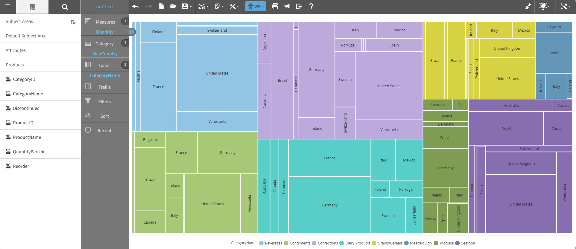
This graph shows an example of a tree map chart:
For details on how to create a tree map chart, see Creating a report by chart type.