Donut chart
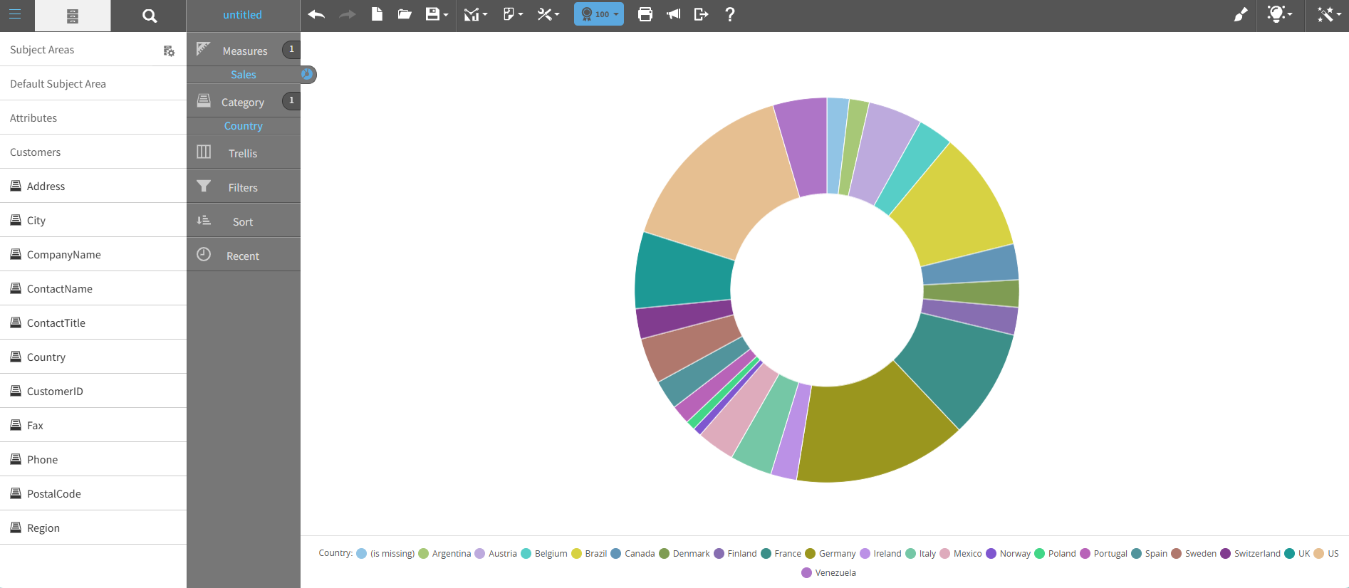
A donut chart is a pie chart variant with a hollow center, forming a ring-shaped visualization.
Similar to a pie chart, a donut chart represents data as proportions, with each segment corresponding to a category.
Use donut charts for a modern appearance and improved readability when showing multiple data series as concentric rings.
This graph shows an example of a donut chart:
For details on how to create a donut chart, see Creating a report by chart type.