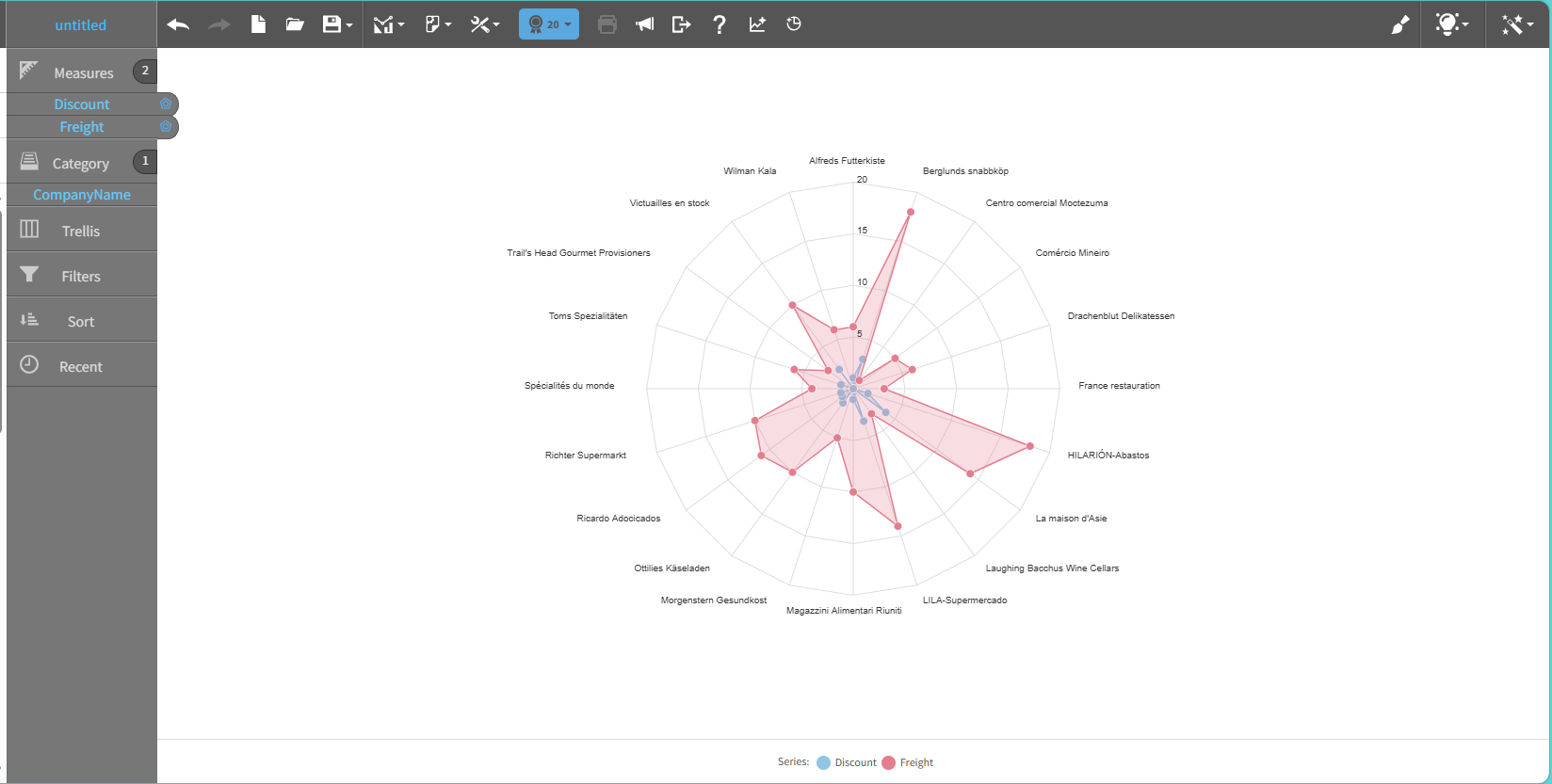
Radar chart
A radar chart shows multivariate data in the form of a two-dimensional chart of quantitative variables. Each variable appears as an axis that starts from the same point.
The radar chart supports both individual and grouped data analysis.
Use a radar chart to visualize:
- Comparison of multiple entities across common variables
- Groups of key performance indicators (KPIs)
- Performance dimensions across categories
- Categorical analytics across products, channels, or segments
The radar chart provides interactive elements, such as:
- Tooltips
- Legends
- Axis scaling
- Export options
This graph shows an example of a radar chart: