Sankey chart
A Sankey chart shows data flows between stages. The flow width represents stage values and indicates volume or magnitude.
Use a Sankey chart to visualize:
- Flow relationships such as energy distribution or data movement
- Resource transfers such as cost allocation or budget breakdown
- Dependencies and paths between stages such as process inputs and outputs
- Gains, losses, or imbalances across stages
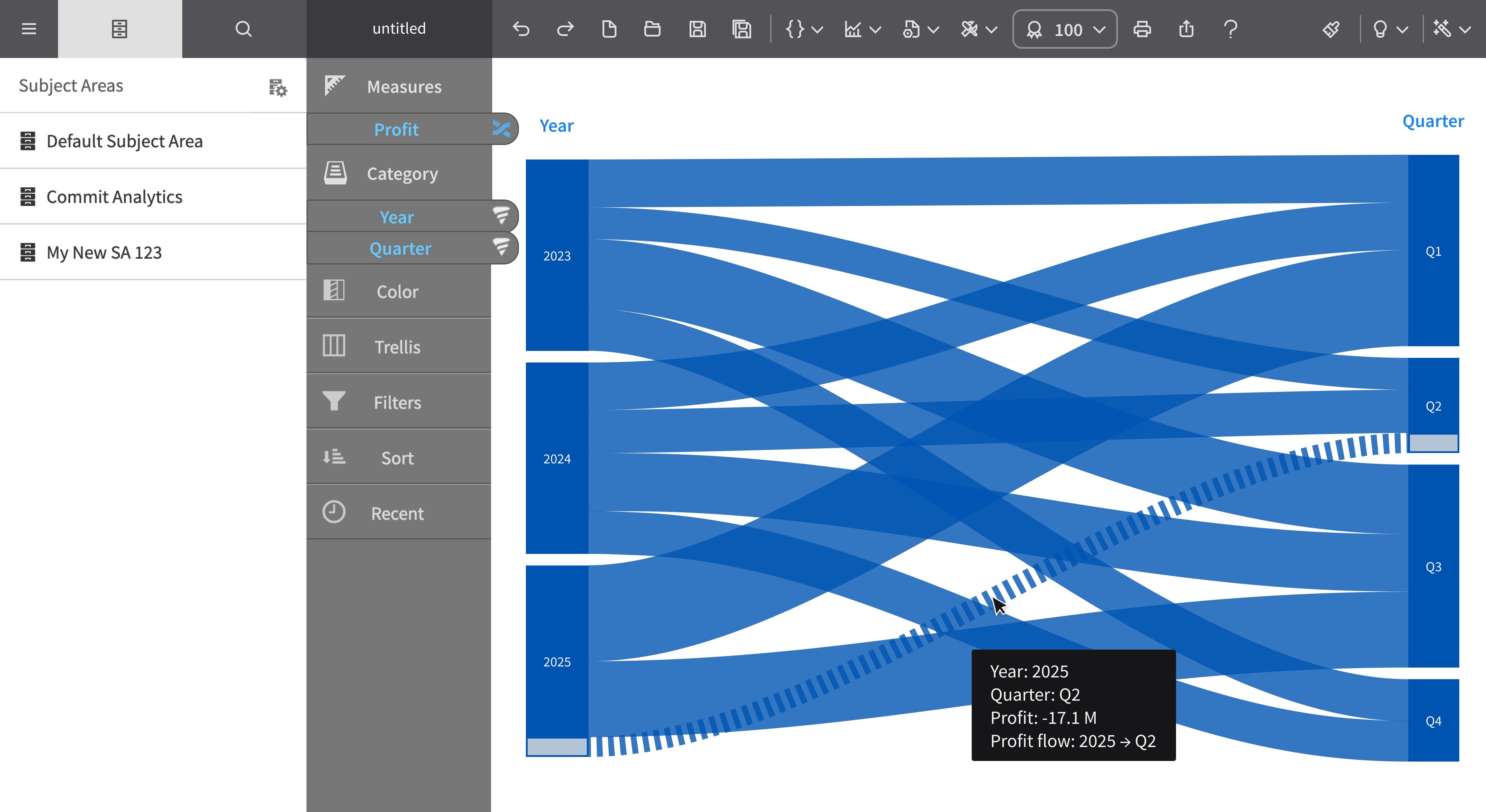
This graph shows an example of a Sankey chart:
For details on how to create a Sankey chart, see Creating a report by chart type.