Polar chart
A polar chart shows data in a circular coordinate system. Data points are plotted around a central axis in which the angle represents the category and the distance from the center represents the value.
Use a polar chart to:
- Analyze cyclical or seasonal patterns such as monthly sales or yearly trends.
- Compare multiple measures across categories in a circular format.
- Visualize periodic data such as sports performance or customer behavior.
- Identify patterns, peaks, and variations that may be less visible in Cartesian charts.
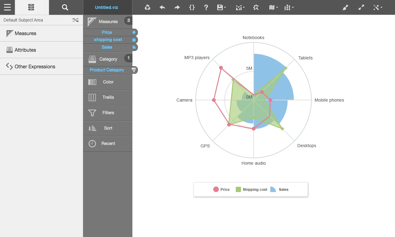
This graph shows an example of a polar chart:
To apply the Top N or Bottom N filtering, click and specify information by which to filter data in the Value, Metric to Rank By and Attribute to Rank By fields. Click .
For details on how to create a polar chart, see Creating a report by chart type.