Bullet chart
A bullet chart shows data as a horizontal bar that compares a primary measure against defined targets and qualitative ranges. The bar length represents the actual value, and markers and background ranges indicate performance thresholds.
Use a bullet chart to visualize:
- Performance against targets such as actual versus planned revenue
- Progress toward goals such as quota attainment or KPI tracking
- Threshold-based performance evaluation across defined ranges
- Comparisons of multiple KPIs in a limited dashboard space
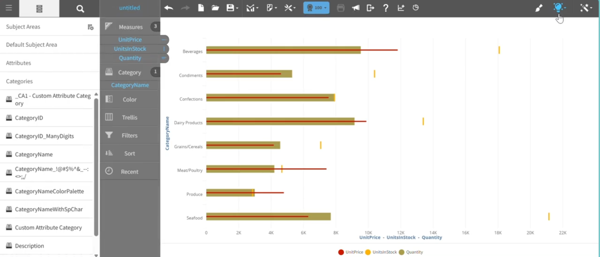
This graph shows an example of a bullet chart, where UnitPrice is Actual value, UnitsInStock is Target value, and Quantity is Comparative value.
For details on how to create a bullet chart, see Creating a report by chart type.