Creating a report with data

Use Search to find the columns that you need for the report. If you are not familiar with the columns available in your data, browse the measures and attributes in the Subject Area.

Note: Rest your cursor over a column name to display the full name. If a column name is longer than two line paths, the column name is cut off with "..." and is not fully displayed.

Best Practice: Start the report with a measure.

To create a report, start with data:

  1. In Visualizer, locate a measure:
    • In Search, start typing the name of a measure. Visualizer searches all of the measures, attributes, and folders in the subject areas of the space.
    • In Subject Area, click Measures to browse the list of available measures.
      Note: If an attribute or measure name contains an underscore (_) or period (.), Subject Area and other Visualizer area do not show those characters.
  2. Select the measure name, or drag the measure to the Canvas. Visualizer adds the column to the appropriate bucket in the Chart Builder and builds a visualization on the Canvas. By default, Visualizer creates a column chart as indicated by the Column icon on the tab next to the measure.
    Note: The Chart Builder menu can disappear in a web browser, such as Chrome and Firefox, if you change the browser font size in the browser settings menu, from medium to large or extra-large. Restore the medium font size setting to display the menu again.
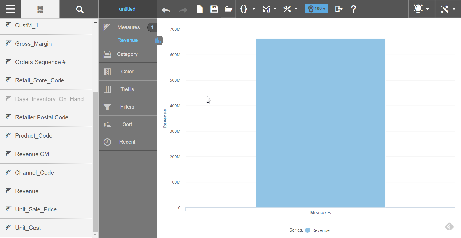
    chart builder graph in visualizer

    Note: You can hover over a measure in Chart Builder to display details for that measure.
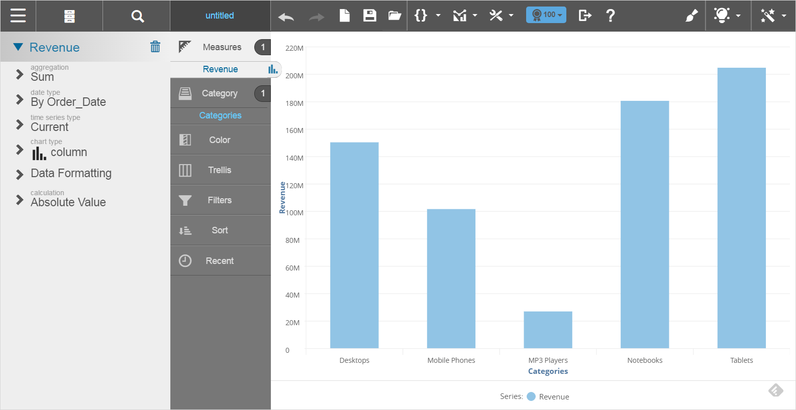
  3. To modify measure properties, select the measure in Chart Builder and choose an option. You can change:
    • Aggregation: Count distinct, count, average, maximum, minimum, or sum.
    • Date type: By Order_Date, Ship_Date, or other date types that exist in the underlying data model.
    • Time series type: Current, trailing 12 months (TTM), trailing 3 months, month ago (MAGO), quarter ago (QAGO), year ago (YAGO), quarter to-date (QTD), year to-date (YTD).
      Note: If you change Time series type, add a Time attribute, such as Time.Month, Time.Quarter, or Time.Year to the report.

      Do not use a Year attribute with a measure that uses the YTD time series. Use Quarter, Month, or Day attributes to ensure accurate results.

    • Chart types: Shows the current chart type and lets you change to another type of chart.
    • Data formatting: See Formatting the Data in a Visualizer Chart and Formatting Visualizer Tabular Reports.
    • Calculations: This option appears after you add an attribute along with the measure. See Changing Measure Calculations.
  4. To rename an attribute or measure:
    1. Double-click the name in Chart Builder.
    2. Double-click the property name.
    3. Specify the new label.
    4. Click Apply
  5. Select Subject Area to return and find the attributes.
  6. Add an attribute. Chart Builder adds the attribute to Category and plots a bar chart.
    adding attributes to category
  7. Add any other attributes and measures. Some chart types require columns to be added as colors, shapes or sizes. You can also create trellis charts.
  8. Add filters or change the way the data is sorted as needed.
  9. Optionally, you can:
    • Change the style of the chart by changing its chart type.
    • Create an expression and add it to your visualization.
    • Change the axis labels.
  10. Click Save.
Note: Use these guidelines when you create a report with data:
  • To clear the current report and start a new report, click Create a New Chart which is located next yo the Save button.
  • You can drag a column from one section (also called a "bucket") in Chart Builder to another, when you want to filter or sort on a column.
  • To delete a measure or attribute, drag the name of the measure or attribute from Chart Builder to the Subject Area and drop it on the Trash.
  • Click the items in the legend to hide or show objects in the visualization. Click the legend icon to show only the selected item and hide everything else in the visualization. Click the name in the legend to show everything except the selected item.
  • Visualizer has a 50,000 row limit for tabular data and 2,000 points/rows for chart data.