Box and whisker chart
A box and whisker chart shows the numerical data distribution with a five-number summary and enables comparisons across multiple categories.
A box and whisker chart consists of these elements:
- Minimum: Smallest non-outlier value in the dataset.
- First Quartile (Q1): Value below which 25% of observations fall.
- Median (Q2): Middle value of the dataset.
- Third Quartile (Q3): Value below which 75% of observations fall.
- Maximum: Largest non-outlier value in the dataset.
- Box: Interquartile range (Q1-Q3).
- Whiskers: Lines that extend from the box to the minimum and maximum values.
- Outliers: Optional. Data points outside the expected range, displayed as individual markers.
Use a box and whisker chart to:
- Compare the value distribution across categories or groups.
- Measure variability and assess data spread.
- Identify skewness and symmetry in a dataset.
- Detect outliers and unusual observations.
- Analyze performance trends, quality metrics, and experimental results.
To make any measure as numeric attribute, perform these steps:
- Select
- Select the table in that contains the measure you want to convert.
- Click .
- Select the required measure column or columns.
- Click and select .
- Add an appropriate , if required.
- Click .
This graph shows an example of a box and whisker chart:
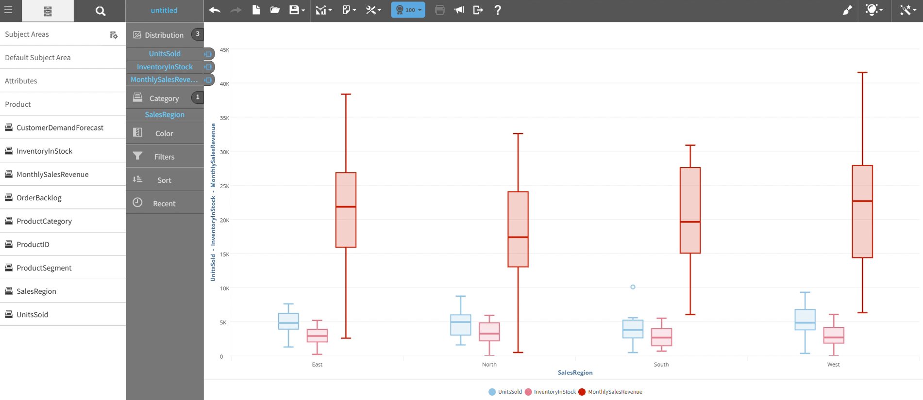
For details on how to create a box and whisker chart, see Creating a report by chart type.