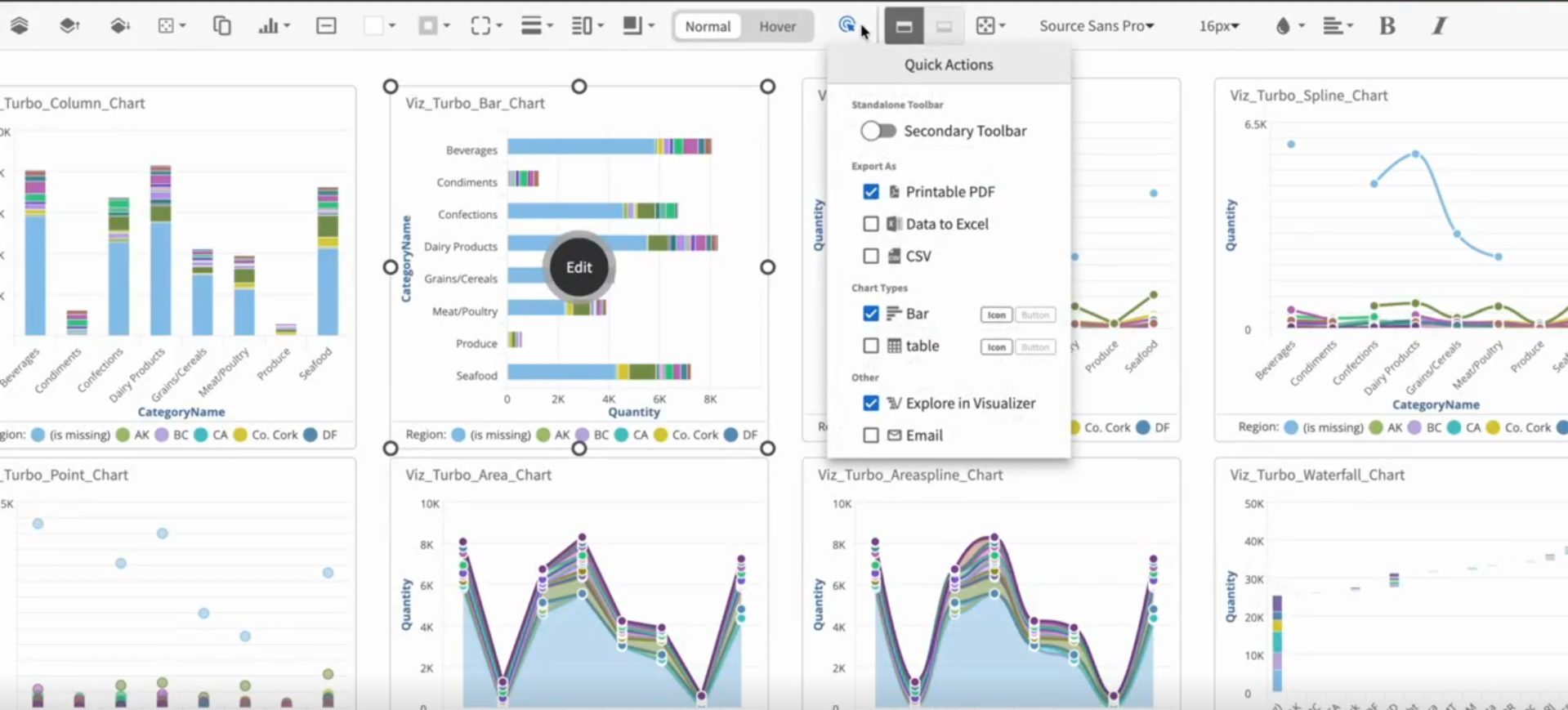
Edit toolbar options
The Edit Toolbar has a number of options for you to customize your dashboard. When you select one or more dashboard items, the Edit Toolbar is displayed. Click to save the changes to the dashlet.
Bring to Front or Send to Back
option brings the item to the topmost layer of the dashboard. For example, if three items on the dashboard overlap, the selected item is now displayed in front of the other two.
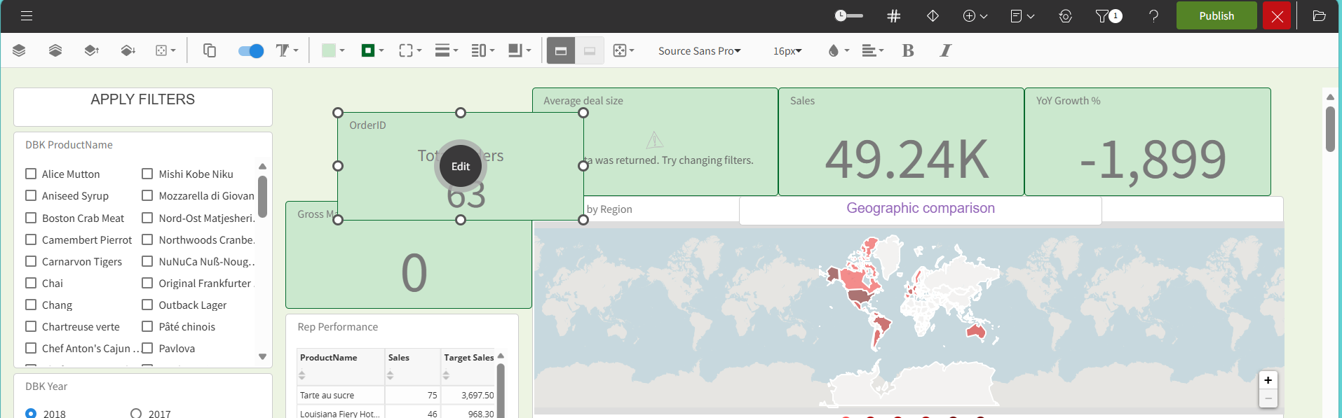
option sends the selected item to the backmost layer of the dashboard. For example, if three items on the dashboard overlap, the selected item now is displayed behind the other two.
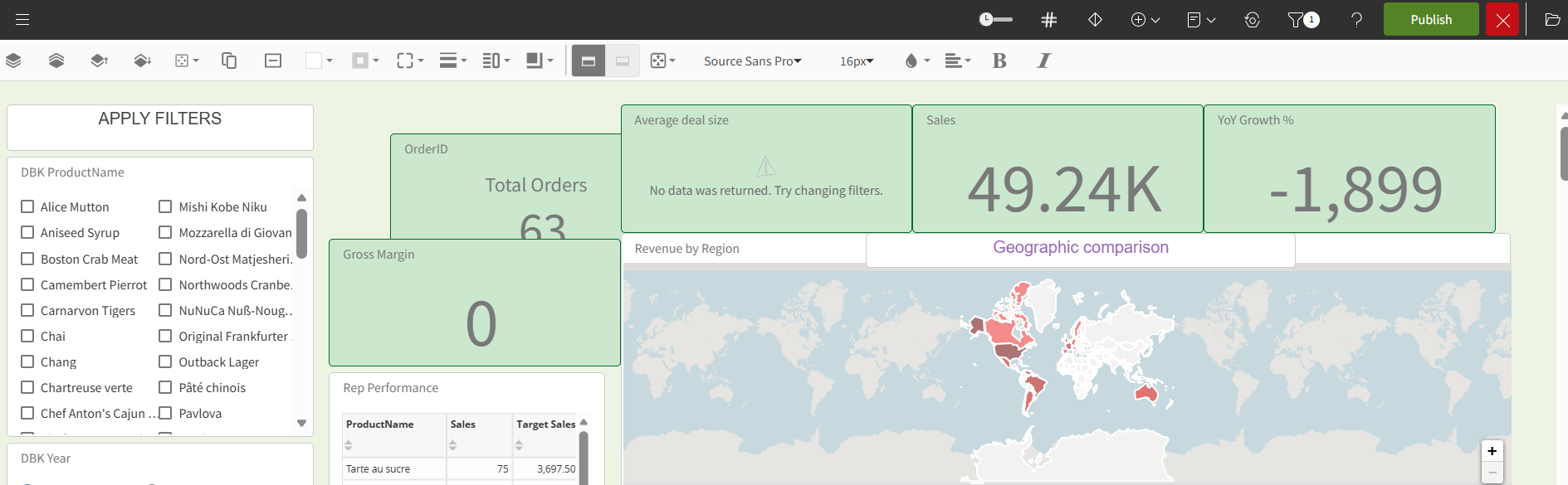
Bring Forward or Send Backward
option moves the item forward one layer on the dashboard. For example, if three items on the dashboard overlap and the backmost item is selected, the selected item is now displayed between the other two items.
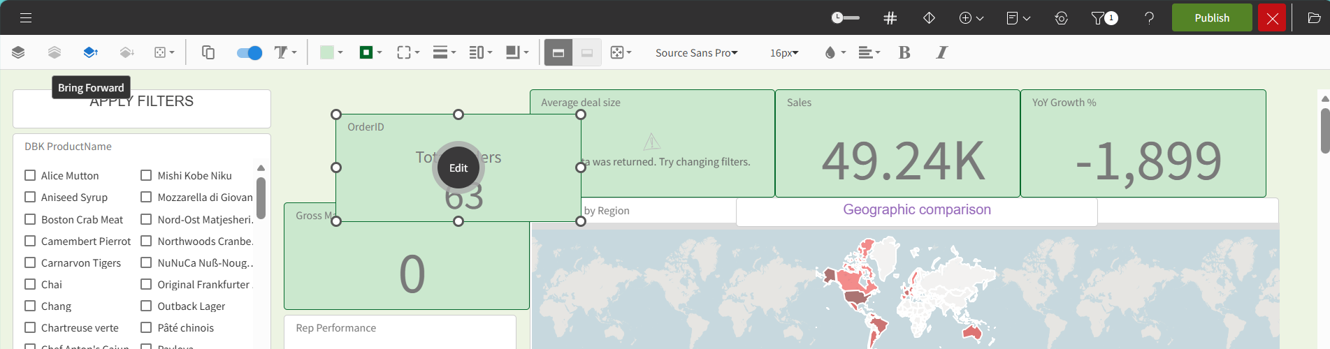
option moves the item back one layer on the dashboard. For example, if three items on the dashboard overlap and the topmost item is selected, the selected item is now displayed between the other two items.
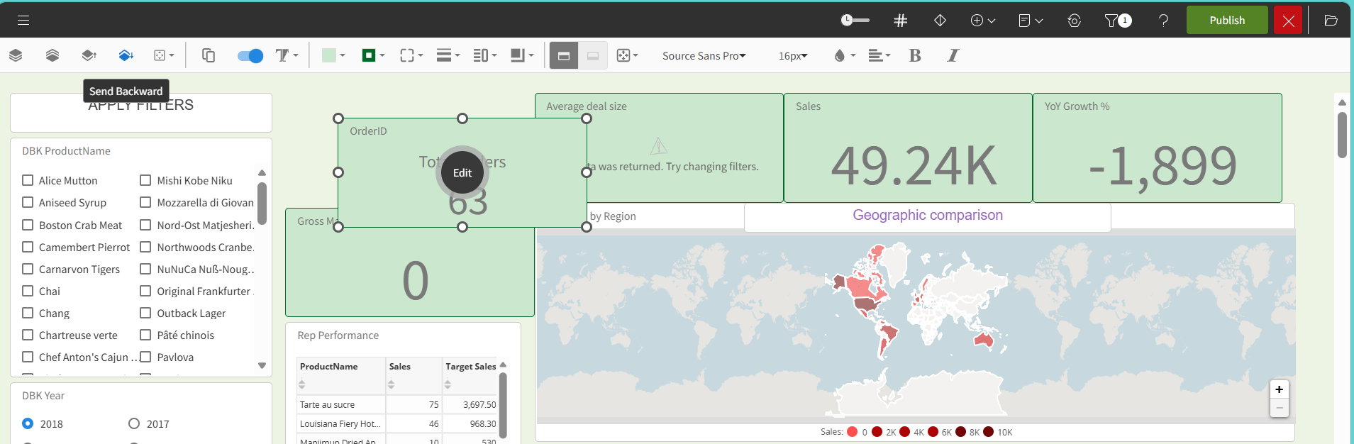
The and icons determine what layer of the dashboard a selected item exists.
Alignment
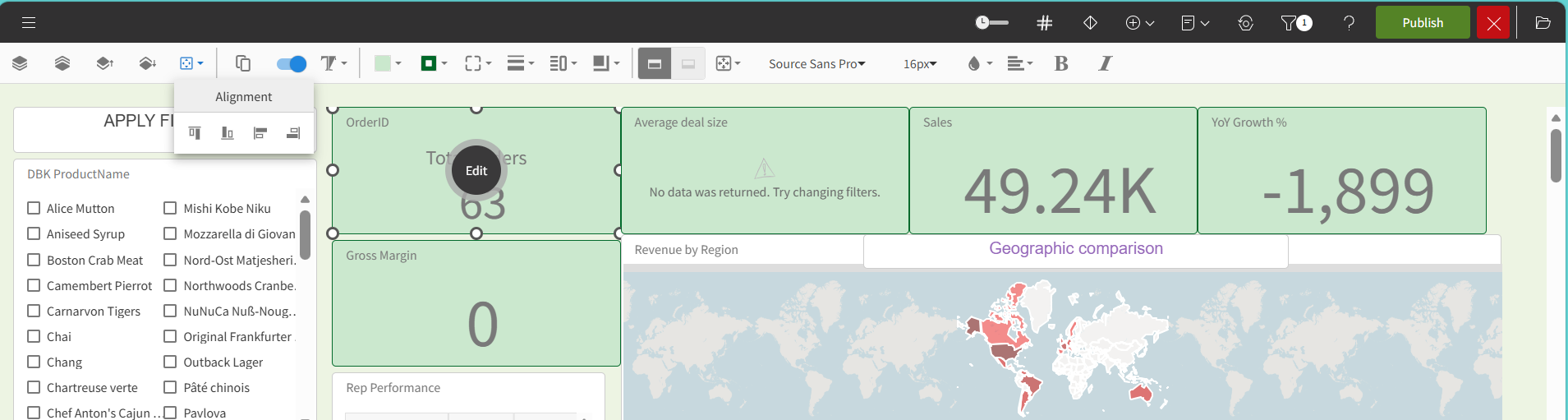
Click the icon to align the selected items. You can:
- Align top edges aligns all selected items by the topmost edge of a selected item.
- Align bottom edges aligns all selected items by the bottommost edge of a selected item.
- Align left edges aligns the selected items by the leftmost edge of a selected item.
- Align right edges aligns the items by the rightmost edge of a selected item.
Duplicate
Click the icon or press the keyboard shortcuts to make a copy of one or more items.
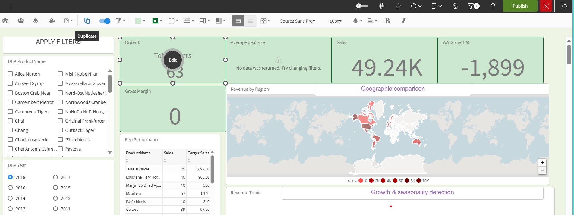
These are the keyboard shortcuts:
- For Mac, press Cmd + C to copy and Cmd + V to paste.
- For Window, press Ctrl + C to copy and Ctrl + V to paste.
Background Color
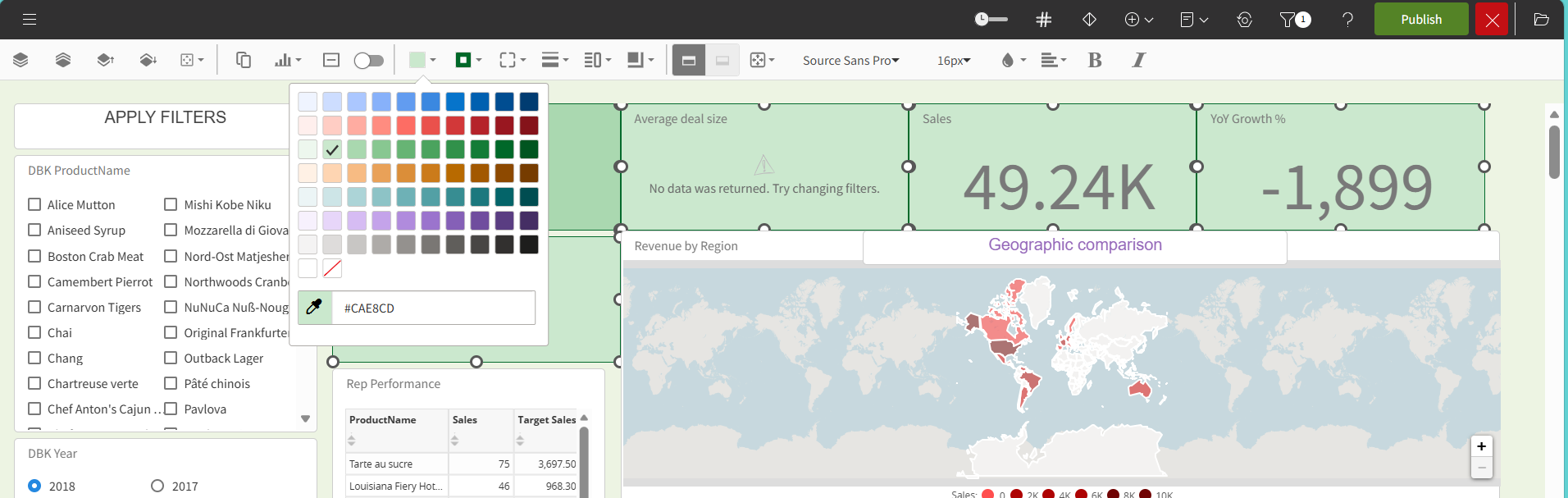
Click the icon to change the background color.
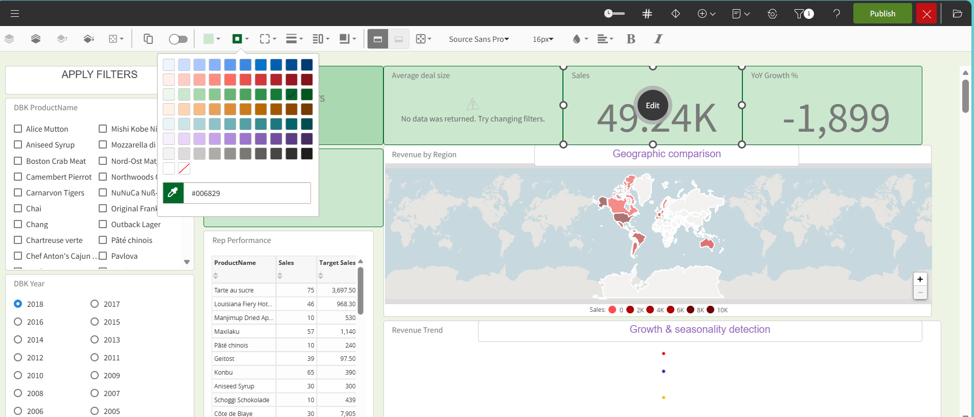
Border color
Click the icon to change the border color.
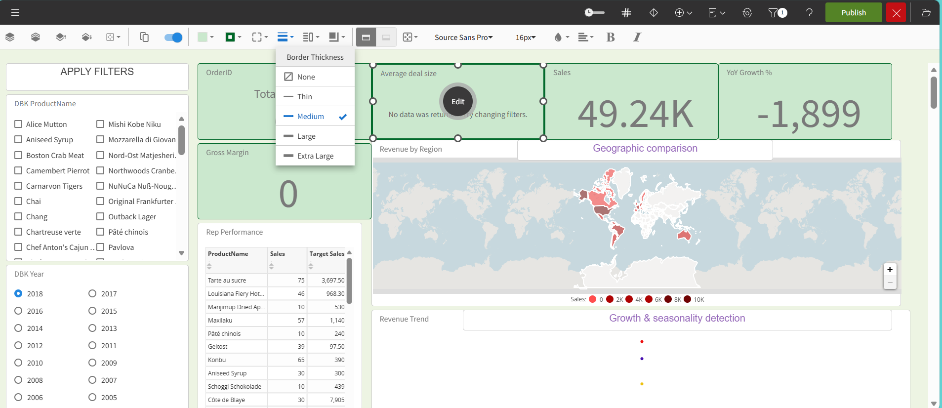
Border Thickness
Use to set the thickness of the item's border.
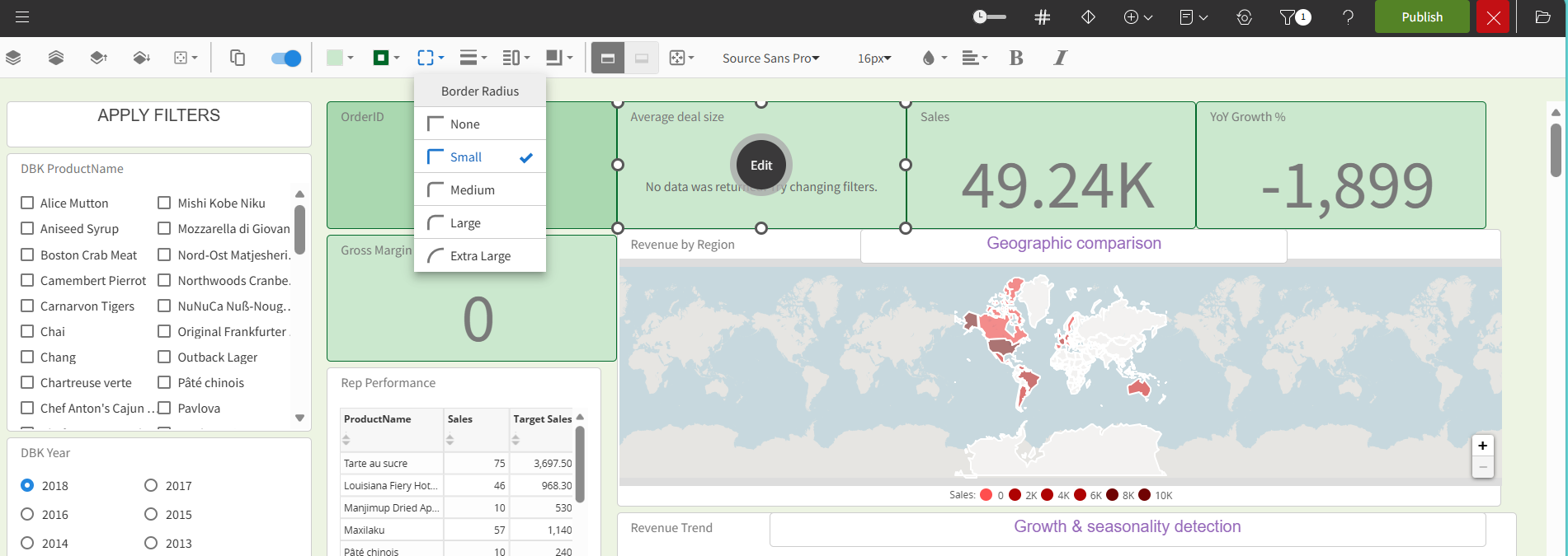
Border Radius
Click the icon to change the border corner style.
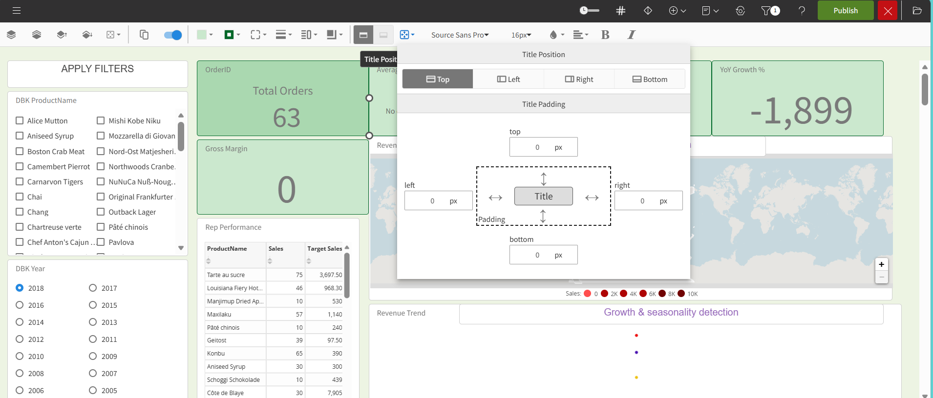
Title Position and Padding
Click the icon to set the space between the item and the border.
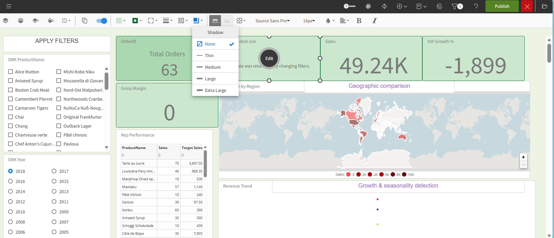
Shadow
Click the icon to set the drop shadow outside the item.
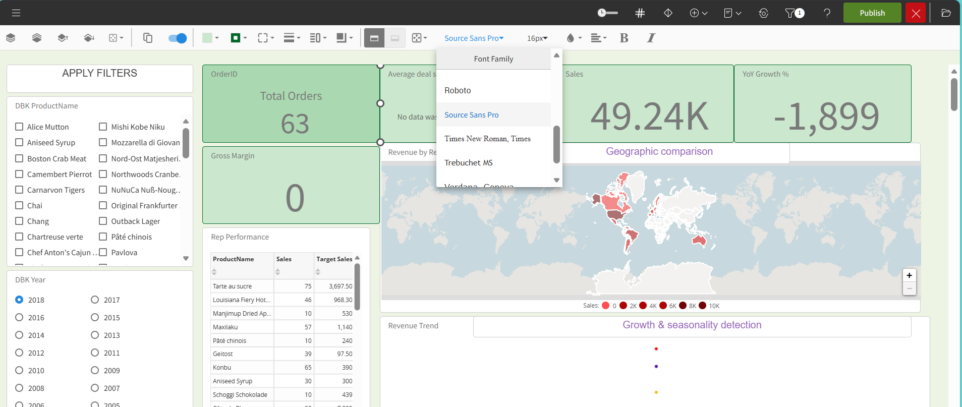
Font Family
Click the icon to set the font family.
Font size
Click the icon to set the font size. Buttons have an Auto option in Font Size that makes the text in these objects responsive.
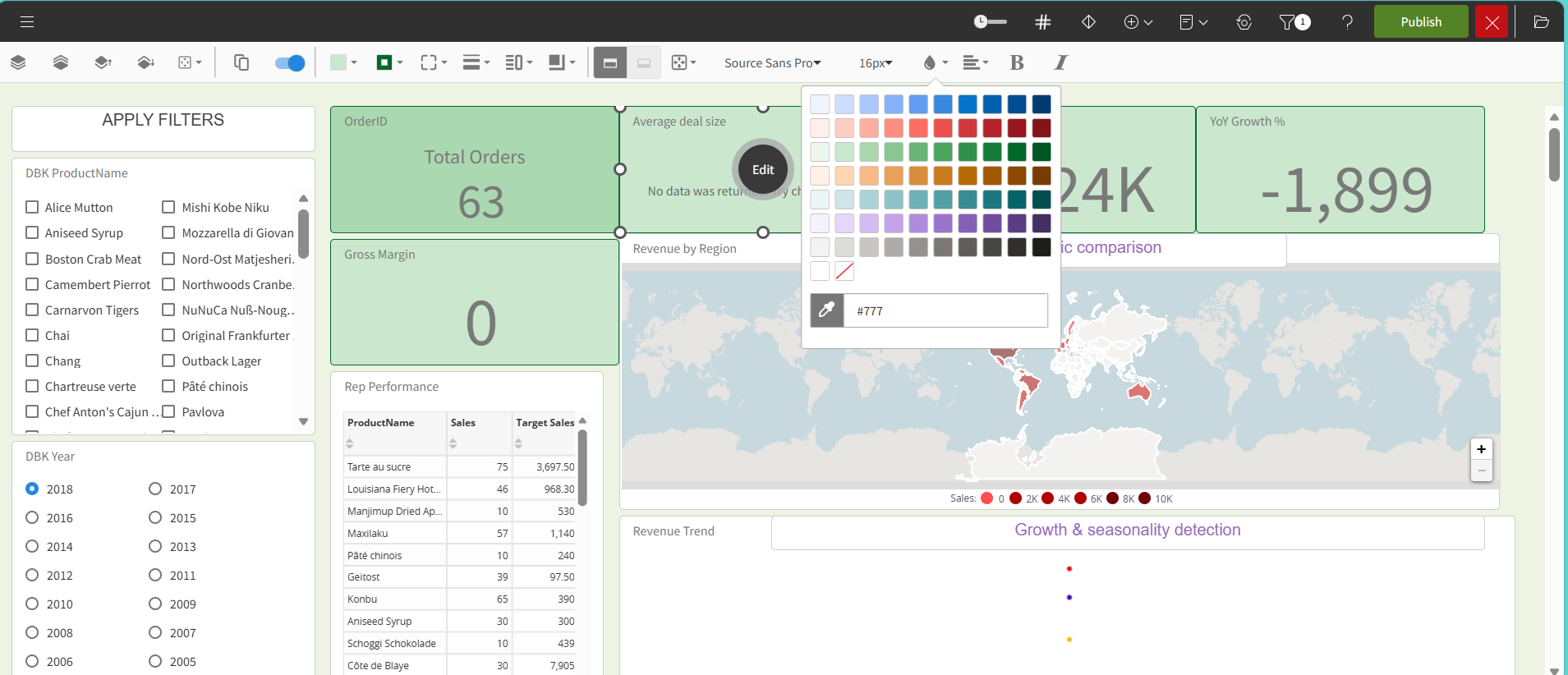
Font Color
Click the icon to set the font color.
Font styles
Use to set the text alignment.
Use to set the font style to bold.
Use to set the font style to italic.
Quick Actions
Enable the switch in the menu to configure each dashlet individually.
After you click the button, the secondary toolbar becomes available for the dashlet.
Configure at least one action to display the secondary toolbar on the dashlet.