Adding colors to a visualization
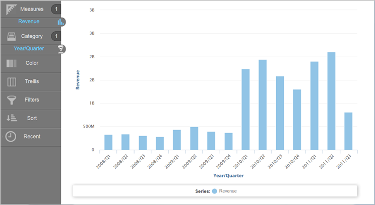
- In Visualizer, add a measure and an attribute to plot a chart. For example, Revenue by Year/Quarter as a column chart.
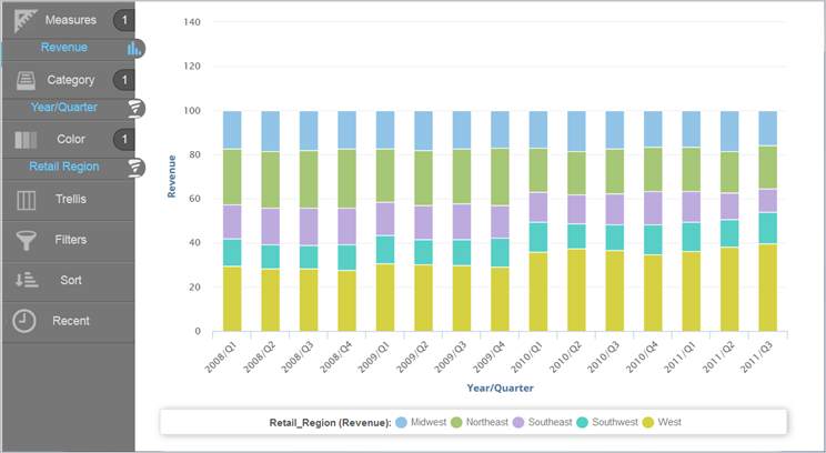
- You can divide the columns into colored sections that represent another visual dimension. Search or browse for an attribute and drag it to the Chart Builder. You can:
- Drag and drop the attribute onto Color.
- Drag and drop the attribute onto one of the suggested visual options. This is also a way to change the chart type.
- When you add an attribute onto Color and use the Color bucket:
- The menu allows you to select different ways to visualize your data for your chart type.
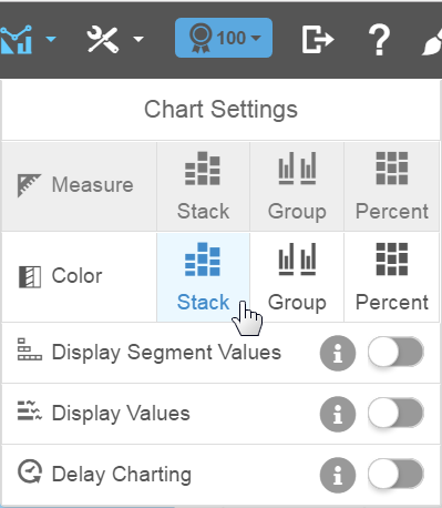
- If you display segments such as with a stack, you can switch the Display Segment Values option to show the values within the segment, space permitting.
- You can change how the Region dimension colors appear in a column chart. For example, show the color bars by percentage.
- Click Save.