Visualizer Geomaps let you display data by geographic regions in a map format, for example Sales by State or Region.
Important: Users working with the Visualizer Geomap feature should be aware of limitations in the number of data points that can be plotted using this type of visualization. Geomaps were built with use cases in mind where highly aggregated data is displayed using these maps. Geomaps perform best when the number of data points does not exceed 500 data points. Individual results can also be affected by the resources of the computer where the client is running. We suggest that when using Geomaps, you first start with a small number of data points and increase the number of data points incrementally. Geomaps display reduced performance, and potentially become unresponsive, when too many data points are being plotted. If users require data points that exceed the capabilities of Visualizer Geomap charts, they should use a third-party tool specifically built for mapping visualization and embed the charts generated from these tools into Birst.
- Create a geomap
- Change the layer type
- Change the colors
- Format the tooltips
- Save a default zoom level
- Overlay measures using layer types
- Multiple attributes and Layers in Geomaps
- Apply conditional formatting to layers
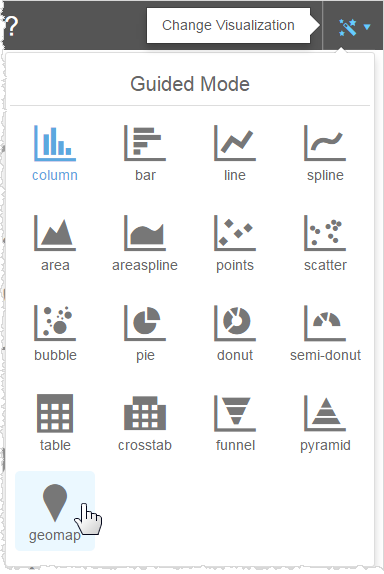
To create a geomap report
- From the Guided Mode menu select Geomap.
The default map displays and Visualizer prompts you to add a measure and a geoattribute.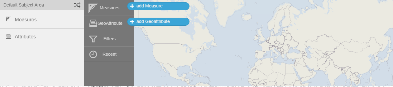
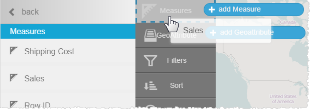
- Add a measure, for example, Sales.
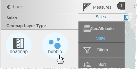
- Set the Geomap Layer Type for the Sales measure.
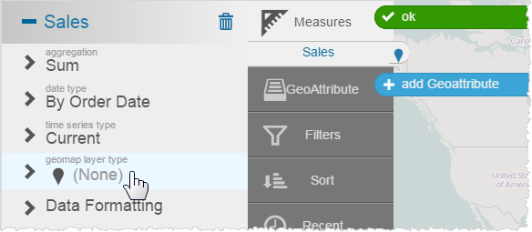
- Pick a layer type, for example Heatmap.
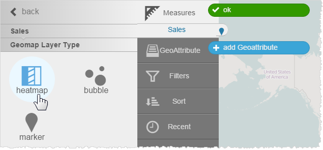
- Return to the Subject Area. Notice that the Sales measure in the Chart Builder shows the heatmap icon.
- Add a Geoattribute, for example, Orders.State.
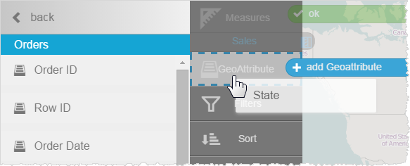
Visualizer prompts you to associate a map with the attribute.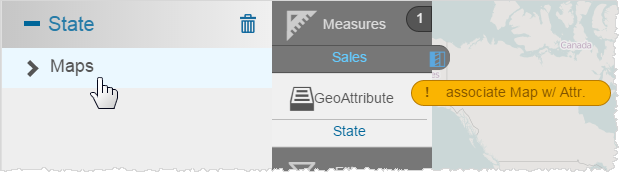
- Click State.
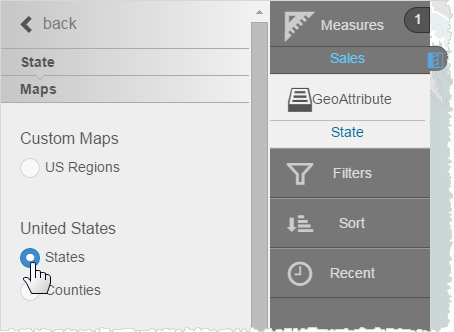
- Click Maps and select one, for example, United States States.
Visualizer applies the Sales measure and the State attribute data to a heatmap.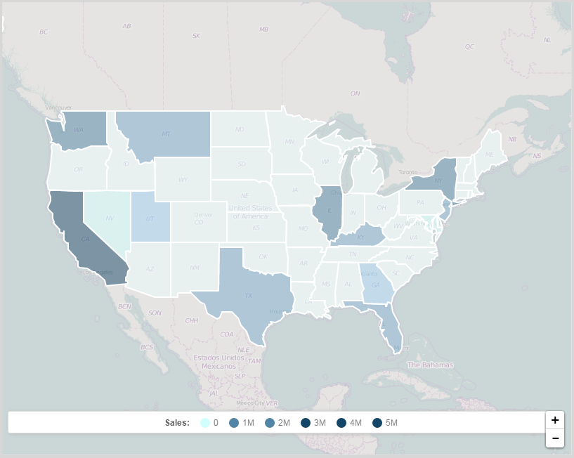
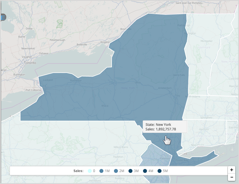
- Hover over the map to see the data. Click a State to zoom. Use the zoom controls ( + and - ) to resize the heatmap.
To change the geomap layer type
- Click the measure in the Chart Builder column.
- In its properties click Geomap Layer Type.
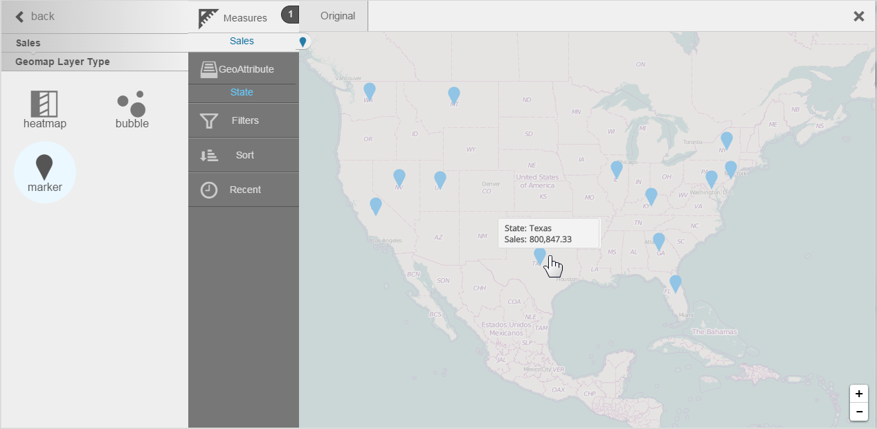
- Choose another map style, for example Bubble.
Visualizer applies the new bubble type.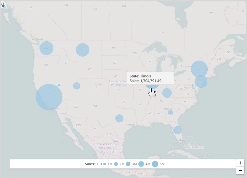
- You could also use a marker type.
To change the colors of a geomap
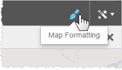
- Click Map Formatting.
- In the properties click the arrow next to the palette.
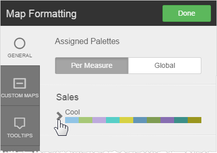
- Select another palette.
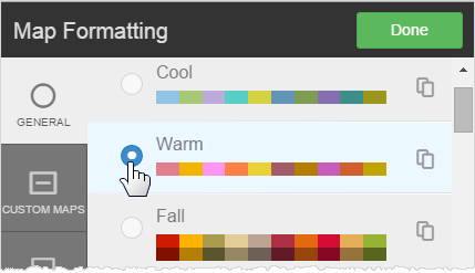
Tip: Create and use a custom palette for your company. - Click Done.
To format geomap tooltips
You can apply tooltip formatting to geomaps, just like other types of reports.
- Click Map Formatting.
- Click Tooltips.
- You can change:
- Text formatting
- Unit formats or percentage
- Suffix
- Decimal precision
- Currency symbol
- Click Done.
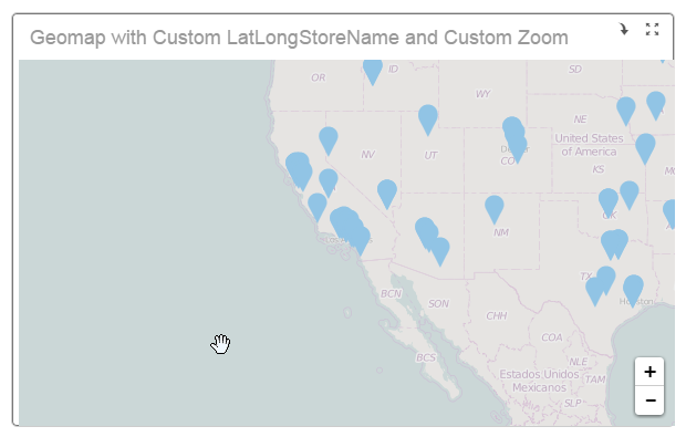
To save a geomap report at a particular zoom level
Visualizer retains the zoom level it is at when you save a geomap report. You can use this feature to set up a default map area, based on a built-in map, and let users zoom in or out from there.
- Use the zoom control and move the map to the area you want as the default map.
Zoom: Move:
Move: 
- Save the report.
For example, you can save a map of Greater Los Angeles, based on a built-in map. In a dashboard users zoom out to see the West and more.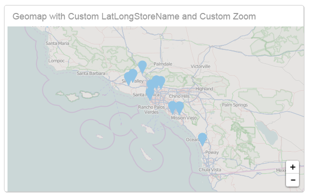
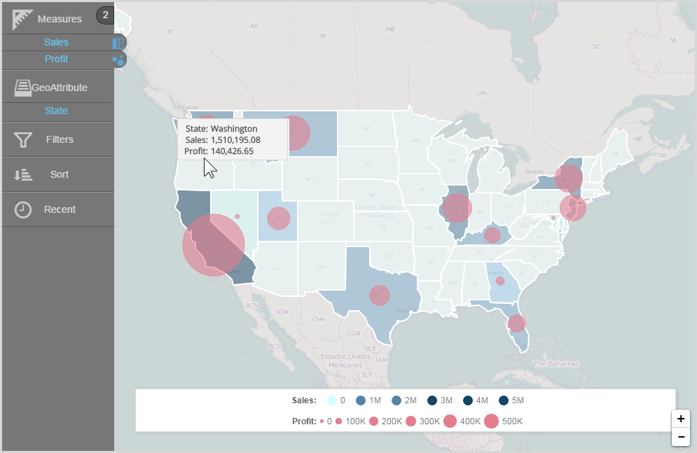
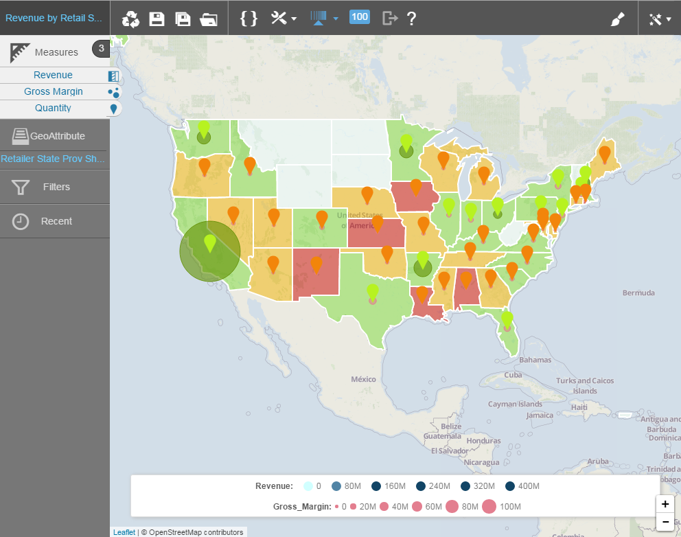
To overlay measures on a geomap
You can display one measure as a heatmap and another measure as a bubble map, and/or another as markers.
- To an existing map, add a second measure, for example Profit.
- Select the alternate chart type. Visualizer displays the two measures in two different chart layer styles.
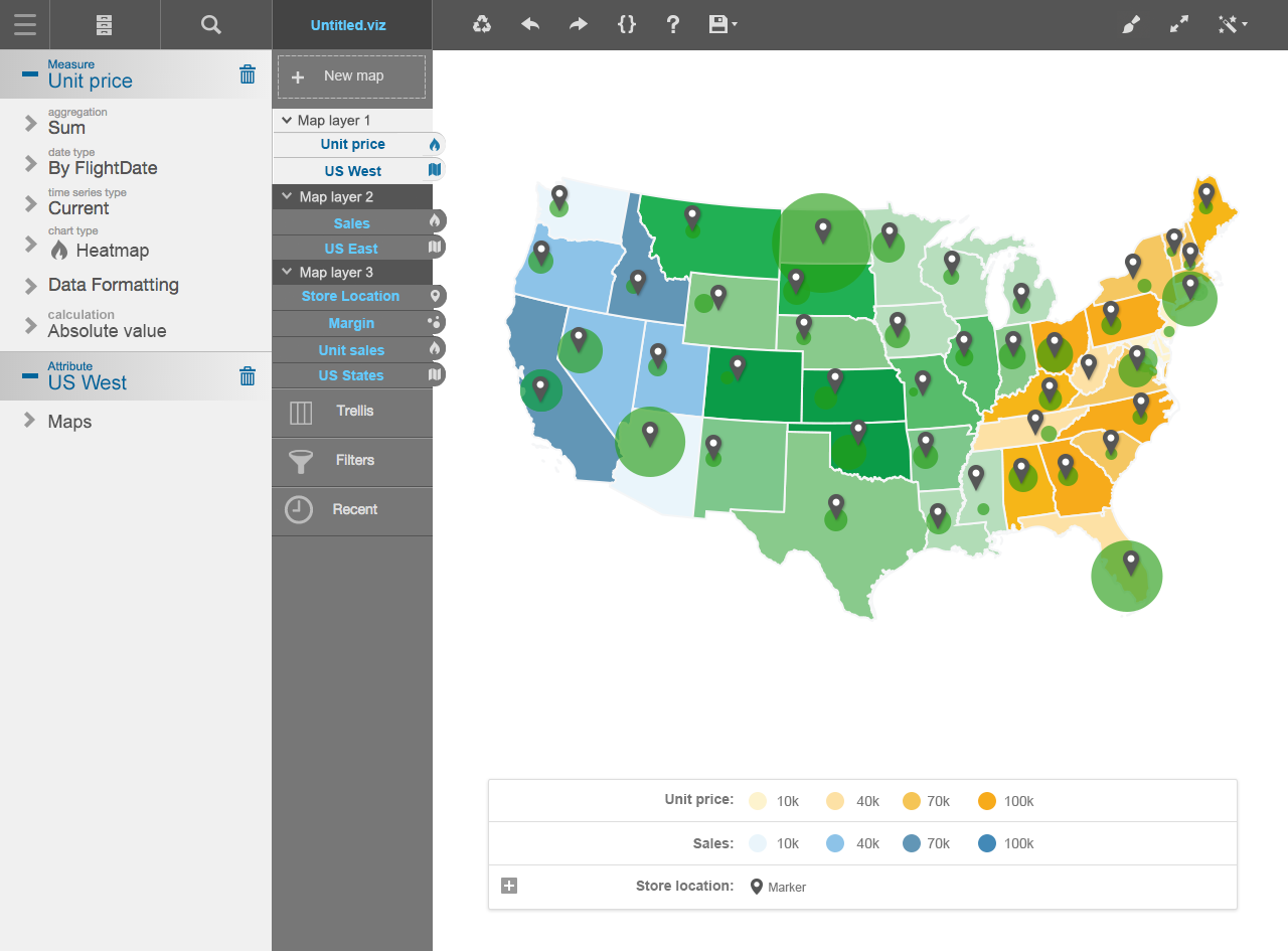
Multiple attributes and Layers in Geomaps
With the 5.27 release, Geomaps can now contain multiple attributes, each associated with a measure and a layer type (bubble or marker).
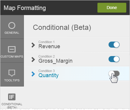
To apply conditional formatting to a measure on a geomap
You can apply conditional formatting to geomaps using BQL and IF/ELSE IF/ELSE syntax and color. This applies to any layer type. The following example uses the heatmap layer type.
- Click Map Formatting.
- Click Conditional.
- Select the measure.
- Enter the BQL expression for the condition.
Tip: The BQL expression can be any expression that you like and it does not have to include the measure of the layer. - Select the color to apply when the condition is met.
- Click Apply to preview the geomap conditional formatting.
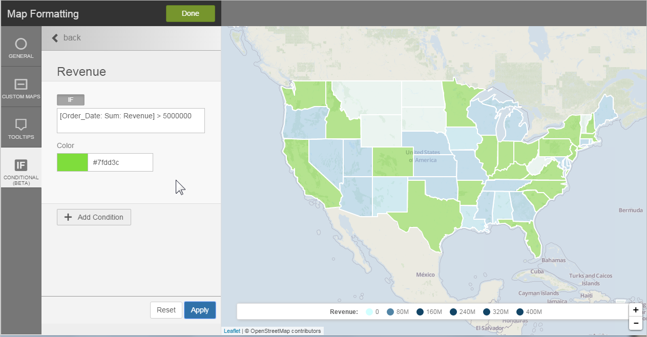
- Optionally, add another condition.
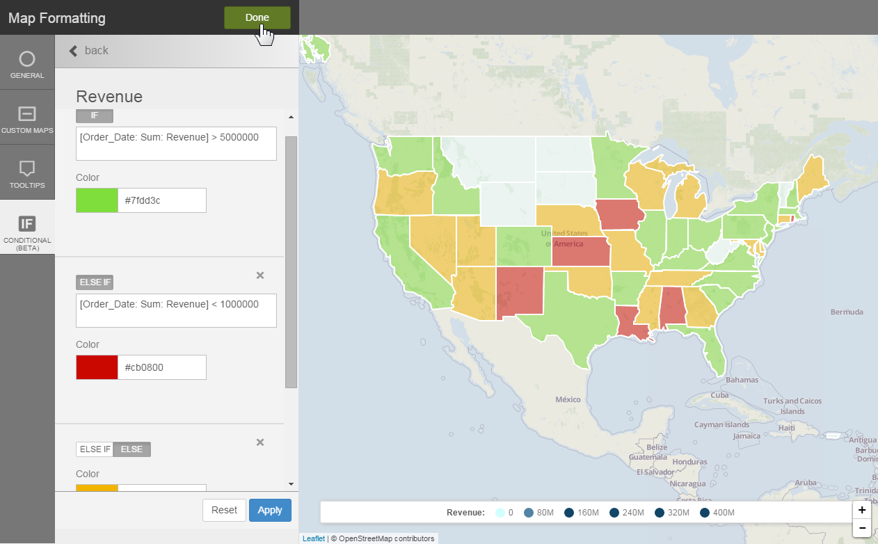
- Click Done.
Tip: Overlay measures and apply conditional formatting to each for a more interesting visualization.
Tip: You can toggle conditional formats on and off in the Map Formatting - Conditional tab.