Visualizer provides formatting options for measure data displayed in axis, tooltips, and display values. You can format:
Unit symbols that represent magnitude, such as M for millions
Suffix symbol for percentages (%)
Decimal precision display
Currency symbols
You can format currency symbols and decimal places for any measures, including:
Measure type expressions created in Visualizer. See Adding an Expression in Expression Builder.
Saved expressions created in Designer and listed as Other Expressions in the Subject Area.
Custom measures created in the Admin module.
Tip: Currency and date formatting also depends
on the user's language locale setting.
Example Data Formatting
A measure's Data Formatting applies across the visual elements that
use the measure. For example, unit, decimal precision, and currency
symbol settings apply to both Y axis labels and tooltips. 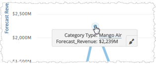
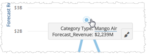
Tip: You can override the data formatting at the chart formatting level for axis, tooltip, and display values. For example, you can set the Y axis unit on a chart to be different than the tooltip unit. See Formatting Visualizer Charts.
To format the measure values in a chart
| 1. | Click
a measure in Chart Builder. The options menu opens with a section for
each measure.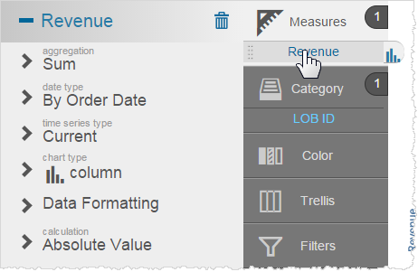 |
| 2. | Click Data
Formatting for the column you want to change. Visualizer displays the
options with the defaults highlighted.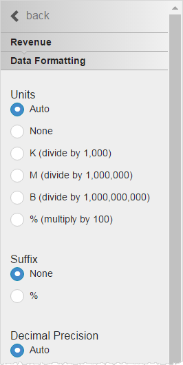 |
| 3. | Select the unit for formatting numbers. Options include: |
Auto default - commas (150,413,715)
None - no commas (150413715)
K - divide by 1,000 (150,413.71K)
M - divide by 1,000,000 (150.41M)
B - divide by 1,000,000,000 (0.15B)
%
- multiply by 100 (15,041,371,500%)
When you select an option, Visualizer immediately updates the chart axis and the tooltips.
| 4. | Select the suffix, for display purposes only. |
% - percent
| 5. | Select the decimal precision. |
| 6. | Select the
currency symbol. This is for display only, it does not change the data. 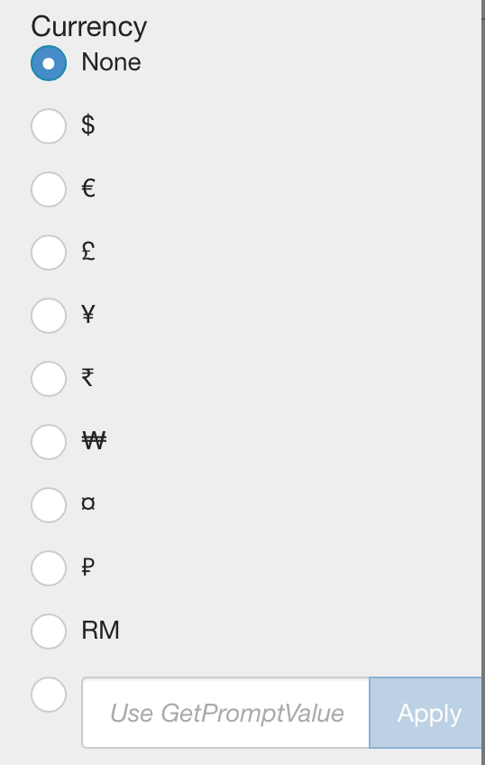 Tips: |
- Visualizer supports dynamic currency symbols. You can define a variable and use it as the currency format by entering the GetVariable('variable_name') syntax. See Using Variables.
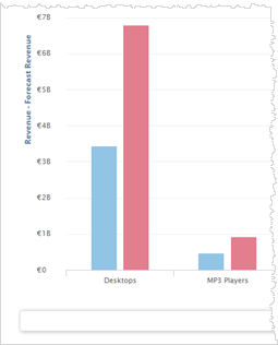
- If you have merged more than one measure
on the axis and the currency symbol is not the same for each measure,
Visualizer does not display a currency symbol on the axis. To display
a currency symbol on a merged axis, set both measures to use the same
currency. For example, set Revenue and Forecast Revenue to both use Euros.
| 7. | Click Save
 . . |
Tip: You can override formatting at the data level with formatting at the chart level. See Formatting Visualizer Charts.