Dashboards 2.0 provides filters to explore different levels of detail. For example, a filter can show a subset of a group of items, or a range of dates.
You can easily specify what a filter contains:
- Editing Filter Properties
- Check List Filters
- Advanced Filters
- Operators for Advanced Filters
- More Options for Filters
Additional features allow you to:
- Quickly locate filters when you have a large number of them
- Order the list of filters
- Create expressions for filters
- Use custom subject area variables in filter labels
- Link filters together so that a parent filter affects the choices available in a child filter
- Pass filter values to embedded web pages. See Embedding External Web Pages.
Types of Filters
You can add standard filters or embedded filters. These filters can either be available for all dashboards in a space or limited to the dashboard they were created on.
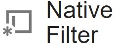
- A Native Filter is only available on the dashboard it was created on.
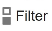
- A Filter is available to all dashboards in the entire
space. When
you edit a filter, the changes apply to all instances of the filter on
any dashboard in the space.
- Standard
filters, when active, appear as filter cards at the top of the dashboard:
Hovering over the card reveals more information: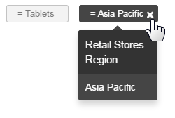
Clicking on a filter card opens the Filter Drawer where business users can choose different values for the filter.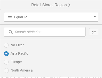
- Embedded
filters are used in a dashlet. Embedded filter colors are dashlet properties set at the dashlet and theme levels.
Search Embed Filters
If you have a long list of filter selections in an Embedded Filter, the search feature can help you find the desired filter value.
Standard Filters
In Published mode, users access standard filters from either the filter card or the Filters menu. The Filters menu indicates how many active filters have been applied to the current dashboard. 
To see how many filters are available to a dashboard, click the filter icon to open the filter drawer which displays the filters available.
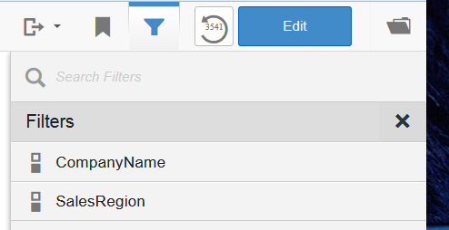
Note: If you are dashboard edit mode, you would have the option to create new filters from the filter drawer by selecting the Manage Filters feature.
Define a filter and associate it with dashlets on a dashboard
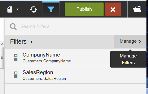
- In Edit mode, click the Filters icon to open the Filters panel.

- Click Manageto open the Edit Filters panel.
- You can either create a new filter or filter group or edit an existing filter.
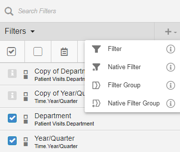
- To create a new filter, click + Create New Filter to define a new filter or filter group.
See Create a new filter or Create filter groups.
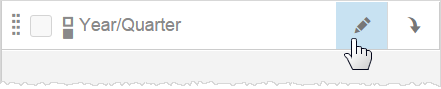
- To edit an existing filter, click the filter's Edit button. See Editing Filter Properties.
- To create a new filter, click + Create New Filter to define a new filter or filter group.
See Create a new filter or Create filter groups.
-
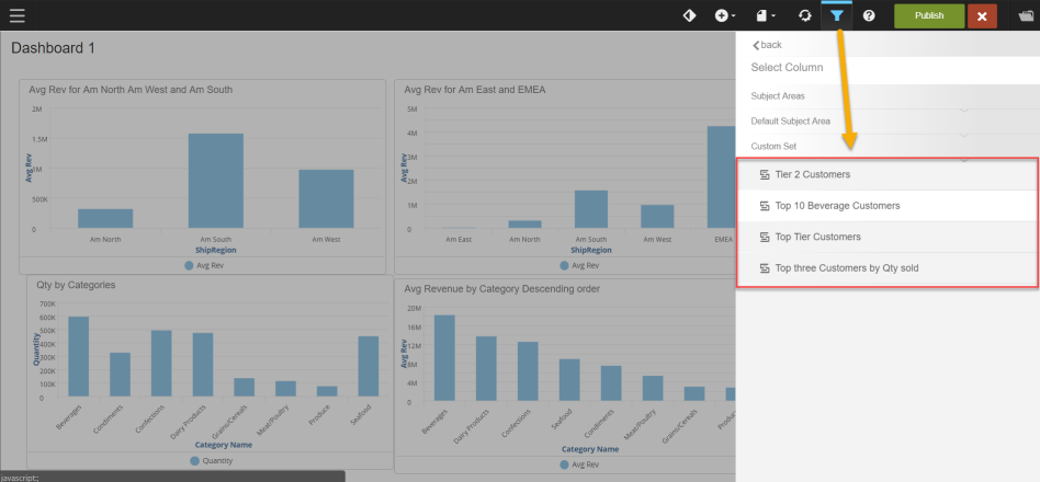
Custom Sets can be used as dashboard filters. See Working with Custom Sets.
- When you enable a filter, the filter icon displays on the
lower right of all dashlets the filter will be associated with the dashlet. f you do not want a filter applied to a highlighted dashlet, click the
dashlet to deselect it.
- To close or exit the Filters drawer, click the Filters menu again. Applied settings will persist in the drawer until you edit them.
Create a new standard filter
- In Edit mode,
click Filters.
- In the Filters
pane click + Create New Filter.
- Select either Filter or Native Filter.
- A Filter is available for use on all dashboards in a space.
- A Native Filter is only available for the specific dashboard it was created on.
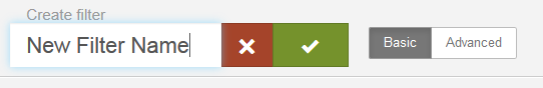
- Name your filter.
Tips:- Filter cards are automatically arranged in alphabetical order from left to right at the top of the dashboard. If you are creating multiple filters and the ordering is important, consider how you name them.
- Different filters can have the same name. For example, you may want to present filter options differently on different dashboards, but use the same filter name.
- Click the check box when you finish entering the name.
- To pick the filter, either:
- Type
to search for columns. You can change the Subject Area if needed, to browse attributes and measures. See Editing
Filter Properties.
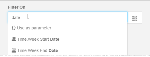
- Type a parameter name and click Use as parameter. Parameters are useful
in expressions and custom formulas.
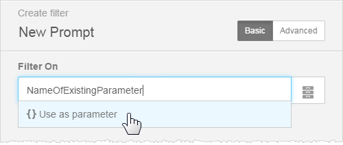
- Type
to search for columns. You can change the Subject Area if needed, to browse attributes and measures. See Editing
Filter Properties.
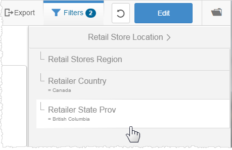
Create parent/child filter groups
Parent/child filter groups are sets of related filters that let the user narrow down a set of results based on a logical hierarchy of sets and subsets, such as geography or time. Filter groups are supported for standard filters only, not for embedded filters. Note: Only list filters can be added to a filter group.
When you add a filter to a filter group, Dashboards 2.0 creates a copy of the original filter. Because the filters in a filter group are copies, you can make changes to a filter in a group without affecting the original filter outside the group.
- Create the
filters. For example, Retailer Region and Retailer Country.
Tip: For better performance and usability, set a default value for the top filter in the group. - In the Filters
main panel, click +Create New Filter.
- Select either Filter Group or Native Filter Group.
- A Filter Group is available for use on all dashboards in a space.
- A Native Filter Group is only available for the specific dashboard it was created on.
- Name your filter and save.
Tips:- Filter cards are automatically arranged in alphabetical order from left to right at the top of the dashboard. If you are creating multiple filters and the ordering is important, consider how you name them.
- Different filters can have the same name. For example, you may want to present filter options differently on different dashboards, but use the same filter name.
- In the New
Filter Group, drag and drop the filters into the group panel.
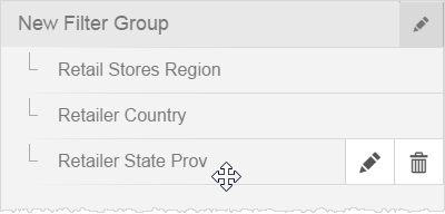
- Drag to arrange
the filters in the hierarchical order you prefer.
Tip: Drag a filter to the right and underneath to make it a sub-filter.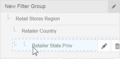
- On the filter
title click Edit, enter a name for the filter group and Save.
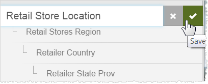
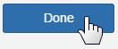
- Click Done.
The Filters list updates to show new filter group. - Check the
new filter to enable it.
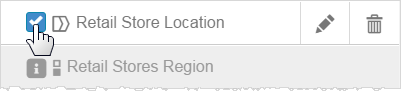
Tip: Individual filters in the new group are automatically marked as already active with the "i" icon. - Confirm to
which dashlet reports this filter group applies. Reports with the filter
show a filter icon. Click the icon if you do not wish a particular report
to use the filter.
- To save the
dashboard click Publish.
Business users can traverse the filter group in the Filters panel.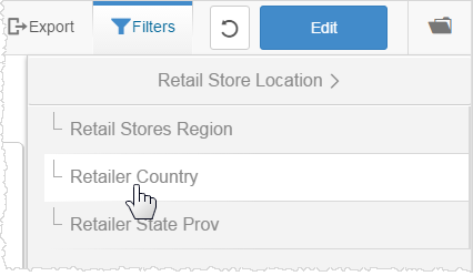
Embedded Filters
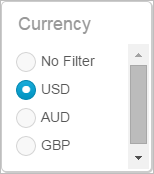
Embedded filters make it easy for users to see the filter values you want them to use. Placing an embedded filter next to a dashlet that it affects helps to provide context.
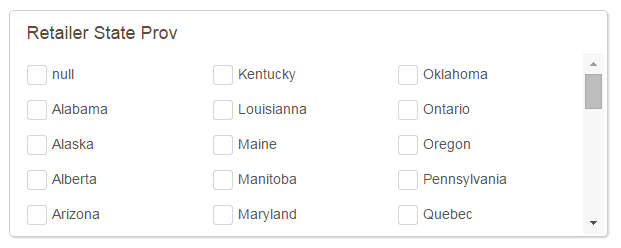
Embedded filters exist in their own dashlets. For example, a single-choice Currency selection radio button list.
For another example, a multi-choice check box list.
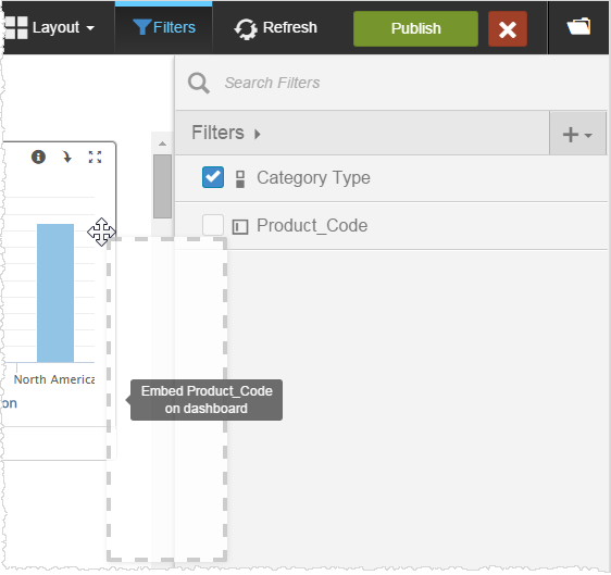
Create an embedded filter
- To add an embedded filter to a dashboard either:
- In Edit mode, click the Insert icon and select Embedded Filter. A new dashlet prompts you to select a filter.
- Click Select
Filter.
- Select from a list or search for another filter. See Editing Filter Properties.
- Drag and drop a filter from the filter drawer onto the dashboard.
- Enable or disable the filter for the dashlets.
- Position and
re-size the filter dashlet as needed.
Tip: To save space on the dashboard, re-size a long radio button or checkbox list until it automatically becomes a dropdown or a multi-column list.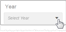
Lock the layout
Embedded list, input field, and slider filters automatically reformat to a more compact style when the dashboard resizes to a smaller area. You can set the style so that the filter does not reformat.
- Create, place, and resize the filter to the way you want to see it on the dashboard.
- Select the embedded filter on the dashboard.
- From the dashboard style menu, click Embedded Filter Layout and select the layout you want to keep. The options depend on the style of the filter.
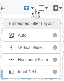
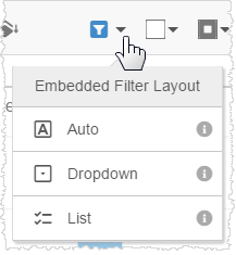
- Click Publish to save your changes and test the new layout.
Editing Filter Properties
The Create Filter panel gives you many options for defining filters.
Important: If you edit an existing filter the changes will be applied to any dashboard that uses the filter. If you do not want to apply the changes across all dashboards using that filter, rename it to create a new filter or create a Native Filter.
By default the Create Filter panel opens in the Basic options screen.
Tip: Dashboards 2.0 picks a default filter style based on the data type of the Filter On attribute or measure. For example, integer type filters by default use the slider style. You can change that style in Advanced mode.
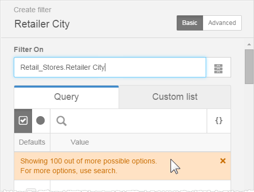
Filters can be based on
- Query-based filter: Users can pick
from values provided by the system. You can specify a default
value or values, or a custom expression. See Expressions for Filters.
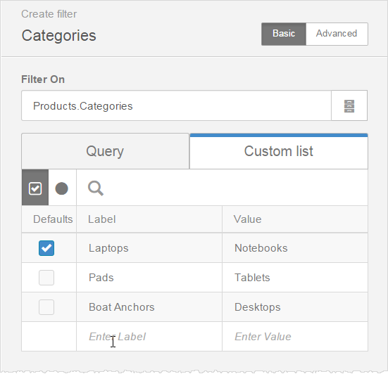
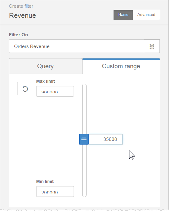
- Custom list- or range-based filter: Users can pick
from a list (text-based) or range (numeric) values that you define. This is helpful if you want to show different labels. Naturally, these values must exist in the data source. For a list you specify whether it's a radio button or check box, enter the labels and values, and click the defaults.
For a range you specify the maximum number, minimum number, and a default number.
Advanced Filter Format Options
Click Advanced to open the Advanced screen and apply a check list, slider, value, or calendar date picker filter style, and define operators.
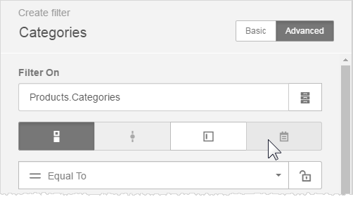
If the data type of the filter is not supported by the filter style, the button is grayed out.
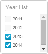
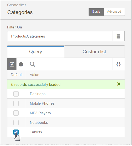
Check List Filters
By default, the Create Filter drawer opens in Basic mode for creating Checklist filters, either check box or radio button. You populate the filter values by
- Click
the check box to allow users to select multiple values.

- Click the radio button icon to permit users to select only one value.
- Select a value or values in the Defaults column to specify the filter value to apply when the user opens the page.
Tips:
- If there are many filters in the list, use the Search to more quickly find what you need.
- If a large number of results are detected, a warning displays and suggests that you refine the query.
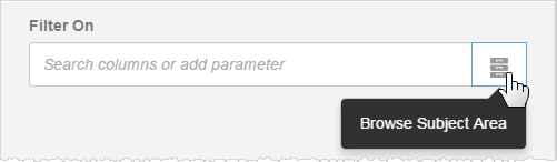
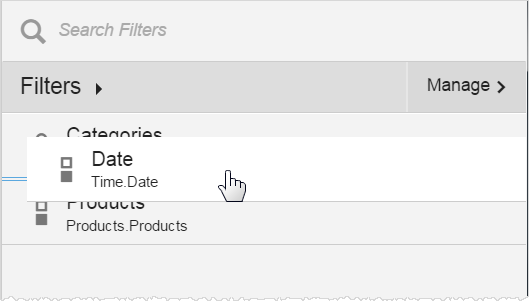
- Click
the folder icon to browse other subject areas.
- Tip: If you are using the built-in Year time series, you can narrow the range of the years for the entire space in the Admin - Manage Space - Modify Properties - Min/Max Years.
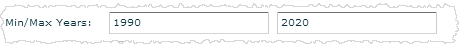
When you change this Admin property, it does not affect existing filters in the space. The new range applies only to built-in Year filters created after this property changes.
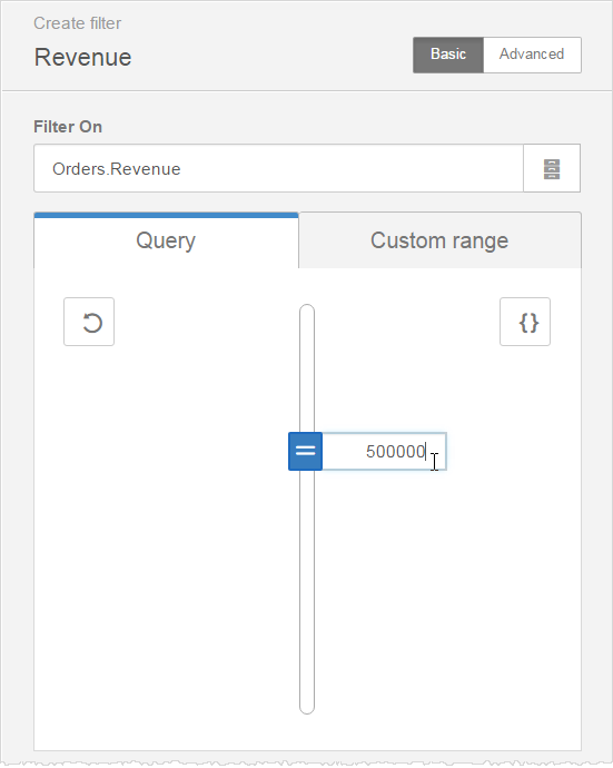
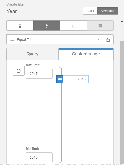
Slider Filters
Users can move a slider to narrow the filter results. Slider filters are available for columns of the following data types:
- date
- datetime
- integer
In addition you can set a custom range for the slider.
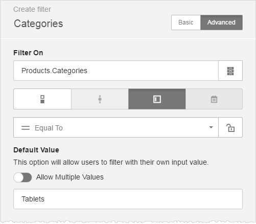
Value Filters
Value filters provide a text entry field so that users can type their own value for a filter.
Allow Partial Texts with Wildcards in Value Filters
Use the Contains operator to allow the user to enter partial texts with the percent wildcard (%). The percent sign is required for the Contains operator. 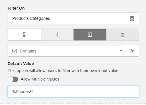
Allow Multiple Values for Value Filters
To allow users to enter multiple values, toggle the Allow Multiple Values option to On and enter a default value or values. Optionally, change the default comma delimiter (,).
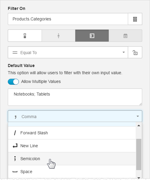
Tips:
- The default delimiter is a comma (,).
- The supplied delimiters include: Tab, Space, Semicolon, New Line, Forward Slash, and Comma.
- You can enter a custom delimiter. Do not use a percent sign (%) as a custom delimiter.
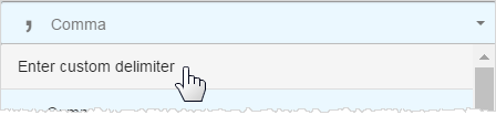
- Use the specified delimiter in the default value texts.
- For multiple values, the generated BQL uses an OR operator in the query.
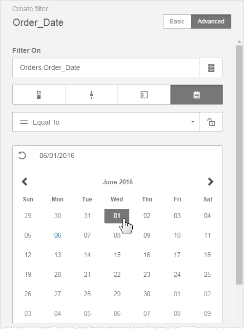
Calendar (Date Picker) Filters
Calendar date picker filters are supported for date data types. Calendar filters cannot be embedded. The filter editor shows what the calendar would look like to the user of a published dashboard.
You can set default values including start and end values.
Operators for Advanced Filters
Advanced filter modes can apply operators such as equal to, not equal
to, greater than or equal to, less than or equal to, contains, does not
contain, is missing, is not missing, between, or outside. 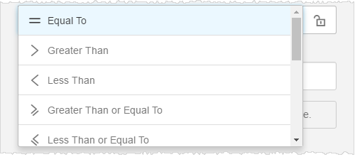
If an operator is not relevant to the data type of the filter, it shows at the bottom of the dropdown. 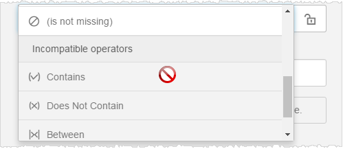
Tip: When using the Contains or Does Not Contain operators, business users can add the percent character (%) to search strings. The percent character acts as a wildcard around keyword strings. For example, "%Company%" returns all values where "Company" exists in the string. "Company%" returns all values that begin with "Company".
Locking a Filter Operator
By default end users can change the operator of a filter. If you do not want to provide this feature to end users, you can restrict the filter to use only the operator that you set up. Click the lock icon to lock a filter operator. For example, you can lock a date picker so that end users cannot select a range, they can only select one date.
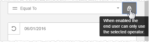
For another example, it may not make sense to allow the greater than or less than operators (> or <) on Varchar columns, as they will sort alphabetically. For many Varchar columns a simple equality (=) operation is best.
More Options for Filters
For additional functionality, click the More Options button at the bottom of the Create Filter drawer. 
The More Options screen opens.
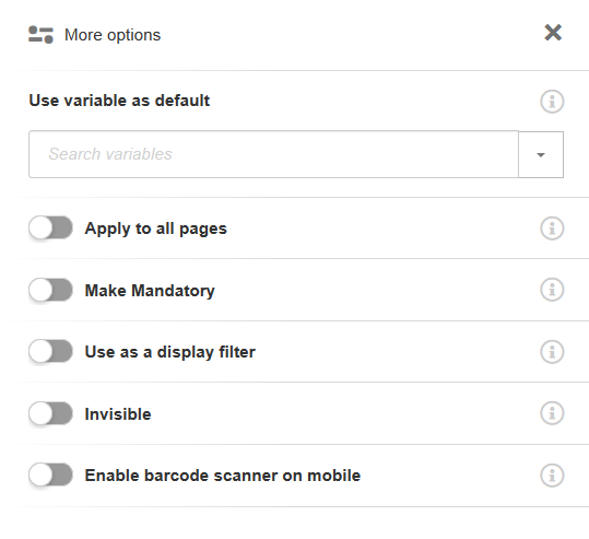
Additional options become available depending on the type of filter.
- Use a variable to set the default
value when the filter loads. Choose from the list of existing variables
or create a new one. For range filters that use BETWEEN or OUTSIDE operators, such as date pickers or sliders, enter two default values.
- Apply the filter to all pages that use the same name in the Filter On property. All such pages will pre-apply the same filter.
- Use as display filter causes the filter to be applied on data in memory rather than at the database.
- Make the option mandatory in situations when you want to ensure that a filter value always exists. For example, enabling this forces a radio button filter to always have a value (by default the first value in the list), and the "No filter" button does not appear.
- Make a filter invisible when you want to pass the filter values but not display the filter on the dashboard.
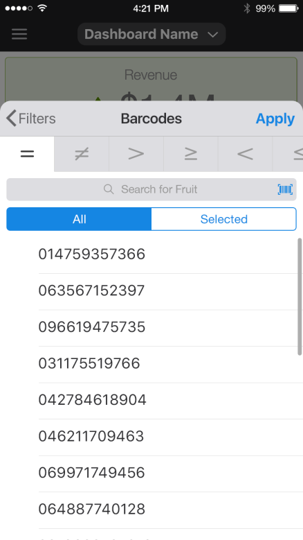
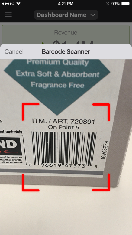
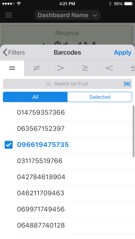
- Enable barcode scanner on mobile This is new feature enables mobile devices to filter based on bar codes. This option enables a button in the search bar of the filter panel in mobile apps. When pressed you can use the camera as barcode scanner to quickly filter on complex codes.
Search for Filters
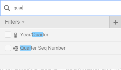
Some dashboards require many filters. To help locate filters in a large list of them, use Search and/or quick sort controls.
- Enter
text into the Filters search box to narrow down the list of available
filters and quickly find an existing filter.
- Click
the Filters dropdown to open a quick sort control bar. Click the
filter types to narrow down the list of available filters.
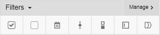
From left to right, the filter types are: Selected, Not Selected, Calendar, Single Choice, Multi-Choice, Value, and Group.
Ordering the Filters List
You can control the order in which filters appear in the filters list.
Just drag-and-drop the filters to order them as you like.
Expressions for Query Filters on Check Lists or Sliders
You can use BQL to further refine the filter values that users will
see. Click Expressions ( ).
).
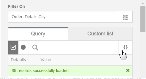
A BQL editor opens. If a filter was already selected, it displays.
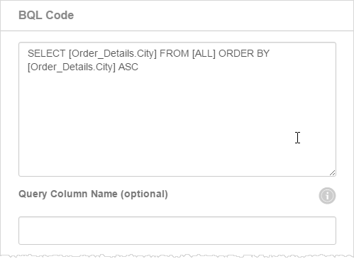
You can edit the BQL to precisely specify the filter.
Optionally, you can pass a different column for the filter than what is displayed to the user. For example, you may want to display the month Name to users but the query actually passes the month ID. Enter a Query Column Name to pass as the value, and make sure that it is used in the BQL.
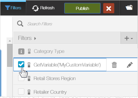
Custom Subject Area Variables in Filter Labels
Variables set in the Column Label of a Custom Subject Area are resolved when used as Filters in a published dashboard.
For example, create a static system variable called "MyCategory".
Use the variable in an expression as the label for a Custom Subject
Area attribute "Category Type".
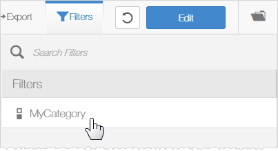
Create a new filter, find the expression label in the custom subject area, and set its properties.
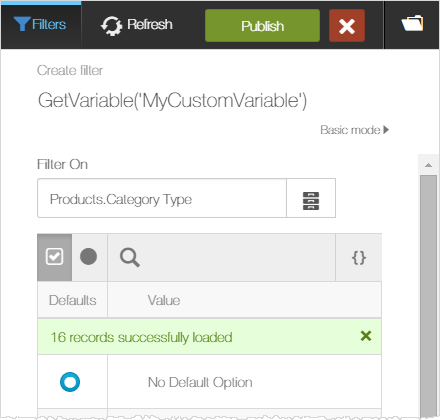
The label appears in the Filters editor as its expression was entered for the label property.
End users will see the resolved value of the variable, "MyCategory", instead of the data store label "Category Type".
Linked Filters
Parent/child linked filters are similar to parent/child filter groups, however there is no need for a logical hierarchical relationship between the filters.
Tips:
- When the business user selects the parent filter, it filters the result set of the child filter. This approach helps to narrow down the choices in a child filter.
- A child filter can have more than one parent.
- Only filters of type query are supported for linked filters.
- Either embedded or standard filters or both can be used in linked filters. A standard filter can link to an embedded filter, and vice versa.
- A date picker filter can be a parent filter but not a child filter. A child filter is affected by its parent date picker when the date picker operator is one of the following: =, <, >, <=, >=, not equal, is not missing. Range filters (between, outside) are not supported for a parent date picker filter.
- A slider filter can be a parent filter but not a child filter. A child filter is affected by its parent slider when the slider operator is one of the following: =, <, >, <=, >=, not equal, is not missing. Range filters (between, outside) are not supported for a parent slider filter.
To link filters
- In Edit mode, click Filters. The Filters drawer opens.
- If needed, create a new filter.
- Select the child filter and click Add Parents.
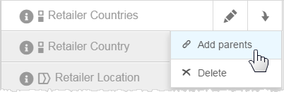
- Drag-and-drop the parent filter.
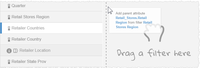
- Click Done.
- Click Publish.
For example, when a user clicks on a Region the child filter shows only the Countries in that Region.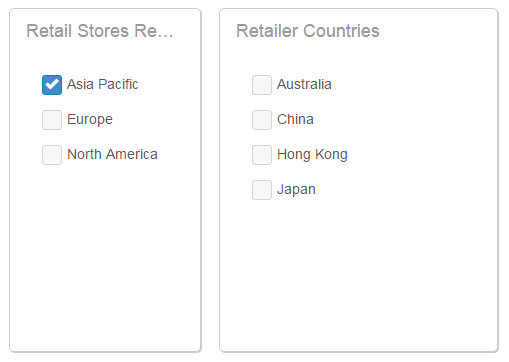
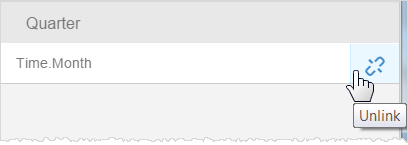
Unlink a filter
- In the Filters editor, select the child filter.
- Click Unlink.