A crosstab report is a table made of multiple measures, attributes, and summaries. A crosstab can be thought of as a concatenation of related simpler tables, and is sometimes called a pivot table. When you provide a Visualizer crosstab report on a dashboard, users can sort on rows, columns, or summaries to see details.
The basics of creating and formatting a crosstab report are the same as that of a table. See Creating a Table in Visualizer.
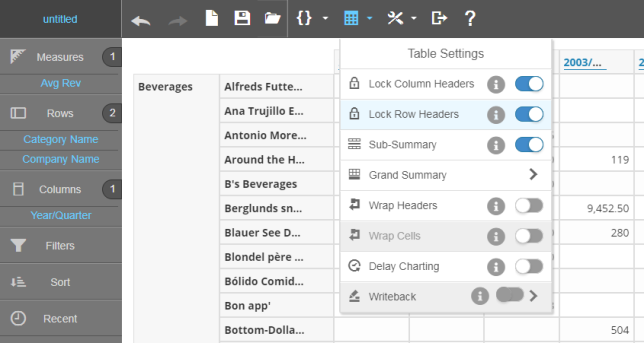
Tip: You can now lock cross tab column and row headers using the Chart Settings feature Lock Column Headers and Lock Row Headers. This is the default behavior.
To create a crosstab report
| 1. | From Guided
Mode  select crosstab. The Chart Builder prompts you to select the minimum two
attributes and one measure required for the report.
select crosstab. The Chart Builder prompts you to select the minimum two
attributes and one measure required for the report. 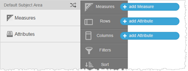 |
| 2. | Add measures
and attributes to the table from the Subject Area. For example,
Revenue and Gross Margin per Product Category by Year.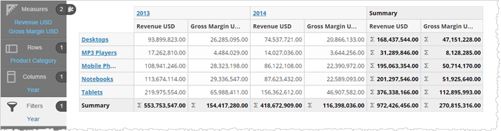 Like it does for tables, Visualizer automatically adds summary and grand summary data. Click the table icon to toggle the summaries. 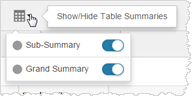 |
| 3. | You can toggle
measures between columns and rows.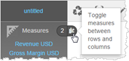 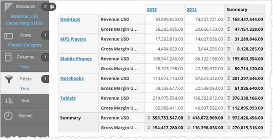 |
| 4. | You can click
the hyperlinked attributes to drill down and use the drill breadcrumbs
to drill back.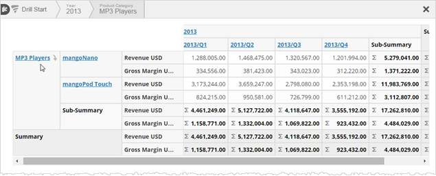 |
| 5. | Click the
downward arrow on an attribute to toggle whether the column title appears.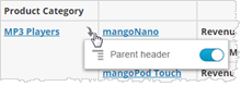 For larger crosstab reports you can control the visibility of row and grand summaries. 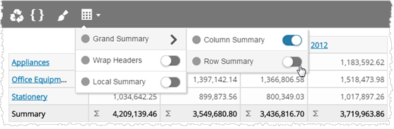 |
| 6. | Click the
sort icons to sort rows and columns by ascending or descending order.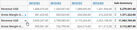 You can also sort an attribute by a measure. When there are multiple measures Visualizer prompts you to pick one. 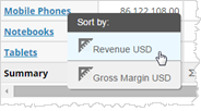 |
| 7. | Click Save
 . .Tip: You can export a crosstab report to PDF or Excel. 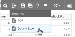 |
| 8. | Use the crosstab
report on a dashboard. See Adding
a Visualizer Report to a Dashboard. Like you, end users of the Visualizer crosstab report can also: |
Drill
Sort
Toggle headers